Psychology of the Crowd

Talking to Joey yesterday about, yep you guessed it, politics. Reminded me of a series that was shown on the BBC a few years ago called ‘The Century of the Self’.

It goes into the black art of Public Relations or its proper title Propaganda. And how successive governments and corporations have used this line of mass control to get us to purchase product not out of need, but desire. (Episodes on Google video really worth viewing alas low quality stream, but its about the content).

So how does this relate to our Projects? Well if you can understand the aspirations (desires conscious or subconscious) of the end users then there is more of a chance of the park being ‘adopted’ by said people. In the marketing of the park(s) at the beginning and end, always keeping our eyes on the end user. If you feel that they won’t get ‘it’, then its about communication/education/marketing and ultimately changing their viewpoint/desire. You could link it to the change and acceptance of abstract art in our everyday life. There was a point when it was laughed out of town as  fraud, but now as a group we accept it. Education/manipulation/fashion who knows, but we want to be associated with it, and therefore our association with it we assume it will make us seem more cultured/intelligent to others, which could be seen as an advantage amongst our piers. This proves the point that ‘new’ need not necessarily be bad, its about ‘viewpoint’ and what benefit is it to the force that is ‘self interest’

Self interest, what or how can it benefit ‘me’ as an end user, because if they (as groups of individuals) don’t see a benefit to themselves we will have an abandoned space, again. With little maintenance and thus the snow balling effect of decline will run its course, again. It all rests on adoption/love of the people for the parks. Think, Angel of the North, adopted and loved, by the local community. Who want to be associated with it as its considered to represent them as a sophisticated community, Manipulation? who knows, but they feel good about themselves, when we visit and say how wonderful it is.

Big Picture, not the ego of the designer (or as Tom would put it Nester rather than Hunter).

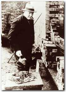
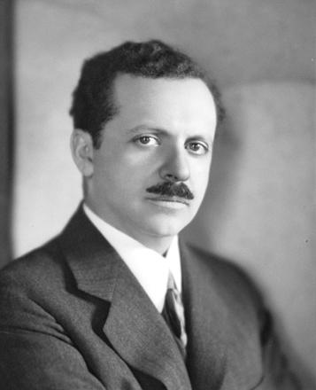
Its not really about Fraud, but about Edward Bernays the father of the Public Relations movement, really frightening how easy it is,if you know how.


http://video.google.com/videoplay?docid=-6111922724894802811#docid=6718420906413643126


Edward Bernays


Off my soap box for another few days, Back to work!

Original idea?…nah don’t exist!

Had an idea a for Calverley Grounds whizzing round my head for three weeks, then Jamie blurts it out!!!! DOH!!! I think i will still use it as one of my idea’s, but as the saying goes ‘nothing new under the sun’.

This next section does sound daunting, proper big school, no hiding behind the comfort of Hadlow College now.

What have i learnt this week? I am an internationalist by nature and my fear of nationalism also makes me suspicious of localism, thus (if) i have a design style then it would be along the lines of an international style, with a hint of local, but outward looking rather than inward, future looking rather than too much to the past as we should celebrate the now and not be downtrodden by the past and its design statements. That does not mean that we don’t learn from the past, just don’t mimic it. Confidence not timidity. High quality and grades of materials. Skilled tradesmen to construct with management systems that help not hinder.
And a high budget for ongoing maintenance, after all we all know that Park Citroen could be sooooo much better with some TLC.

Conclusion: we are all driven by our baggage ,not necessarily a bad thing, but worth being aware of nonetheless.

Babble over, Photojobo sent these photo’s through, Will never see curry in quite the same way. A case of ‘small is more’. Click on them to get the full effect.

Spilt milk

Todays fashion is tomorrows disaster?

As i have been glued to buildings and materials this past couple of weeks (and most of my life building them), it struck me how fickle tastes are. Love the Tunbridge Wells Town Hall, and actually like the Axa Building opposite (along with the much maligned ‘Barbican’). So why? I think time has an effect on softening our views and maybe understanding what the original concept was before it got lost amongst all the clatter of the baying ‘heritage’ mob.
I suppose its a case of the present mood, the optimism of the post war years for a fresh start gave us brash and bold design, not really thinking about the consequences when people had to actually live and work amongst these bold statements for new living. The point i think i am winding my way to is that a desire to create timeless pieces that are adopted by people. The Gherkin building in London for example is now an accepted part of the skyline.
How is it done? Who knows, but Faith and conviction play a major part along with a thick skin!
And with our present Tutors i am sure we are all developing a leather like shell.

Talking of a thick skin, a man who knew his brick bonds and would quite happily talk for hours about brickwork, Not sure Cameron would understand the joys of actually building rather than tearing down.

The Greatest Bricklayer of them all Winston Churchill, on a nice bit of 18″ (450mm) brickwork.

Mystic Meg visits car park

When leaving late one evening from Avery Hill, noticed how a bit cold of mist can effect the haze of lighting. Very spooky, but enclosed by the darkness of the sky in contrast to the effective downlighting (to avoid light pollution) of the white lights (high pressure sodium i believe), compared to the orange (low pressure sodium, more efficient for luminosity to power consumed than the high pressure ref: http://en.wikipedia.org/wiki/Luminous_efficacy). 
The white is more up lifting and ‘safer’ in a car park situation, but putting that aside for the moment, the white just looks better due to ability to bring out the green (ie white spectrum compared to orange) in the planting. Thoughts for both parks. I know blue works well with humans in low light as it works well with our non colour sensors (what ever they are called) in the back of our eyes. Which i believe are there for low light (ie the less light the more grey and white landscape we see) or is my school boy memory playing tricks again? Normal back of post card please.
Getting ‘A back to the Future’ flash back, expecting a Delorian to come screaming out of know were doing 80mph+ with maybe a long haired version of Tom Turner at the wheel after an adventure in some Renaissance carriage park (or should that be stable yard), he would so love that.

Rendering..good or bad?

Its not modern (1945) and its not clever, but i really like the simplicity of it. Back to my Janet and John view of T/Wells. The simplicity means that the idea is immediate rather than trying to look past fancy rendering covering up an average design (i am very much speaking to my self here). i am not saying i like the utilitarian design (form follows function), but there is a certain honesty about it. Plus the instructive Gill Sans font, very ‘KEEP OFF THE GRASS’.
Or am i talking blather?

Harry Wingfield illustrated books of the period, very idealistic.