Who are the ‘Green Engineers’?

That is the Question.


Two days of green engineering and i thought i would be ready to go back to my Neanderthal ways, being a cynic, unless its proven in my mind (in my few years on the planet i have seen  a lot trends promoted and used for ill gain, so its always good to question and not just accept because ‘billy big bollocks ‘ says so) then its hot air blather which is no use for beast or man.


But i can so see the logic in proceeding down this route, not the sandals and sack cloth,but the high and low tech solutions to everyday needs, in particular, waste.
As in not wasting resources moving products around the planet, saving and reusing local resources first before going further a field. Lastly, efficient buildings whose creation is mainly due to the landscape, not the other way round. 


The idea that LA’s are ‘engineers’ from our lesson on SUDS was an inspiration. I knew a bit about swales and suds (or at least i thought i did) but never joined the dots. A really fantastic lesson. The fact that this was backed up with evidence and the interest from Governments from around the world proved even more that what we are now entering is an age of proactive green policy rather than chest beating ‘i don’t own a car and am a vegan’ macho talk.


So ‘if’ i and the rest of us make it, then we have a duty to not to be shrinking violets, otherwise the holistic big picture of building as part of the landscape will be lost amongst the desire for engineered infrastructure that engineers love so much. Forgetting the impact on the world, rather than the often the simple solutions of using what the landscape has used for millions of years. Very inspired even if we did not make it to China!

Taking green technology to the limit, The new hospital (completion 2014) in Bermuda


A lot of thinking and re-evaluating to be done.

Can’t see the wood for the Tree’s

Focussed on the point.


A bizarre saying, never really understood it for years, but at the moment its crystal clear and i am sure for most of us it has a chime of truth. 
Looking at your own work for hours/days/months, doubt creeps in until you have no idea whether its good, inspirational and ground breaking or tired, predictable and safe.
Then the trap of adding more ‘stuff’ and losing the less is more simplicity ,which we all know is so hard to achieve. It comes back to the would i like to spend a day in the Park? As an 8 year old or 70?


This so has to become a ‘place’ again. It must become a point of reference to what a park could and should be the local and wider community. Otherwise leave it as it is and spend the money else were, were it would be beneficial.


Enough rambling,


Drawings 


Sunday Morning, this is were i am at


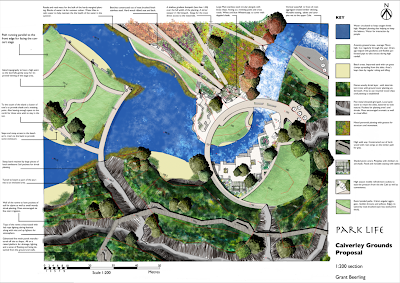
1:200 plan. Updated and tightened the annotation. Added trees to correspond to planting plan. Lightened the South bank. Cross section markers. Reduced the size of the scale bar. I am sure i have missed stuff

Boy, did i spend some time on this little puppy. There can never be enough information for a contractor. So site visits would still have to happen though the idea of leaving a drawing that the informed contractor could refer to and not be phoning up every five minutes is the challenge.


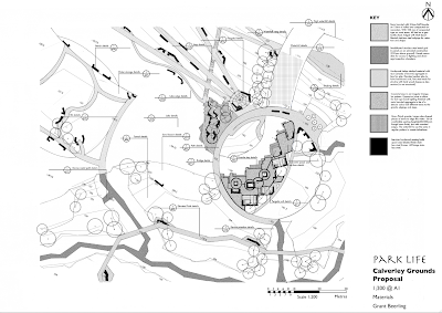
Flattened the textures for the different materials to reduce any confusion. Though i am sure a specification book could go with each drawing, as i seem to have a lot of questions for the designer, oh shit thats me!
I can easily see how a year of designing as a team with hundreds of drawings and specification documents could easily happen , and then have a major F/Up
because somebody has missed the ‘bleedin obvious’!


Sunday have loads to still do, given up on getting the model done, but you never know!!!


‘To Nail or not to Nail, that is the question’

Slingshots and Arrows 


If the Bard had been on our course i am sure he would of reached this conclusion. Having tried to complete stuff for pin ups i often compromised on annotation, levels, planting, materials, etc,etc. So ended up having to explain myself on the back foot, which is fine (you pay’s your money…..and all that), but non the less annoying. 
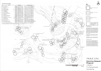
So this week i have concentrated on nailing the 1:200 ‘freeze’ plan. In particular levels, planting and materials. Really tried to get the ‘zing’ back. So slingshots and arrows, yes, but at least i feel that i have been thorough (to my ‘student’ standards at least).


Plan


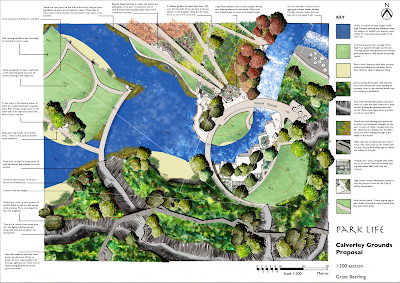
Drawn on the ‘board’, scanned and merged. Photoshop rendering. A lot quicker this time as learnt techniques used and hopefully improved. Tried to make it a bit lighter in feel, but still atmospheric.
A lot of updates, but in particular the cafe to the right of the waterfall, set back into the hill, more space to accommodate seating. Thought a lot about the hills of grass to sit on, there aspect to the views in particular.

The annotation will be improved once i have completed the planting and material plans. Again a case of nailing them then updating this plan. I think the scale bar needs improvement, i know Andy had a good template. I feel some plagiarism or is that inspiration, m’Lord.
Sketch Book


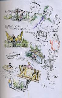
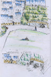
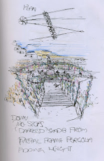
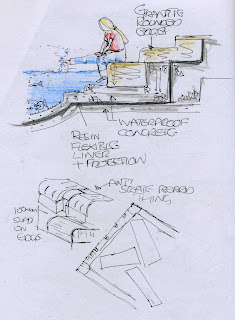
Spent quite sometime drawing idea’s that were suggested as well as developing new ones. Scribbling seems to help me think, even if it turns out to be rubbish, also to check if whats in my head would look ok spatially and other problems that may be thrown up.

Had a go at rendering with water colour pencils, a hint is better than total fill i think.
My usual scratchy ink (fountain pen). I have come to the conclusion that this is the way that works for me, quick and effective (to my eye at least)

If i want to draw steady lines then i can trace over, but i think i have drawn this way for sooooooo long that the old dog ain’t gonna learn this time.

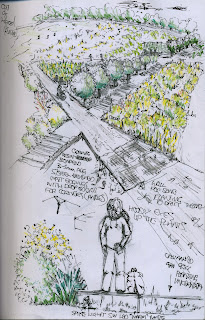
The zigzag of the planted path with axil steps cutting across, seems ok, Put a hoody in with some swag who is distracted by the lovely planting, later nabbed by the ‘Fuzz’ ,society to blame and all that

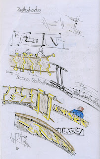
Brass railings an inspiration from the new bridge at Kew (with a nudge from Paula ,cheers ). Playing with a gold/brown glass or plates of textured brass, copper /zinc alloy (Admirality Brass higher Zinc ratio for reduced corrosion or maybe bronze copper/tin alloy)

Youth on bridge

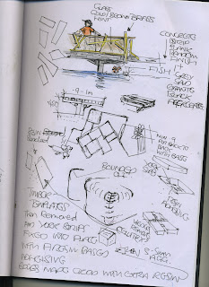
Timber high walk way through the south bank. Resin in lay in the timber (aka Bluewater though black rather than yellow…yuk)

More balustrades, Central meeting point on the North bank under a large pergola. My version of the ‘Green Business Man’.

Cafe by the waterfall, out of scale and to near the front, rectified on the little sketch below.

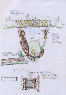
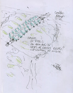
A thought about enclosing the axil stair’s in a metal pergola with a climber. Plus a tunnel effect and shade, minus reduces the view across the park, mmmmm a conundrum as Sue would say. 

A cross section of granite by the water. Plus some anti skate board idea’s (grumpy gene coming into operation i am afraid)

Axil steps lined with trees? 


Its about People………..Stupid

I have been going on (ie boring the pants off every one) about this study along with a book titled ‘A Visual Approach To Park Design’ by Albert J Rutledge. For the web, Chicago city started an organisation called ‘Project for Public spaces’ which was inspired by Fred Kent one of Whyte’s assistants on the project below.  A massive resource of idea’s that i wished i looked into further before doing the document ( i skimmed the edges as lack of TIME like all of us). If i have a passion its making places that effect peoples lifes for the better on a daily basis. Which i realise Parks are one of them. Can you imagine Calverley becoming ‘A Place’ again? Sod the fancy stuff, get the basics right…..See below.

About PPS « Project for Public Spaces – Placemaking for Communities

So here is the video in question. Made in 1979 (when most of you less than a twinkling in somebody’s eye) but still relevant, like good music if the quality is there then its timeless. Thus this research video. An hour long, but totally fascinating. Applies to both parks, the low traffic flow of TW thus need to attract, and the high traffic of Jubilee, need to retain.

I would be interested on your thoughts.

For me, it was the answer to the big question, Why should anybody visit my park, or to put it another way, how do I make my park ‘A Place’ rather than a field?
https://archive.org/embed/SmallUrbanSpaceshttps://archive.org/details/SmallUrbanSpaces

On the third viewing (…sad I know) the point of ratio of human space. Too wide and the distance will not be to scale, and narrowness in not necessarily a deterrent. To finish, a quote from the great man himself,

“I end then in praise of small spaces. The multiplier effect is tremendous. It is not just the number of people using them, but the larger number who pass by and enjoy them vicariously, or even the larger number who feel better about the city center for knowledge of them. For a city, such places are priceless, whatever the cost. They are built of a set of basics and they are right in front of our noses. If we will look.” ‘William H.(Holly) Whyte (1917-1999)’


The Social Life of Small Urban Spaces, Washington, D.C.: The Conservation Foundation, 1980.

Back to the Coalface

Well had to get back to work and actually earn some filthy money.

Bit of a shock physically, slept like a dead man.

Sketch blow up


Good exercise in thinking about what you have to resolve. My main points to resolve before thinking about anything were spot levels, gradients and differentials as in water height to island height for example.

A lot going on in the chosen area. I can visualise in my head what is going on, which is no help to the viewer so more perspective sketches needed, even the two minute cross section type.

Then i can start to nail down materials and planting styles along with irrigation, lighting, etc.

Reading an interesting book called, ‘The Dynamic Landscape’. the outline of the book is about bio diverse planting in parks as the education of the public to understand and appreciate the beauty of naturalistic planting rather than the municipal planting of the 19th century that is still the core of most local authorities , ‘we have always done it this way’ philosophy.

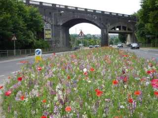
If the park can demonstrate the example of the naturalistic style with the slightly more formal prairie style then this can help the local authority to use this style as the public will have seen this in the park. Complaints can be referred to the park as an example. A case of re education. Use this style for roadside verges and cut down on the present high maintenance amenity grass that is the norm

A company providing flowering grasses specifically for local authorities…Nice

Why do i feel ‘Miffed’

Well crit over/marking. Not really sure what to make of it all. yeah, yeah, fancy rendering, but i agree with Paula (Romania) the previous one has more life as did the the very first sketch. This one is to dull, to refined. I prefer something with some more soul.

Its about being expressive for me and although there is a place for straight informative drawings, it just doesn’t get the feeling across. And thus the feeling of disappointment.

Perspective Ahhh need to do sketch up model for depth of field, over all a bit miffed. I think on the marking front i got away with it and it was generous. As the seduction of rendering helped the lack of skill on the perspectives, another day another attempt.

I think earlier in the Degree i felt more confidant about taking risks, as i get nearer the finally i find myself getting more conservative, its a case of letting go of the reins and then thinking too much about the consequences. Really quite annoyed.

What to do?

Well its a case of not trying to ‘please the panel’, but to concentrate on the design.
The difference of designing for a client, either they get it and love it or they don’t the story ends, whereas this situation its the added chasing marks regime which we all do as they are there as a standard, and there has to be bench mark. So i am going to try and stop thinking will they or won’t they and go for what feels right as that is the point otherwise we would all be Jamie/Julia/Paula clones and bad ones at that.

The presented drawing had cross section annotation, forgot to put the update on my stick and thus lost is when shutting down Uni computer.
Like this one, but the extension to repetive. trees have not been thought through, rather what i could find. Though there is some atmosphere.
Again trees’s 

Tree’s etc

etc

Just don’t and have never liked these, just can’t get excited.
So the remedy, bring back the excitement/noise of experimenting and taking risks. Lesson over, now the document.

Back from the edge.

So much work, so little time sums up my (and i suspect the rest of the class of 10/11) Christmas.

Pin up on Monday was a strange affair as everybody looked so pale and bloodshot, alas not from a night on the town. I think the ‘Blitz Spirit’ is alive and well in our group as we all can empathise with others long dark nights of the soul, when that blank sheet of paper mocks your every stroke of the pen.

So what i pinned up for the first crit, of the year. We have a week to update and final marked crit on the 24th of January. As usual the crit normally states what is at the back of your mind or what you were trying ‘wing’. Plus some surprises.

(click on pics to enlarge)

                                                     Park Life


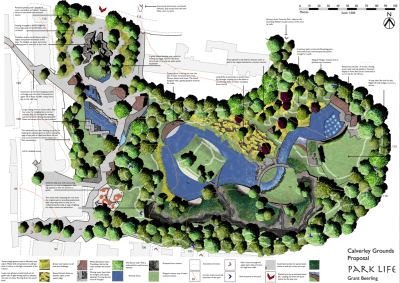
The Masterplan


My Aim: I was trying to convey the topography of the site with shades of green. Tried loads of new ideas and techniques. Overall pleased with the strong but tonally dark colour scheme. Not so happy about the water, general cramped feel, paving colour, outside buildings. The name feels right as it conveys (in my opinion) that people are the park, as in the Blur song ,park life. Simple, catchy and with an element of humour, which adds up to a memorable title, i hope.
Crit : Too much writing, smaller more descriptive to the point annotation  and thus more of them. Trees too small, line weights generally to heavy, little or no hierarchy in the line weight, Loads more definative shadow, Outside buildings greyed out, buildings defined, generally more obvious and less suble communication.
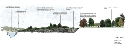
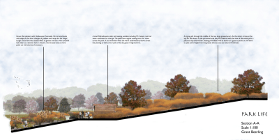
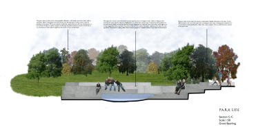
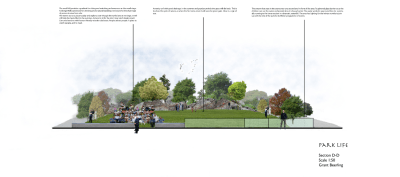
Cross Sections

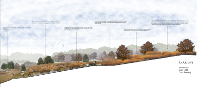
1:100
Aim: Trying to get atmosphere in the area. The calm feel of the grasses along with the enclosure of the planters. Depth of field.
Crit: Line weight of the ground level too thick. Shorter and more concise annotation, more of it. Use the whole with of the page, otherwise wasted opportunity.

Aim: To show the vallies and different shrub/tree planting on bank. to get depth to the other side of the park.
Crit: As Above
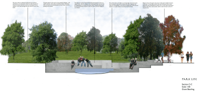
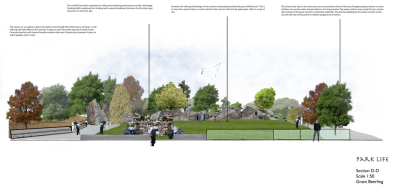
1:50
Aim: Depth and water and sitting possiabiltys on the granite cubes. Not so pleased with this as it lacks fun and atmoshere, which is the point
Crit: As above
Aim: To show a small crowd enjoying an event. Stones being used. Depth of field. Really hard to get people sitting on the ground looking at you of the net.
Crit : As above.
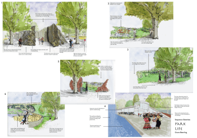
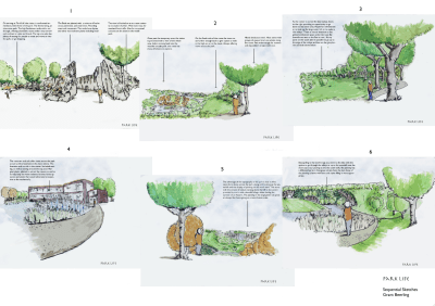
Sequential Sketches on the main circular route.


Aim: Really rushed, all 6 in 6 hours. Some of the perspective are way out as they were all out of my head. The tree’s in the for ground are naff, though in the distance are ok. Though the drawings are average at best there is some atmosphere.
Crit: Line weight! way to heavy, lolly pop tree’s and people. no variation or possible id of different tree species. Colour, shadows the list goes on!! 
Conclusion, Need to sharpen self crit skills to see what is actually in front of me.More sketching less photoshop filters. I think i need to just nail some issues such as grass and mass area’s for colour and feel. Atomsphere rather than to much technique.
                                        Think Atmoshere

Sketch Designs

What a diverse bunch we are, from extreme wow ,noisy, party, to calm considered and conservative. I noticed that nearly all of us had a phrase  that our favoured design seem to spring from, even if we did not know it before presenting. You have to go with your own personality and how you see the world to get passion, otherwise its just ‘another job’. There was plenty of passion yesterday.

I will not tell you which one was chosen to develop yet, so that if any viewers would like to comment then there is no bias. An initial idea sketch followed by a more detailed sketch. The three words they are inspired by are Connective, Educational and Alternative.

Click on image to enlarge.

The big idea is to re-connect Tunbridge wells with the Park (known as the grounds really needs to changed as it congers up the wrong picture as one thinks of sport, not leisure). So when some one says Tunbridge Wells they would think Calverley Park. Connect with people and their every day life, whether using its direct routes as a more pleasant walk from one end of town to another or stopping for a cup of coffee and a rest whilst admiring the views, promising to come back another day to explore further. Connect Business so that they have a vested interest in the park staying well maintained (through Business rates). Concert venue, water and ice, fantastic planting scheme, restaurants, circular walk/run, all designed to pull visitors and regulars into the park. It should be part of the day when in Tunbridge Wells. 
Education about food. Local schools, colleges and higher education, to use the facilities and be hand on. Local markets to sell produce on the site. All the cafe’s and restaurants to have a theme of fresh produce, cooked on site (no boil in the bag) and reasonable pricing to show good food does not have to be expensive. Large play area with bespoke designed equipment for the process of education through play. Circular walks of woodland and amazing planting.
Simular themes of connection and leisure incorporated in the design. User groups to have a say in the running of the park, so to attain adoption from the start.

An alternative experience of the landscape. Using the topography to our advantage, rather than being frightened of the challenges it throws up. Cutting into the landscape creating a valley with high sides, making and enclosure. The navigation is not obvious and is rewarded with surprise views of the park plus some enclosed viewing points over the lake. A contrast is the large grassed area’s, very formal for play and relaxation. A concert stage cut into the hill looking over the lake (facing S/E). On the south facing side superb planting schemes to draw people in for a more meandering walk, exploring scent, colour and texture.
Upper area restaurant with fountains and ice rink in the winter. Water fall working its way down to the lake. Circular walk for the dog walkers and runners. Adoption as above encouraged.
So there we  have it, three big idea’s, one choice. Your thoughts would be gratefully received. Still more development needed but its a start.

Wigglesworth looks at Robin Hood rescue | News | Building Design

Following suggested links via Christine, toms regular contributor on his not insubstantial ( or is that a double negative, i am trying Joey) web site. I eneded reading about the proposed demolition of Robin Hood Gardens, and as usual got all hot under the collar (saves on heating bills) and ‘shared’ my thoughts on the subject. Not that anyone will ever take any notice, but its one step better than talking to yourself. Yes that’s right, shhhhhh somebody may hear.

Wigglesworth looks at Robin Hood rescue | News | Building Design

Where on earth do they get their prices from? £70-100k pet unit, Coming form the construction industry that really is a load of tosh. This argument is put forward all the time and nobody ever challenges it.

As for what is replacing it, spot the difference? nope neither can I. The lessons from the 60’s about not listening to communities and bulldozing on are alive and well by the sounds of it. Its so reassuring having our betters to do the thinking for us, m’Lord.

The core of the subject is people, place people with opportunities to better themselves in a community, you get the Barbican. Take away those opportunities and tell them they will lucky to get a job and if they do they should be satisfied with minimum wage, dump them on an estate, bingo! sink estate! A building is never going to solve how people see the world, opportunity and hope are the way out. As people take pride in themselves, then pride in their surroundings follows. This is were the modernists got it wrong (i love modernist buildings, and i am not an architect) people are not machines. Can we learn from this? Yes but foundations first, and recently the raising of student fee’s (and its not only the young who go to University) has in one swoop put us back 40 years, degree’s will now be privilege of the wealthy. Politicians hang your heads in shame.

I think the real issue is being brushed under the carpet. So whether Robin Hood stays or goes the issues in that area will remain. What a bloody waste.

What makes a great space?

Or what makes a space were people want to meet. Found this worth a look, as at the end of the day if one forgets about people during the bustle of trying to create a cool design then it will be an empty space and the first place were local councils will reduce budgets when times are tough. 
Though to be fair, we seem to have covered most of the words with our brain storming.

Spent a lot of time thinking (and commenting on other peoples sites) instead of working (paid work). Now have three days to put something down on paper.

So need to do some sketching. So do it!!!