The Business Model

The bane of  society
Well you may ask surely we need business models for business to run effectively and for growth and thus the prosperity of the general populous. Yes, but were on the chart of importance should it be?


A conversation between a dying Steve Jobs and Bill Gates ended in a humble appreciation of each others skills. But the give away comment for me was Bill’s using the phrase of the conversation “well, we have a difference of opinion of our business models” and there is the give away comment. The model first, then how to execute it, whereas Jobs view was innovation and connection. Innovation was primarily about the end user, for example the iphone, before that product the phone market resembled the TV market at present, confused, unconnected (how many handsets does it take to watch TV now!!!) and short term. Connection of products and operation systems learn one then you can operate all the other applications , ie get ‘Pages” (macs ‘Word’) then all the others have the same interface…simple. 
Try that with an Adobe product! A circle in Photoshop is different from InDesign which again is different in Illustrator, and before you say well they are different products so they have to be different, ask yourself who are you thinking about the engineers who build it or the end user? Who is your primary concern? Making life easier for the engineer or the end user?
Thats why artists and engineers have to work together, either on their own and you get a pretty product that crashes all the time or a product that works, but is overcomplicated for the ordinary user and therefore not used.


Make IT simple…Three moves 
We now take it for granted that we buy a phone and use it, not spending hours trying to find stuff and reading reams of instructions. It has to be intuitive to reach the majority otherwise you have a product the excludes.

So which is the better model? 
The one were you sell as a product that is short term, rushed to the market (the ipad has been promised for over 10 years, not until battery life was improved would it be released), selling something that is shiny and status driven or a product that is aimed for everyday people to use, setting bench marks rather than following, actually trying to improve people lives rather than just trying to get cash out of their pockets.


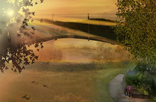
Its always about the end user


“They just don’t get it” (Steve Jobs) in reference to Google and Microsoft’s approach to product design


http://cnettv.cnet.com/av/video/cbsnews/atlantis2/cbsnews_player_embed.swf

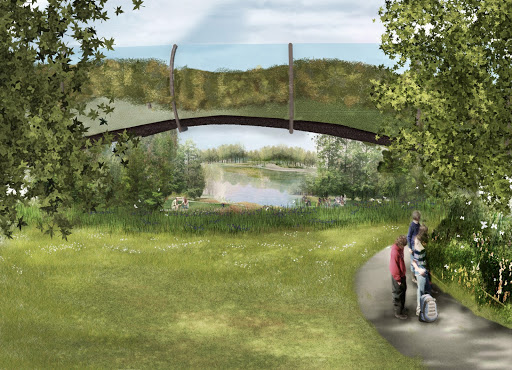
As Landscape Architects and Garden Designers we need to ‘GET IT’ otherwise what is the point? Vanity, personnel status, wealth? 
All chasing the wind, here to day gone tomorrow, all is vanity, as Solomon is alleged to have written.


Conclusion
The end user determines design.
This is our mission, if not, go and get a job in the City.


Legacy, what are you going to leave behind?

A bit of what you like

Urban Noise Crit


Well after working hard on this it seemed to be appreciated, even if it was probably a bit safe on the idea front.


General Points from Robert And Benz


These are the points that are general to all of us.


1) Short, sharp and snappy. Keep on subject don’t try and cover it all.


2) More ambitious!!!!


3) Before and after, make it clear.


4) More sketch up for massing, as in buildings etc.


5) Image and Annotation otherwise a slide waisted.


6) No PDF. Use Powerpoint (or equivalent) carful with film.


Personal Crit


1) Could be more contemporary


2) Lighting was lame


3) More adventurous


All very fair points, so more pushing the envelope, so to speak.


Urban Noise Video 1 Minute (watch in HD/full screen for best effect)


Well it seemed to cause a bit of amusement near the end, not sure why, so answers please or is my Asperger’s cutting in?
A bit romantic and poetic thanks to Vaughn William’s ‘Lark Ascending’ (but not 
the obvious bit) going into a lovely minor key.


Always felt it had too many slides and the first few were a bit messy, generally needs tightening up and a bit more of a radical proposal.

A bit muddy on the lighting, and also a bit too many dark spots, has an East German Border feel about it. 

Worked hard on this one to try and get the sunrise through the tree, really not that easy, half blinded myself getting photos of similar sunsets. The important thing is the silhouette effect. The tree opposite should be much darker and the lens flare not quite right. More birds, though Mr Fox i like. Slowly getting atmosphere even if its not that subtle at present.


Dappled light and distance seem to work well. Plus grumpy teenagers out with Mum (much rather be on my Nintendo). pleased with the grass, trees improving.

Now a week of AutoCAD.

My least favourite programme, but found out today (thanks Paul) that files can still be converted to Bryce, but you have to convert to 3Dmax from AutoCAD.
Another 100 hours of my life gone i suspect.

Got a test copy of V-Ray, may give it a go as Photo realism is the in thing.

Thats it……


As Changeable as the Wind

Theme Project , silent (well almost) presentation
Well rather jumped upon finding out that we had only one minute to present, (rather than the assumed 3) so my 2 min video was lost in is minor glory. Also no sound on the machine (so i will endevor to upload some drivers so that we can all have sound if not bring a lap top in and play them simultaneously, as your lap top does the sound and the picture on the TV)


Other point to remember are, all MAC users save to mpeg-4, not a quick time movie as it won’t play(as Jimmy tried too).


Video 
Well rather rushed so the idea was not executed properly but with a bit more time would’ve refined it. The pace was set by the music and thus that i was annoyed that i could not play the whole 2 minutes. Admittedly we were the guinea pigs. So next vid will be more refined i hope. 


Full screen button next to ‘Vimeo’ press while playing 

Trees in photoshop

Photoshop CS5 Tutorial.


Ok it was late and thus a bit monotone, and a few errors for you to spot!


The idea is to show you how to create a simple tree from above with shadow. Its a starter for you guys to build upon so the detail is basic for that reason. A foundation if you like.


It took a long time to work it all out so it has some value to me (at least). So i will share it with Greenwich Students LA and Garden Design, to give you guys something to work with. Really appreciate if you don’t publish this video, download it by all means as it won’t be up forever.


 Come back for updates.

Original Vid below.(Update May 2014)


//player.vimeo.com/video/33098258?color=c9ff23
Photoshop CS5 Graphic Trees from Grant Beerling on Vimeo.


Its about People………..Stupid

I have been going on (ie boring the pants off every one) about this study along with a book titled ‘A Visual Approach To Park Design’ by Albert J Rutledge. For the web, Chicago city started an organisation called ‘Project for Public spaces’ which was inspired by Fred Kent one of Whyte’s assistants on the project below.  A massive resource of idea’s that i wished i looked into further before doing the document ( i skimmed the edges as lack of TIME like all of us). If i have a passion its making places that effect peoples lifes for the better on a daily basis. Which i realise Parks are one of them. Can you imagine Calverley becoming ‘A Place’ again? Sod the fancy stuff, get the basics right…..See below.

About PPS « Project for Public Spaces – Placemaking for Communities

So here is the video in question. Made in 1979 (when most of you less than a twinkling in somebody’s eye) but still relevant, like good music if the quality is there then its timeless. Thus this research video. An hour long, but totally fascinating. Applies to both parks, the low traffic flow of TW thus need to attract, and the high traffic of Jubilee, need to retain.

I would be interested on your thoughts.

For me, it was the answer to the big question, Why should anybody visit my park, or to put it another way, how do I make my park ‘A Place’ rather than a field?
https://archive.org/embed/SmallUrbanSpaceshttps://archive.org/details/SmallUrbanSpaces

On the third viewing (…sad I know) the point of ratio of human space. Too wide and the distance will not be to scale, and narrowness in not necessarily a deterrent. To finish, a quote from the great man himself,

“I end then in praise of small spaces. The multiplier effect is tremendous. It is not just the number of people using them, but the larger number who pass by and enjoy them vicariously, or even the larger number who feel better about the city center for knowledge of them. For a city, such places are priceless, whatever the cost. They are built of a set of basics and they are right in front of our noses. If we will look.” ‘William H.(Holly) Whyte (1917-1999)’


The Social Life of Small Urban Spaces, Washington, D.C.: The Conservation Foundation, 1980.

No Oscar nominations for this one

Its is easier with a vid to explain anything on computers, but then ‘Peter and Jane 5’ is more my level of reading.

Just a point of getting it accurate.

A final point that i missed is the printer even if you have the exact A1 size) always seem to scale down to app 97% there is a box on ‘Properties’ to put change to ‘Actual Size’

I would say enjoy, but when has an instructional video been fun, (unless its about making CAKES! obviously)

Very tired when doing this so a bit of brain freeze, croaky voice and general malaise.


photoshop blowing up an area to scale from Grant Beerling on Vimeo.