Done, Dusted and back to reality….Bump

Time……


Been a while due to doing stupid hours to get it all done, got to the point were sleeping seemed like a guilty pleasure!

Everyone really pulled something special out of the bag in the last two weeks well done to all my class mates.

As usual looking around at everybody else’s work see big gaps in mine, but came to the conclusion that we will always be better off following our own cue. 

Regrets, still think my sequential’s are a bit heavy, whereas my 1;50 seemed to hit the spot, with movement and a light touch.

Would’ve liked to have done a seasonal page as i played around with colours earlier on, no time. Would’ve liked the model to be better, seeing the rest of the class picked up some good idea’s, and well done some really nice models.


I think i managed to get the point across with this one, room for improvement on the trees though.

Obama visits Park life for inspiration and too meet an old Mexican friend


Distance and our friendly monks take a stroll.


A particular fave, really thought about the issues as i designed this in particular hidden fixings, but with accessibility for maintenance.


This one seemed popular in the sense ‘ooh i would like to go there’ so managed to sell the festival idea with the ravine.

Just need £20million to build it….. offers welcome


ZZZZZZZzzzzzzz


Don’t push me, cos i’m close to the edge

I’m trying not too lose my head.


As ‘Flash’ put it (the grand master of the furious five). The message still holds its own and was the first ‘real’ bit of hip hop to hit my young ears back in 81 and was an instant convert to all things New York.


Unfortunately i went over the edge today when i realised the document that needs proof reading and up dating is on the external hard drive that has crashed. 
Then as luck would have it, found the file on my Main Mac only for it to be corrupted and refuse to open even though it was showing 50+gb. Threw a hissy, broke my glasses (all £10 from Tesco). Fortunately a friend happened to call and calmed me down. 


So looked around blah blah, threw a prayer up to the Great Garden Designer in the sky and presto it opened, only 10 unlinked photo’s that are easy to retrieve…. Calm restored.


Progress


Is slow, no matter how many targets i set it takes an age. So this is were i am at. Finished and annotated all the Sequences, Lighting spec done, Updated lighting plan and festival plan, spent an age on the model image plan, but that paled into insignificance compared to the ‘Mood board’ how difficult is it to find 5 images…bloody difficult thats how much! And then arranging them in an eye catching way, playing the ‘less is more’ trick, so difficult and time consuming.


Stumbled on a couple of things ‘playing’ with the sequence images, how to get some life into them, out of the box, simple as that, done one, not going to do the others. No time. I will probably do it on the 1;50 sequences. Using cut out people,but manipulating them so that they ‘sink’ into the image.

Turned this into a panorama and pulled Hari forward to give the image more width.Plus moved some of the trees higher to the right. Made the path wider as it was going to narrow to quick. Overall looks more balanced.


As Mr Chilli is a fellow republican i was going to send an image with some Royal joke, anyway these guests heavily p/s to sink into the image plus heavy shadow walking out of the frame, suddenly looked a lot better, lesson learnt , knew it from previous work but got so close to the trees that i could not see the wood.


Took some more model images, had a go at a quick render, inspired by Sue’s pain bucket. Did this with a ‘wet brush’ and some quick filters to sink (Multiply) etc.

Does not look to bad, gets the point across. I am sure with practice one could do some thing half decent. Did not use on the model sheet, time…….

Did a bit of a ‘Paula’ on this one, as in lining everything up, and really thinking hard about composition. Yep it should be 5 images, but it just would not work. So head on the block, 1 and 3 images are uneven numbers and thus clusters.

I am probably 3mm out somewhere Paula!


Spent an awful long time trying to find the ‘right’ kind of lights. Some don’t exist yet. It seems to me that most of the lights are made in China and ‘Badged’ (when several retailers put a name to a product that has been made centrally by one anonymous manufacturer).
So managed to find some recent prize winners from the USA for innovation etc. So the latest Phillips High out put LED’s (17.5w for small and 30w for flood). Still think there is a lot of room for some bespoke designed lights. The rope LED’s are still in their infancy so expect in the near future a lot more LED rope, lamps (bulbs are what you plant in the ground) and lights to come out.


Mood board is a good name as i was in such a foul one while doing this! Cut out some of the images so they merged into the one below. Have not changed the colours or any other p/s stuff. Thank god for ‘Flicker’ and screen shot on the mac. 5 images with some hierarchy hopefully got something across. Tended to look for pictures until one would’ hit me’. This takes some time unfortunately.

Just got Precedents to do later today, (done just need updating to get some more zing and relevance) then 1;50.


Thats it folks. 


DJ Shadow ‘Entroducing’ the darker side.

Shadows that follow.

 Seem to be getting slower as fatigue strikes. So eventually the sequential sketches (annotate tomorrow on a fresh head).

But first, had a look around at what the rest of you lot are doing, bloody hell there is some good stuff, particular praise goes to Mr Chilli for his bounding leap forward ( i assume the name comes for ‘hot air’) really looking solid. Just reminds me of what is expected. 

Aija s model, blinding, Alicks drawings (and studio, so tidy i wouldn’t dare put a photo up, for the simple reason the camera is buried somewhere and all you would see is a sea of tracing paper ) stunning, Sue’s ‘light touch’ of lovely sketches, great shadows. Looking forward to seeing the rest.


8 Sketches.

In no particular order. Updated the previous ones with more shadow (lifts and creates atmosphere, cheers J), backed off the bright green to a more subtle muddy green/yellow. Though i would really like to do a three colour scheme (as Helen Armstrong appreciates and i get it, may do something with the model photographs on the ‘ abstract/atmo if i can). 

Neil will so tell me off for saying this, but still not sure whether i really like this style, a case of looking over my shoulder a bit too much i suspect. On the plus side learnt an awful lot about creating depth and tree’s. 

Maybe its a case of Tracy Emmin, do fine art, nail it, then go abstract as she understands the techniques of ‘realism ‘ but wanted to get beyond that, so use an unmade bed to tell the story, maybe my messy workspace has some use after all!


The large Oak and steel Pergola, +Wisteria. A mobile  (park stored) refreshment to provide the eat, sit, meet, watch that people so love.

Looking over the bottom interaction area (ooh-err-missis, that sounds a bit Frankie Howard). Human scale of height to width, with prairie views that people find so attractive. Shadows are a bit messy.

Looking up waterfall. Added shadow like this one slightly abstract, three colours, though not thirds!

Looking down from the upper small cafe/art space under the waterfall. This is the view that you can see the ashdown forest in the distant view. Glimpses of a view provide some curiosity.

Looking down along the rear ravine evening sun. Long shadows.

Hari. K. Rishna in his orange top surveys the view from the Island.Used the same blue to look as if the water colour reflects the sky, not quite worked. Feels a bit narrow for some reason. To late now.

Looking up from a ravine to the Picturesque style high walk way. Shadow the the first part of the ravnie with light from the intersection ravine splashing light over the rock. This one and the one below i particularly like. First and last.

Looking down toward the Pergola. With the slightly wild looking perennial borders sliding down the hill side for all to see. tree’s a bit contrived/solid. Changed the colours for a more yellow/green corn scene. Thank god for ‘replace colour’ in PS


Annotation tomorrow, i have decided to put them all on individual A3 size and annotate from there. I can easily put on a A1 if needed.

Hopefully will have a good day and find some nice/better images for mood and precedent, plus lighting plan. Been listening to too much Trip Hop so the mood is on the wrong side those glum people from Bristol, i must be some kind of Dummy.

Night all. ZZZZZzzzzzz

Futures bright, futures coming to quick!!

Time


Still chained to the mac, thank God for some good tunes too keep the spirits up, mainly been feeding on Brazilian, Cuban, with some old school (can’t remember how to spell it wrong to be all hip, bit late for that now).


Well three more sequence sketches, learning new stuff and tricks all the time. Used a lot of images that i have already done to save time and manipulated to suit. 


Finished all of them with ‘Dry Brush’ filter to blend all the different components together.


Particularly pleased with the water fall. 


Images look a bit literal, plus bright colours, its the point of communication or do trendy colours, trouble is what i like and think looks ‘cool’ nobody else understands, a case of being on the wrong planet/universe depending on your view of Quantum mechanics.

Dry brush to blend and calm down some of the colours.

A mixture of photo plants and plants from above, plus some. Still a bit janet and john on the colours, but can be adapted.
Dry brush really worked on this one. Used some real people, plus some work to get them to ‘sink’ into the image.
Worked quite hard on this one making sure the eye line worked looking up the waterfall. Waterfalls are ‘white’ water so no blue/green. Tried to get movement and spray.


One more tomorrow, annotate then precedent images.

Not too much moaning Neil, though kettle and black come to mind!

LOL as usual Mr Chilli, cheers.


Time is a hook, and were on the line

According to ‘A Tribe Called Quest’


Well all started well, nice cup of tea, found some greet mixes by J.Rocc and Madlib, mixing Jazz,Funk, and old school Hip hop, in it!!!


So first drawing went ok on the annotation front, but first sequence ahhhhh,


Just could not get the plants right, get them wrong and lose the whole atmosphere eventually after playing with pencils, spent a bit more time looking at images that represent what i want to achieve, then used ‘brushes’ in more options, ways, tweaks than John Prescott’s excuses for losing a by-election.


So only one image after 10 hours work, but i think i know were i am going on the rest (famous last words)

Tried to be accurate, but enthusiastic (ie not to dry). Still not 100% happy with last one, but have to move on.

The killer. I think i may put some real people in, but i will worry about that later. Hopefully got a feel from this, tree’s need some improvement. Yada, Yada.

Really need to get the rest of the Sequences done tomorrow.


Le Crunch

Lille 2011


Sunday,


Arrived late so no change there, NetworkSouth East connections/cancellations blah blah.

Hotel room just south of Paris, a couple next door banging for France and finally the Kettle was broken.(though repaired as many know life without Chai for me is impossible)

so a good start.

Monday,


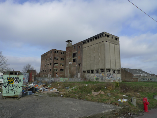
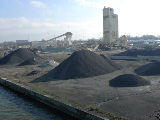
Introduced to the site by the town planners walked around in our team, impression, windy, cold, exposed, industrial, dusty, brewery odours.

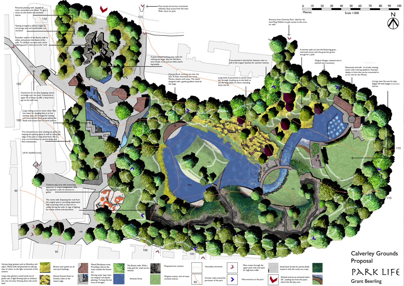
Big site 55 hectares.

Started to scratch out a proposal for Tuesday presentation.

Tuesday,

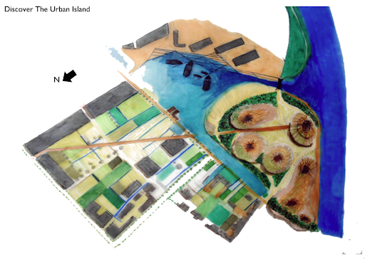
Our theme was escape from the urban, but we really got bogged down in the intellectual process. All very lastminute.com , but fun.

Wednesday/Thursday,


We all worked hard to resolve and combine the two drawings from the two groups. Yes we argued,but in a very good natured way. Win some, lose some.

The God of Context and the saints of the straight line seemed to be our main stumbling block. The main idea in the end was radical so hats off to every one for going along with Simons idea. Pondering further a very good one.

Personally i felt we conformed on other areas such as housing, but its a case of looking past the rendering/model and thinking about the over all long term vision of 100 years. which was a good proposal, ie water recycling from an old dock, and as technology improves thus efficiency increases.

Friday,


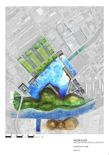
Pin up. Worked late and up early to get it all done. We didn’t but 90% on the wall missed annotation of master plan.

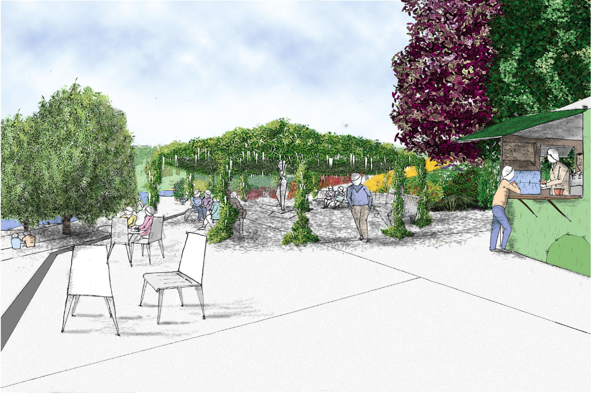
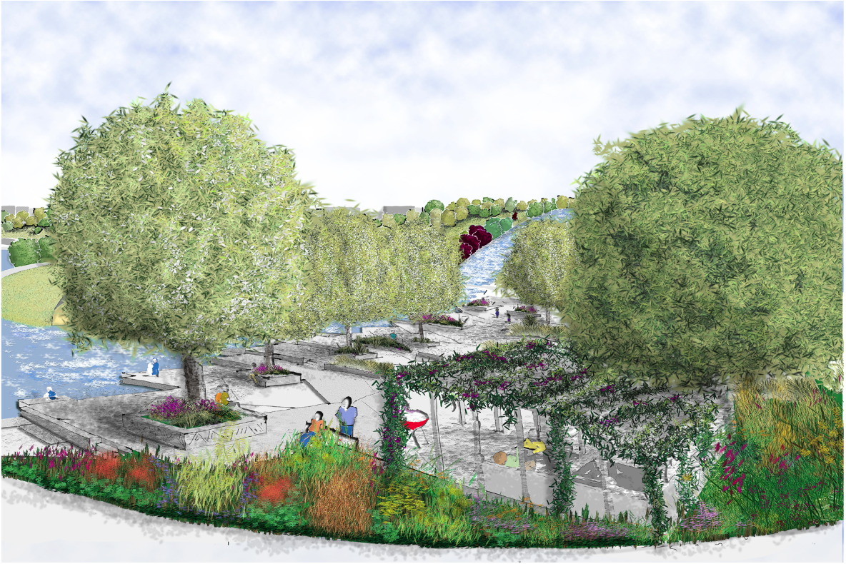
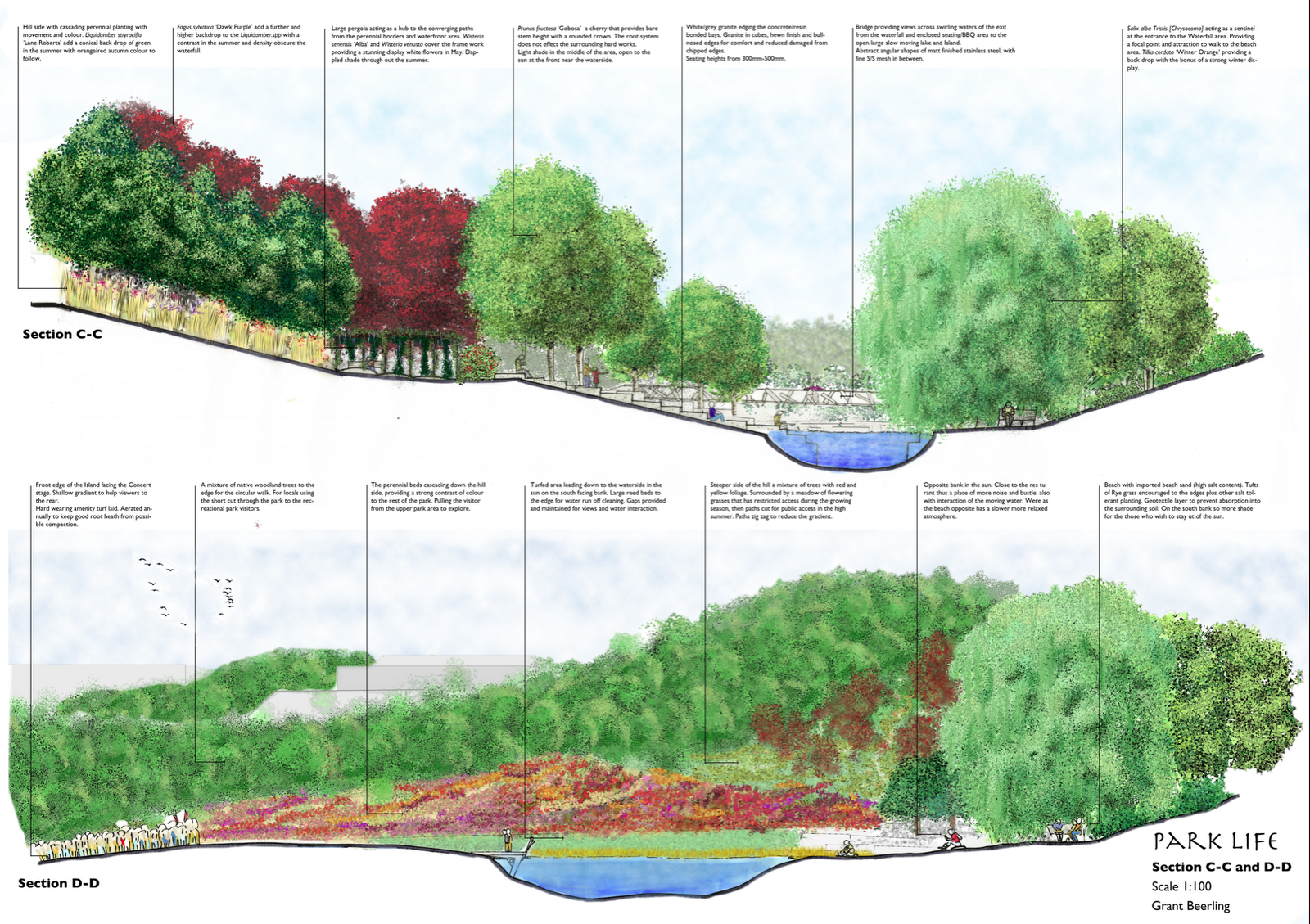
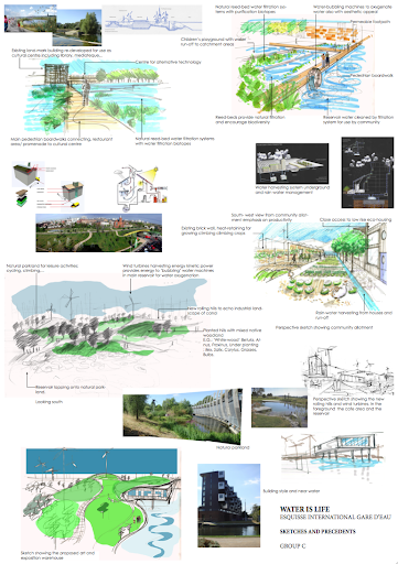
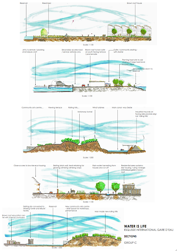
Master plan hand rendered pencil and pro marker
By Batiste, Soziem and Elise

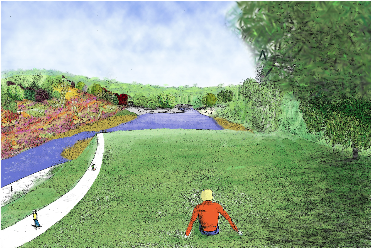
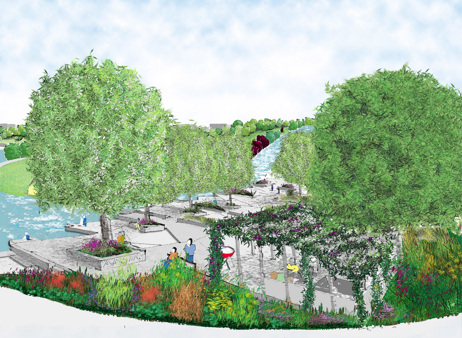
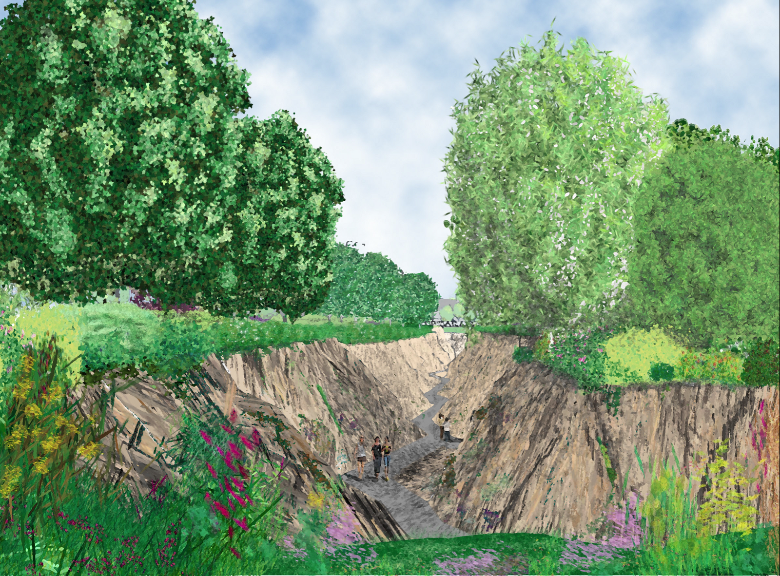
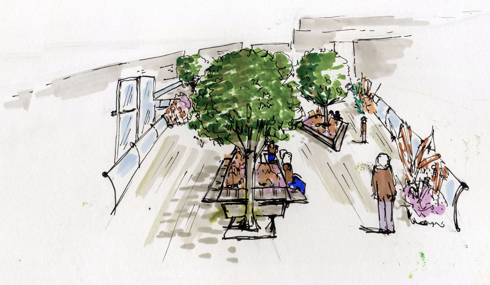
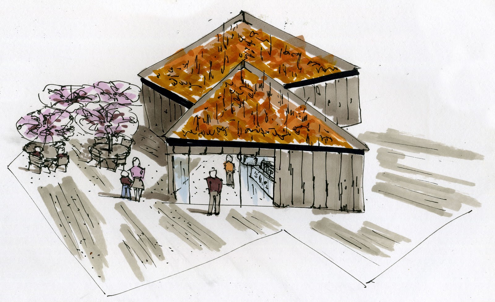
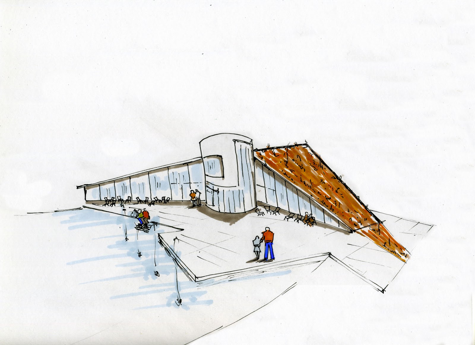
Paula and Amile worked on the document and putting drawings together. 5 star hard workers!! As usual Sue pumped out some excellent perspectives , love the happy chicken. Susan for her work on planting and placement

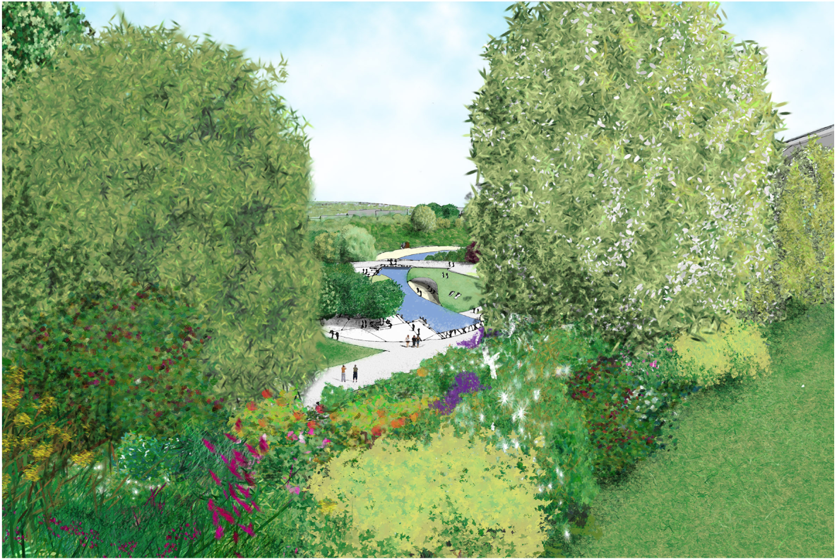
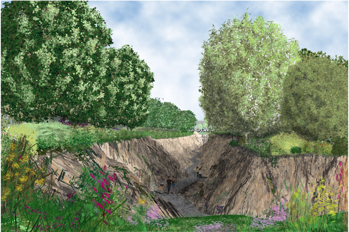
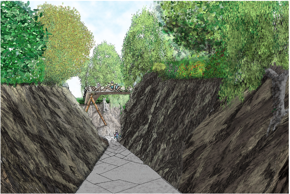
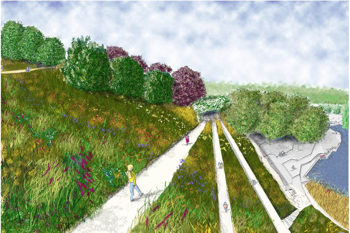
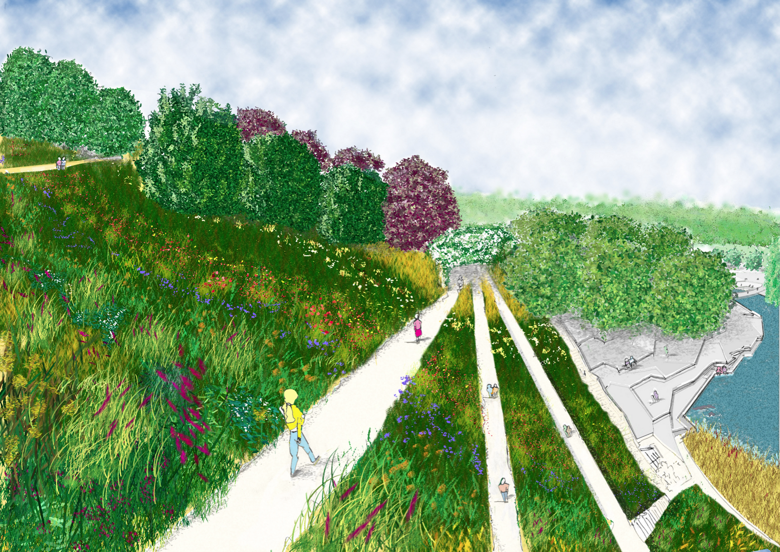
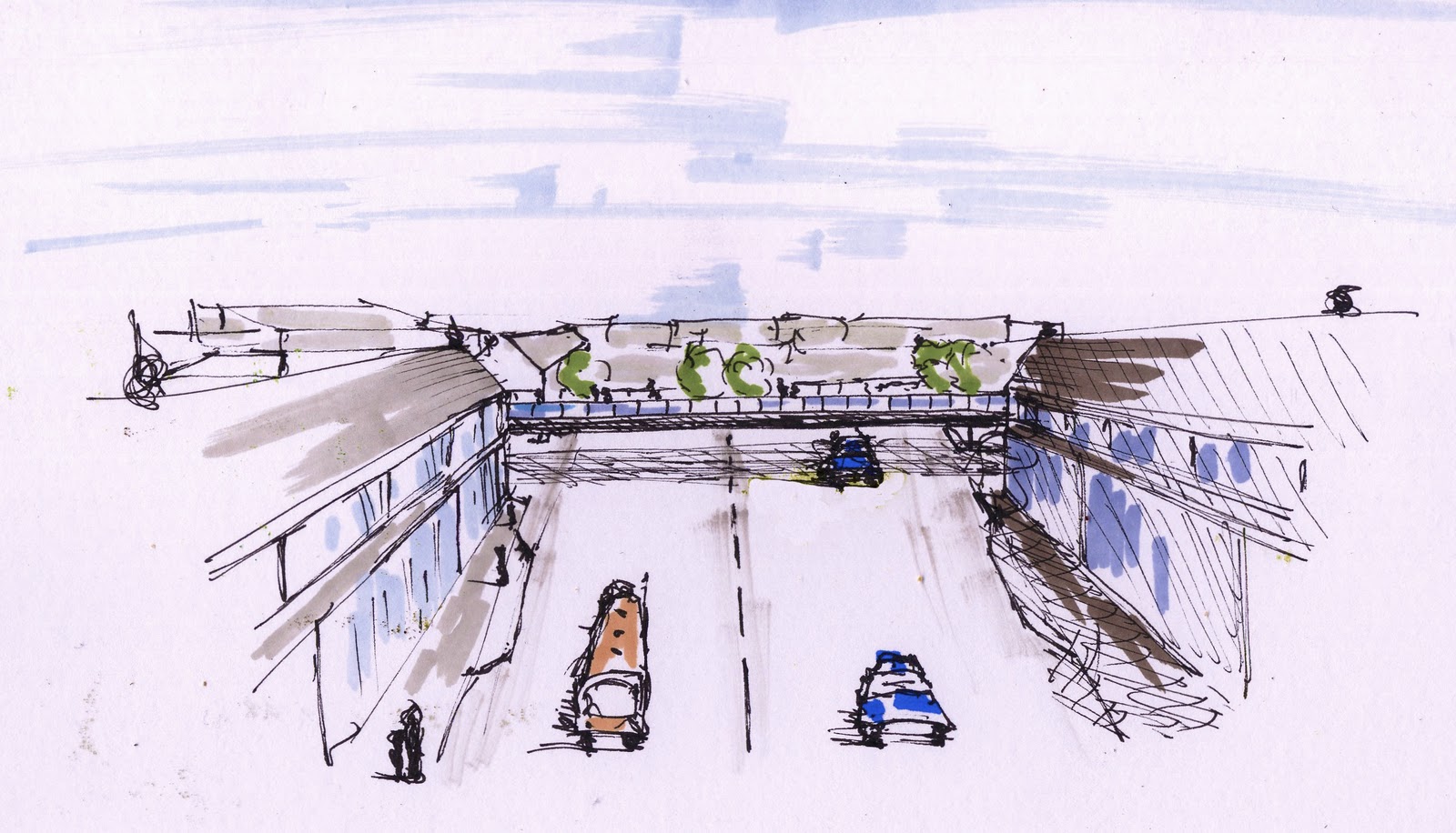
Edith and I, the cross sections, i drew and partially rendered she finished rendering and sky, which i love, swoosh. Jamie said it was very good before realising that it was mostly my work, hilarious seeing him backtrack!!!
Found out today(14th Feb) Paula did a bit of PS to lighten the sky and make them brighter…Nice

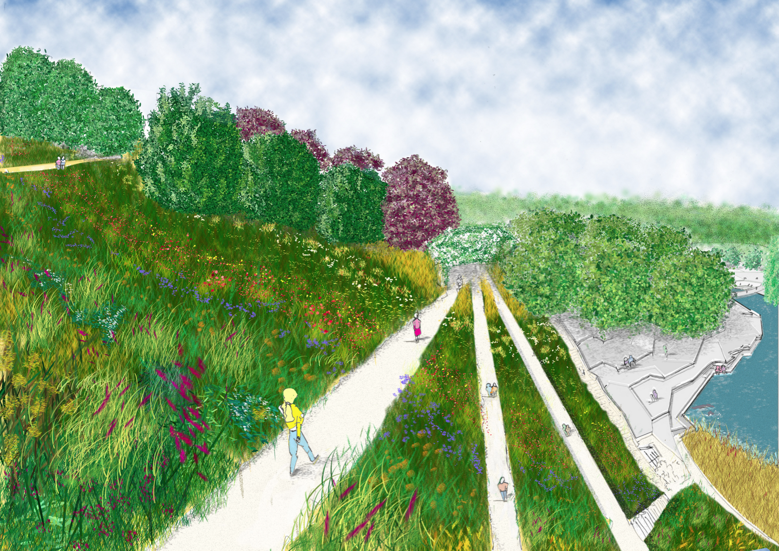
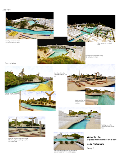
Photo’s of Lukes awsome model. Edith and i for pics then i done the usual photoshop thing for atmosphere. Annotation in a matter of minutes.
One drawing to come with Simons analysis and proposals, very technical,but full of well thought out process. Sue and I also bodged out a time line of 15 years for initial completion. Edith some conceptual, drawings really deep, and more research work from Susan.

Simon And Edith spoke ,very well with Luke and myself jumping in at the end to clarify a couple of points, managed to insult the main man, but hey ho, he won’t forget us!

Over all great team work, no slackers every one gave it their all.


Hurrah for the Water People!

If you hit a medium he won’t be happy

And so it continues…..

Rock solution, first find a rock, this is a good one from High Rocks. Then cut various shapes from it. Looking at the Contour lines. Some small, others large, mix em up.

Then duplicate loads of the images, and start building, making note of keeping contour lines parell to what ever angle you started at, also look at shadows and add if necessary.

All my rocks came from this one pic

Done some more little perspective sketches for the Doc. Slowly getting better, but never satisfied, and yet i see 30 sec doodles by my class mates and love the looseness. Anyway, still a bit lolly pop and not entirely accurate but each one took app 15mins
The hill up Mount pleasant, with my new bridge inc tree’s!
The walk across said bridge, seating, planting and a glass lift.
Lunch time snack cafe in top park serving only the freshest food
(apart from road kill)
The Restaurant with movable seating outside, and viewing tower to look at the distant views of the Ashdown Forest.
BED!!!!

Why do i feel ‘Miffed’

Well crit over/marking. Not really sure what to make of it all. yeah, yeah, fancy rendering, but i agree with Paula (Romania) the previous one has more life as did the the very first sketch. This one is to dull, to refined. I prefer something with some more soul.

Its about being expressive for me and although there is a place for straight informative drawings, it just doesn’t get the feeling across. And thus the feeling of disappointment.

Perspective Ahhh need to do sketch up model for depth of field, over all a bit miffed. I think on the marking front i got away with it and it was generous. As the seduction of rendering helped the lack of skill on the perspectives, another day another attempt.

I think earlier in the Degree i felt more confidant about taking risks, as i get nearer the finally i find myself getting more conservative, its a case of letting go of the reins and then thinking too much about the consequences. Really quite annoyed.

What to do?

Well its a case of not trying to ‘please the panel’, but to concentrate on the design.
The difference of designing for a client, either they get it and love it or they don’t the story ends, whereas this situation its the added chasing marks regime which we all do as they are there as a standard, and there has to be bench mark. So i am going to try and stop thinking will they or won’t they and go for what feels right as that is the point otherwise we would all be Jamie/Julia/Paula clones and bad ones at that.

The presented drawing had cross section annotation, forgot to put the update on my stick and thus lost is when shutting down Uni computer.
Like this one, but the extension to repetive. trees have not been thought through, rather what i could find. Though there is some atmosphere.
Again trees’s 

Tree’s etc

etc

Just don’t and have never liked these, just can’t get excited.
So the remedy, bring back the excitement/noise of experimenting and taking risks. Lesson over, now the document.

Back from the edge.

So much work, so little time sums up my (and i suspect the rest of the class of 10/11) Christmas.

Pin up on Monday was a strange affair as everybody looked so pale and bloodshot, alas not from a night on the town. I think the ‘Blitz Spirit’ is alive and well in our group as we all can empathise with others long dark nights of the soul, when that blank sheet of paper mocks your every stroke of the pen.

So what i pinned up for the first crit, of the year. We have a week to update and final marked crit on the 24th of January. As usual the crit normally states what is at the back of your mind or what you were trying ‘wing’. Plus some surprises.

(click on pics to enlarge)

                                                     Park Life


The Masterplan


My Aim: I was trying to convey the topography of the site with shades of green. Tried loads of new ideas and techniques. Overall pleased with the strong but tonally dark colour scheme. Not so happy about the water, general cramped feel, paving colour, outside buildings. The name feels right as it conveys (in my opinion) that people are the park, as in the Blur song ,park life. Simple, catchy and with an element of humour, which adds up to a memorable title, i hope.
Crit : Too much writing, smaller more descriptive to the point annotation  and thus more of them. Trees too small, line weights generally to heavy, little or no hierarchy in the line weight, Loads more definative shadow, Outside buildings greyed out, buildings defined, generally more obvious and less suble communication.
Cross Sections

1:100
Aim: Trying to get atmosphere in the area. The calm feel of the grasses along with the enclosure of the planters. Depth of field.
Crit: Line weight of the ground level too thick. Shorter and more concise annotation, more of it. Use the whole with of the page, otherwise wasted opportunity.

Aim: To show the vallies and different shrub/tree planting on bank. to get depth to the other side of the park.
Crit: As Above
1:50
Aim: Depth and water and sitting possiabiltys on the granite cubes. Not so pleased with this as it lacks fun and atmoshere, which is the point
Crit: As above
Aim: To show a small crowd enjoying an event. Stones being used. Depth of field. Really hard to get people sitting on the ground looking at you of the net.
Crit : As above.
Sequential Sketches on the main circular route.


Aim: Really rushed, all 6 in 6 hours. Some of the perspective are way out as they were all out of my head. The tree’s in the for ground are naff, though in the distance are ok. Though the drawings are average at best there is some atmosphere.
Crit: Line weight! way to heavy, lolly pop tree’s and people. no variation or possible id of different tree species. Colour, shadows the list goes on!! 
Conclusion, Need to sharpen self crit skills to see what is actually in front of me.More sketching less photoshop filters. I think i need to just nail some issues such as grass and mass area’s for colour and feel. Atomsphere rather than to much technique.
                                        Think Atmoshere

Quick Sequence Sketches, first attemp

Played around with Pro Makers on Trace. Constructive crit on images, darker outline on the foreground (cheers Alick) and fade on the distance.

So played a bit in  Photoshop, with layers of low opacity white, various filters and image enhancements.

Enclosure

Revelation

Noise of waterfall, glass viewing platform reflecting the water. 
Two different speeds of water, thus channeled in different ways