Sussex Praires Visit

Visit


Poped over to the Sussex Prairies with my friend Whit. An interesting visit, rather surreal walking into the space a real non Genius loci moment. The Gardens are there as an example rather than trying to fit in to the surrounding country side.

The planting and effect is stunning, though as designers one always has a critical eye or at least an opinion.  


Worth a visit. 

http://www.sussexprairies.co.uk/


Kent Show 2011

Hadlow Show Garden


I went along to see the Show Garden that my good friend Whitney designed for Hadlow College.


Outstanding design and followed the brief to perfection. A ‘Top Gold’ (read best in show) was awarded, and rightly so….


So why was it so good? 


Well these are just my humble observations


1) Balance, the ratio between soft/hard/water and the building was perfect


2) No Full stops, meaning that the viewer tended to look at the whole picture rather than just hot spots of design. Thus leading them in to explore further and notice the detail.


3) Journeys, plenty of them each leading to a destination, very hard to do in a small space.


4) Space, or the use of in the sense that the seating tended to be in the furthest corner thus back to the wall and more impression of space.


5) Tones, of the planting flowed interspersed with neutral whites to lift the strong orange/burnt yellows out.


6) Humour and idea’s, well we are British and we love a quirky idea.


Design and Whits blog


A few photo’s


As usual got a bit involved trying to do the art picture and forgot to take any overall pictures, hopefully Whit will put some up on her blog about the process of the site

Well done Whitney!


Work…..

A small update on a Garden (alas no funds to do the lot)


Always difficult matching your own work with other, in this case a builders ‘attempt’ and some DIY, so tried to match and improve, but with one eye on the future ie more updates so a bit of a balancing act.


Materials and issues


Every space throws up issues, in this case small, all grass removed, gradient falling towards the house, sleepers everywhere.


The main solution was to provide a new soak away (new crate system wrapped in geotextile felt). Volume .5m cubed (100m2 =1m cubed for well drained soils) for 25m2 area. Slit gully for ascetics, with an adapted ‘p’ trap gully to trap any fines and access for cleaning. All falls 1-80/100. Normal type one compacted/6 to 1 sharp sand mix for slabs, pointed with buff resin system (which if you pay for the proper German stuff is brilliant and quick, sorry Jamie i disagree with you on this one, now i’ll go and dive for cover).


Planting


Worked on yellow and ochre as colours to reflect the colours of the slabs plus to give a warm feel to the whole area. Worked with perennials for the best display albeit for the summer only, a case of a good display for the height of the outdoor season or compromise with spots of colour through out the year… no brainer as far as i am concerned in this situation.
Contrasting shapes with and narrow colour range to keep the effect.


Home Straight of the Marathon…..

But who put all those Hurdles in the way?


Well thats how it feels, but we all occupy the same boat, though Adele seems to be swimming at the mo.


Well working like the proverbial on the planting scheme lost count how may days, keep changing my mind, then visualise and think……. too many ,too few, too busy not exciting enough..then i run out of steam and have to go to bed, only to wake up stupid early and start working and go through the same thing again. So put it to one side for a mo and finished a couple.


Levels and Spot Heights

Had to do spot heights and levels on their own sheet as they are important and if they can’t be read combined then there is no point. So many redraws, did the steps three times kept forgetting something. eventually worked out with 400mm treads (jamie will be pleased) and a decent mid point landing. Spent a while making sure gradients worked with 1;200, and they do with some juggling (thus the step drama’s).Spent some time on the seating area’s thinking about the interaction of people within the spaces.Changed my retaining walls along with stair details.

Also spent some time looking successful parks and the atmosphere that one is left with and whether the design is successful or not. Top of the list is the High Line in New York, ticks all the community boxes, visitor, seating, planting, people watching all within an atmosphere of relative serenity (well as much as one can expect in the middle of a busy city). A must visit next time.

Hard works Key plan


Made sure the rendering stands out and is clear in black and white. So many construction drawings off the back of this. Went into too much detail on the key i think, plenty of time for that on the details. Thanks Sue for the Gradient calculator, saved so much time and grief, got the decimal place in the wrong place a few times was that 30mm or 30m?


Silly stuff

Found this while reading a report on the high Line. let it read your blog and it picks out the most used words in size, surprised to see the word shit and bollocks missing, i am obviously losing my site manners with all this white collar education stuff or that could be a load bollocks!

                            
Or 10 words.
Bed ZZZZzzzzzz


DJ Shadow ‘Entroducing’ the darker side.

Shadows that follow.

 Seem to be getting slower as fatigue strikes. So eventually the sequential sketches (annotate tomorrow on a fresh head).

But first, had a look around at what the rest of you lot are doing, bloody hell there is some good stuff, particular praise goes to Mr Chilli for his bounding leap forward ( i assume the name comes for ‘hot air’) really looking solid. Just reminds me of what is expected. 

Aija s model, blinding, Alicks drawings (and studio, so tidy i wouldn’t dare put a photo up, for the simple reason the camera is buried somewhere and all you would see is a sea of tracing paper ) stunning, Sue’s ‘light touch’ of lovely sketches, great shadows. Looking forward to seeing the rest.


8 Sketches.

In no particular order. Updated the previous ones with more shadow (lifts and creates atmosphere, cheers J), backed off the bright green to a more subtle muddy green/yellow. Though i would really like to do a three colour scheme (as Helen Armstrong appreciates and i get it, may do something with the model photographs on the ‘ abstract/atmo if i can). 

Neil will so tell me off for saying this, but still not sure whether i really like this style, a case of looking over my shoulder a bit too much i suspect. On the plus side learnt an awful lot about creating depth and tree’s. 

Maybe its a case of Tracy Emmin, do fine art, nail it, then go abstract as she understands the techniques of ‘realism ‘ but wanted to get beyond that, so use an unmade bed to tell the story, maybe my messy workspace has some use after all!


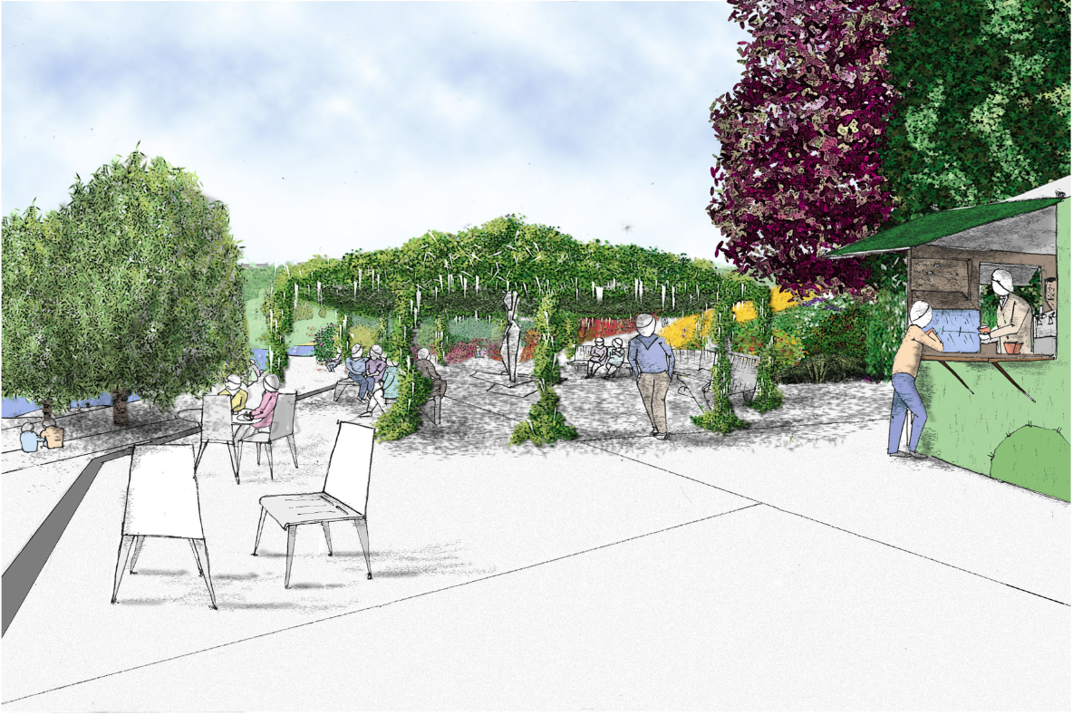
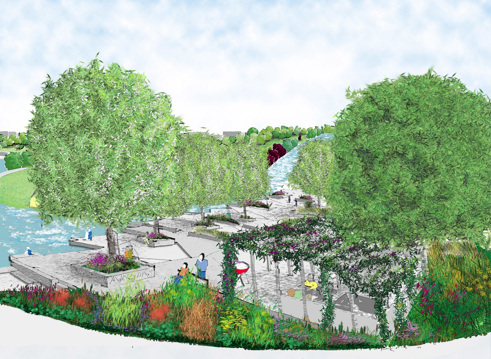
The large Oak and steel Pergola, +Wisteria. A mobile  (park stored) refreshment to provide the eat, sit, meet, watch that people so love.

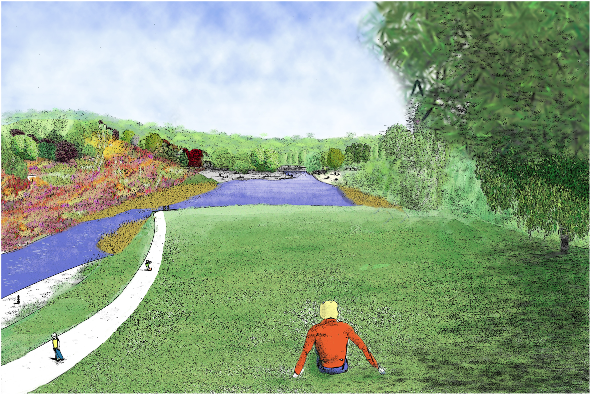
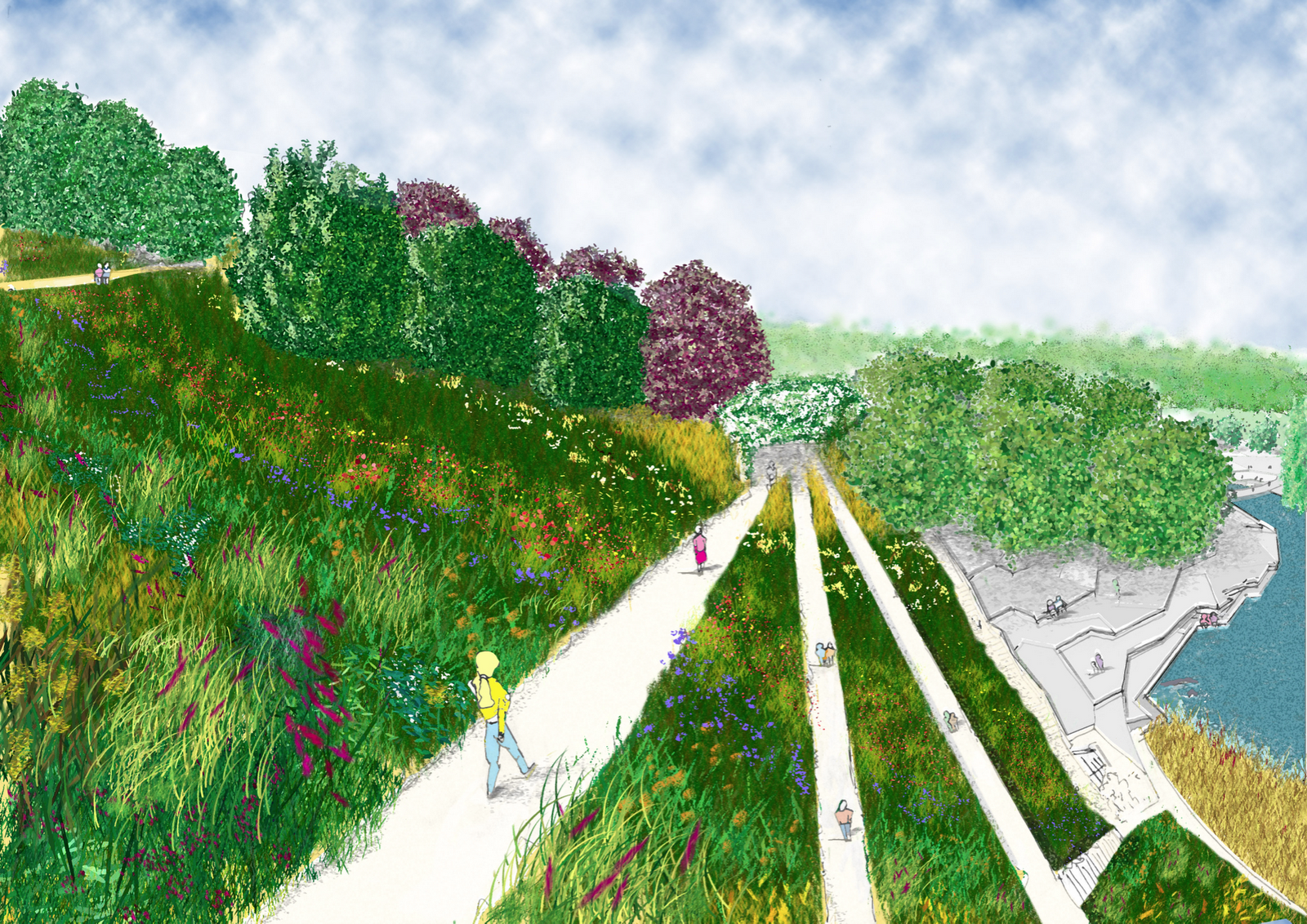
Looking over the bottom interaction area (ooh-err-missis, that sounds a bit Frankie Howard). Human scale of height to width, with prairie views that people find so attractive. Shadows are a bit messy.

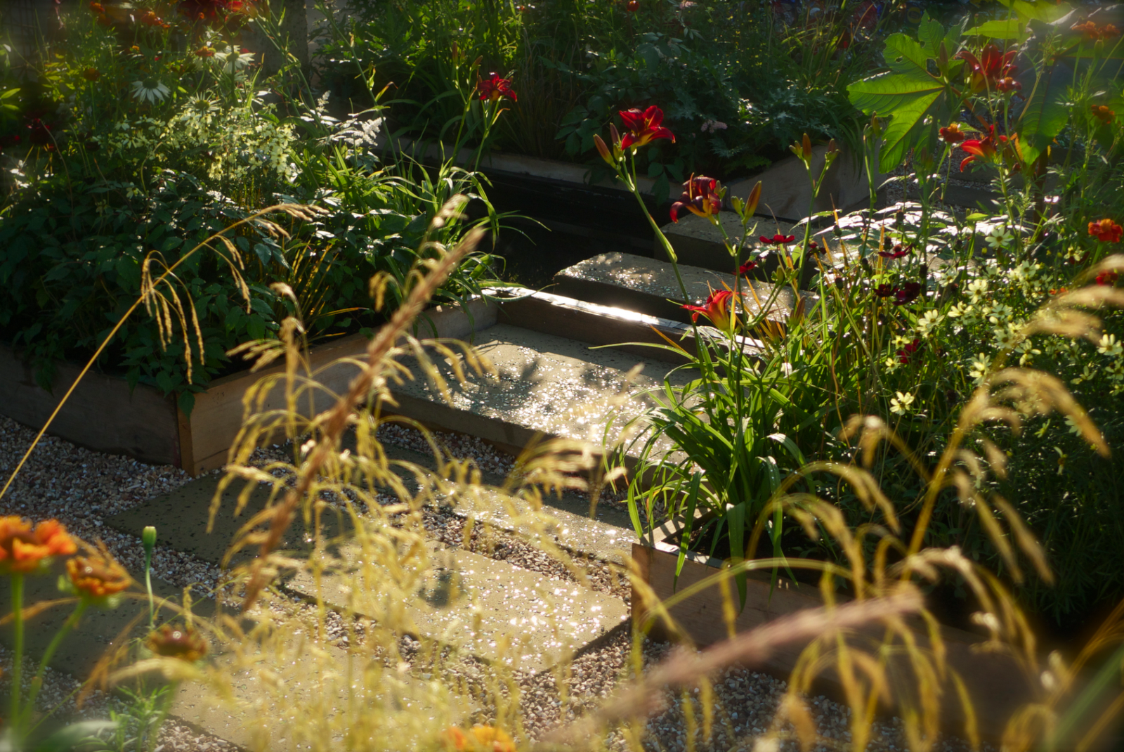
Looking up waterfall. Added shadow like this one slightly abstract, three colours, though not thirds!

Looking down from the upper small cafe/art space under the waterfall. This is the view that you can see the ashdown forest in the distant view. Glimpses of a view provide some curiosity.

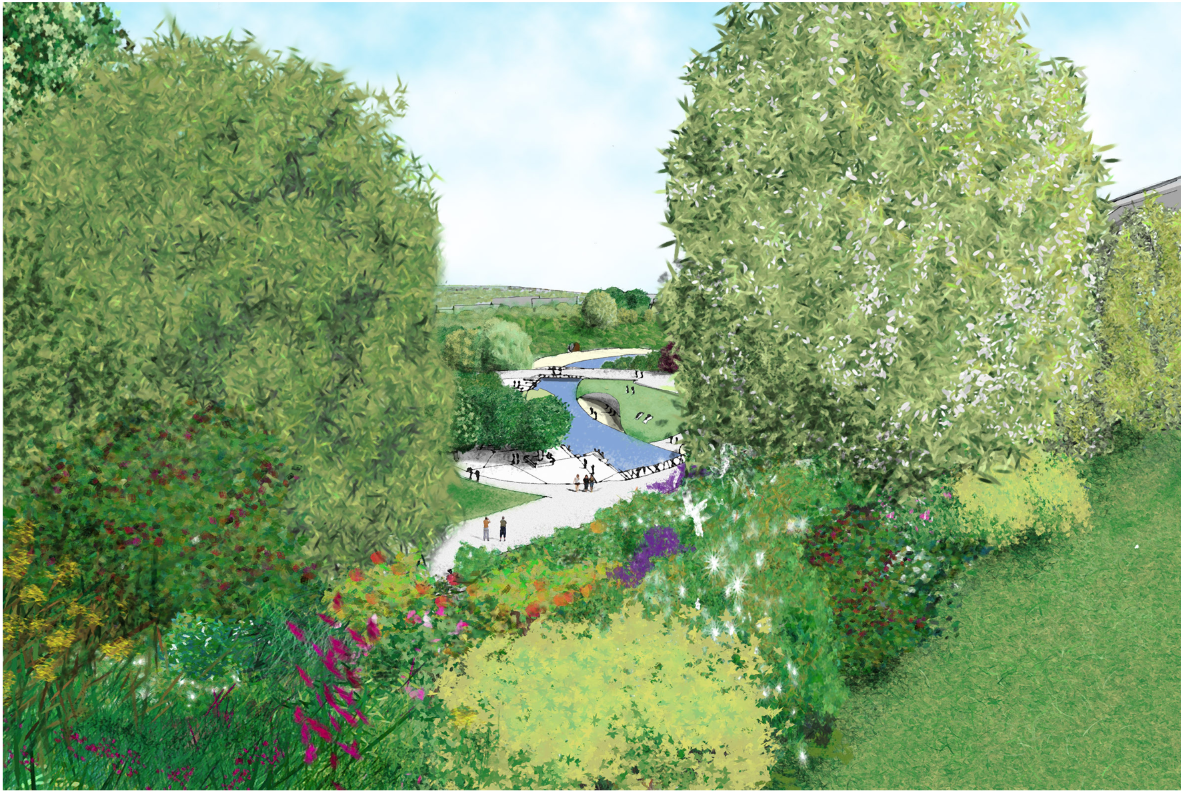
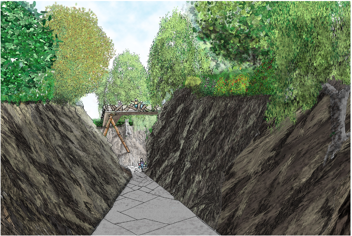
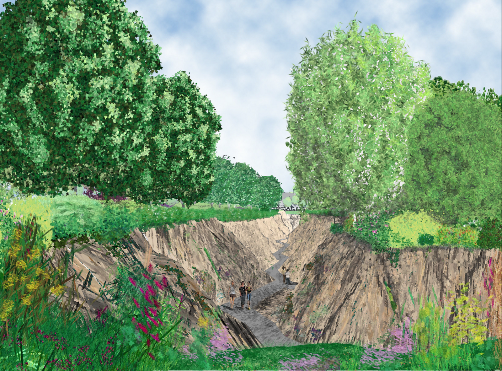
Looking down along the rear ravine evening sun. Long shadows.

Hari. K. Rishna in his orange top surveys the view from the Island.Used the same blue to look as if the water colour reflects the sky, not quite worked. Feels a bit narrow for some reason. To late now.

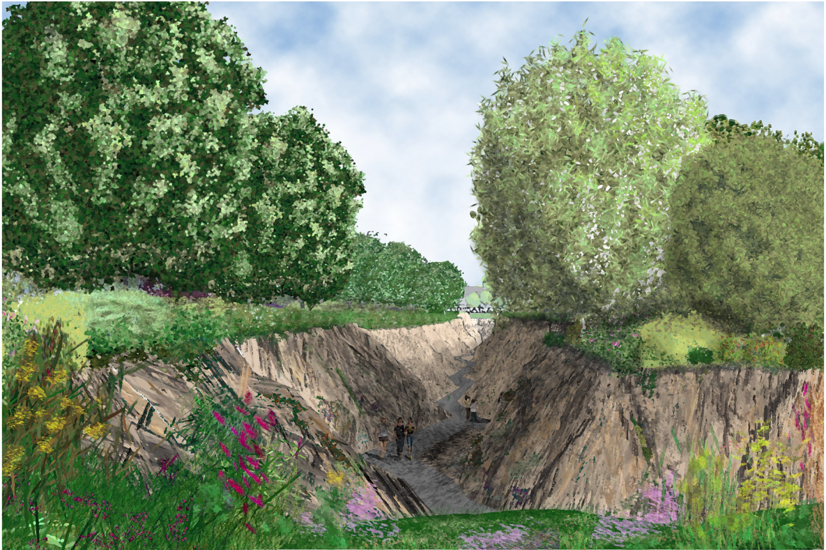
Looking up from a ravine to the Picturesque style high walk way. Shadow the the first part of the ravnie with light from the intersection ravine splashing light over the rock. This one and the one below i particularly like. First and last.

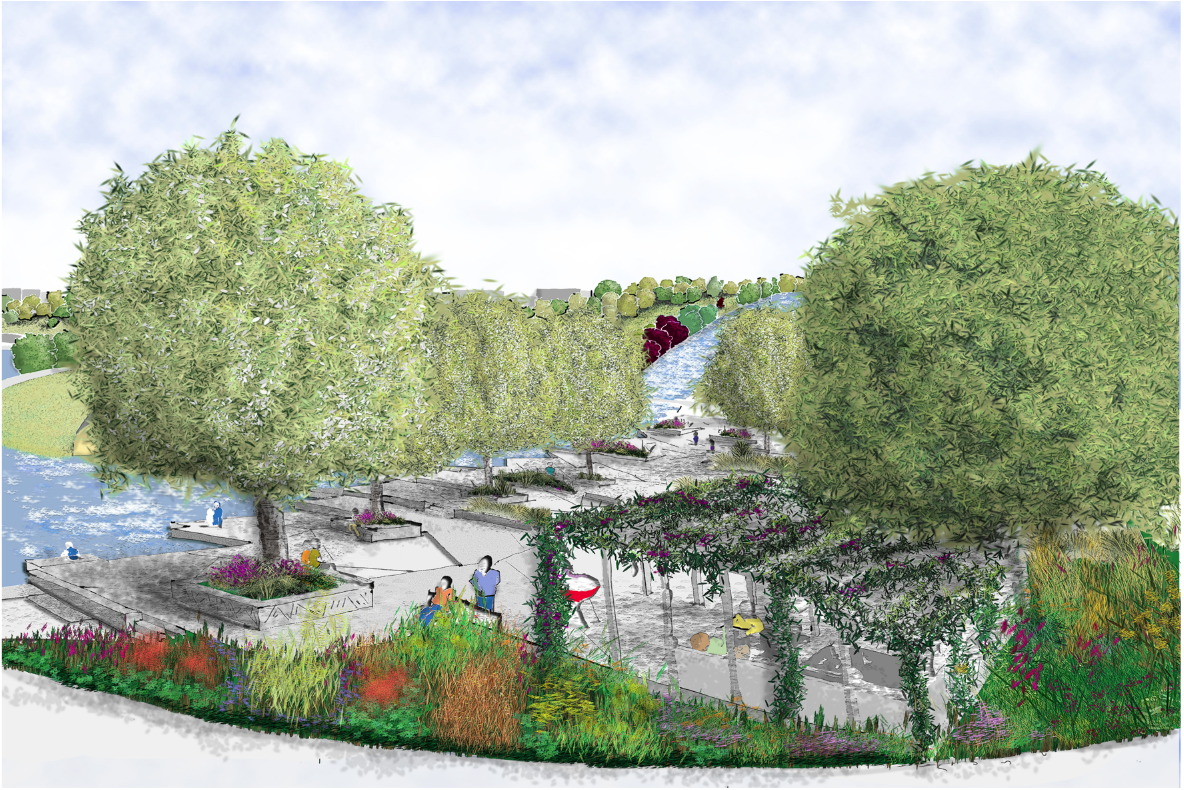
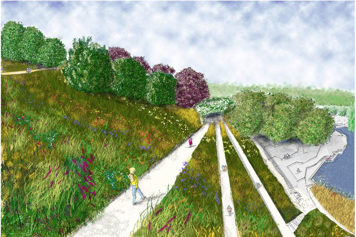
Looking down toward the Pergola. With the slightly wild looking perennial borders sliding down the hill side for all to see. tree’s a bit contrived/solid. Changed the colours for a more yellow/green corn scene. Thank god for ‘replace colour’ in PS


Annotation tomorrow, i have decided to put them all on individual A3 size and annotate from there. I can easily put on a A1 if needed.

Hopefully will have a good day and find some nice/better images for mood and precedent, plus lighting plan. Been listening to too much Trip Hop so the mood is on the wrong side those glum people from Bristol, i must be some kind of Dummy.

Night all. ZZZZZzzzzzz

Futures bright, futures coming to quick!!

Time


Still chained to the mac, thank God for some good tunes too keep the spirits up, mainly been feeding on Brazilian, Cuban, with some old school (can’t remember how to spell it wrong to be all hip, bit late for that now).


Well three more sequence sketches, learning new stuff and tricks all the time. Used a lot of images that i have already done to save time and manipulated to suit. 


Finished all of them with ‘Dry Brush’ filter to blend all the different components together.


Particularly pleased with the water fall. 


Images look a bit literal, plus bright colours, its the point of communication or do trendy colours, trouble is what i like and think looks ‘cool’ nobody else understands, a case of being on the wrong planet/universe depending on your view of Quantum mechanics.

Dry brush to blend and calm down some of the colours.

A mixture of photo plants and plants from above, plus some. Still a bit janet and john on the colours, but can be adapted.
Dry brush really worked on this one. Used some real people, plus some work to get them to ‘sink’ into the image.
Worked quite hard on this one making sure the eye line worked looking up the waterfall. Waterfalls are ‘white’ water so no blue/green. Tried to get movement and spray.


One more tomorrow, annotate then precedent images.

Not too much moaning Neil, though kettle and black come to mind!

LOL as usual Mr Chilli, cheers.


Time is a hook, and were on the line

According to ‘A Tribe Called Quest’


Well all started well, nice cup of tea, found some greet mixes by J.Rocc and Madlib, mixing Jazz,Funk, and old school Hip hop, in it!!!


So first drawing went ok on the annotation front, but first sequence ahhhhh,


Just could not get the plants right, get them wrong and lose the whole atmosphere eventually after playing with pencils, spent a bit more time looking at images that represent what i want to achieve, then used ‘brushes’ in more options, ways, tweaks than John Prescott’s excuses for losing a by-election.


So only one image after 10 hours work, but i think i know were i am going on the rest (famous last words)

Tried to be accurate, but enthusiastic (ie not to dry). Still not 100% happy with last one, but have to move on.

The killer. I think i may put some real people in, but i will worry about that later. Hopefully got a feel from this, tree’s need some improvement. Yada, Yada.

Really need to get the rest of the Sequences done tomorrow.


Distance is a bricklayers best friend

But not trees


Struggling to get a technique to do distant trees quickly, hey ho.


Annotation for A-A and B-B cross section, 
tried to work my planting choices in to justify them.

Annotated referring to the planting and material plans. And Oh the Sun is shining outside.


Trees improving by copying the tree off a photograph, all good practice. Distance a bit naff.

This one i am the least pleased with need to work on the planting area’s,but time and all that. Still took ages on the distant trees grrrr.


Annotate these two tomorrow and then Sequential s


Now a long hot bath and some food other than toast.


Light Fantastic (ish)

Re-visit


Like many in the group i have been revisiting my 1;200 stuff and working my way through,


so far materials, tree planting, shrub and climber planting, lighting, festival lighting (had to do it, very kitsch,but when you are a kid and its Christmas being high brow is not as important a visual overload for a memory, that includes 47 year old children).


Planting trees


Well worked hard on this, the trees are large on purchase to get an effect while everything else is taking hold, a risk, but it also shows the intention of getting an effect to get the park up and running quickly.


Shrubs and Climbers

Felt like this took forever (about a week). Trying to get reasonable flowering through the year with out to many holes. It may be better to go for a spectacular short flowering season or not (ie Augusta Masters Golf, hate the game but love the tournament, and the blowsy Rhododendrons remind me of Mrs Bucket for some reason)?

Lighting


  Enjoyed playing with PS trying to get the lighting in the dark effect, as usual stumbled on a couple of things.

1) In the layers pallet click on the drop down and use luminosity once your blue fill layer has been placed over the colour image. It will turn the blue black ,don’t worry, just mask the main picture and create another colour fill when you have finished. It seems to lift out of the screen a bit more.
2)Brush and brush presets are were its at, once you have mastered layers and masks this is the next most important (in my humble opinion), brushes effect erasers, so the brush pre sets can act as a eraser brush. Worth playing with.

Lighting Festival


The chance of using extra lights for festivals with the ravine seemed a no brainer. The effect is a bit chinsey with these colours but everyone has a bit of chinse hidden away in the back of their head. After all this is a park for everyone not just your average judgmental ‘Garden Designer’ No Baa humbug here!

Drainage


Hopefully finish this one tomorrow and update the 1;200 MP. Thought a lot about catchment and water harvesting, so i will be putting in tanks and irrigation ect. Along with sediment tanks for the collection of silt. Used different arrows to show the speed of water, ie slower on soil that rock/hardstanding along with gradient.


One all the drawings then cross section update, sequential’s, precedents and finally model pics.

Then 1;50. Hopefully have a few drawings for the 4th May.

And Oh, my achilles has gone again, fan bloody tastic.


Can’t see the wood for the Tree’s

Focussed on the point.


A bizarre saying, never really understood it for years, but at the moment its crystal clear and i am sure for most of us it has a chime of truth. 
Looking at your own work for hours/days/months, doubt creeps in until you have no idea whether its good, inspirational and ground breaking or tired, predictable and safe.
Then the trap of adding more ‘stuff’ and losing the less is more simplicity ,which we all know is so hard to achieve. It comes back to the would i like to spend a day in the Park? As an 8 year old or 70?


This so has to become a ‘place’ again. It must become a point of reference to what a park could and should be the local and wider community. Otherwise leave it as it is and spend the money else were, were it would be beneficial.


Enough rambling,


Drawings 


Sunday Morning, this is were i am at


1:200 plan. Updated and tightened the annotation. Added trees to correspond to planting plan. Lightened the South bank. Cross section markers. Reduced the size of the scale bar. I am sure i have missed stuff

Boy, did i spend some time on this little puppy. There can never be enough information for a contractor. So site visits would still have to happen though the idea of leaving a drawing that the informed contractor could refer to and not be phoning up every five minutes is the challenge.


Flattened the textures for the different materials to reduce any confusion. Though i am sure a specification book could go with each drawing, as i seem to have a lot of questions for the designer, oh shit thats me!
I can easily see how a year of designing as a team with hundreds of drawings and specification documents could easily happen , and then have a major F/Up
because somebody has missed the ‘bleedin obvious’!


Sunday have loads to still do, given up on getting the model done, but you never know!!!