Work, curse of the drinking classes.

Mines a pint.

Trying to clear my backlog of paid work.


Just thought i would put up what i am doing to show the different requests from clients and the work arounds one has to do. Also the experimenting with rendering and perspective sketches.

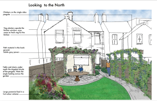
Small narrow back garden.

Client request for veg, cottage style, new baby on the way, interest in perennial planting ie has the time to play/enjoy the garden
Basic perspective copied from a photograph on A3, rendered with pro markers until they ran out!. Finished in P/S. lots of little bolt on tricks, in particular using ‘poster edges’ from ‘filter gallery to get some depth and definition to finish. Tree is a bit Naff.


Looking back toward the house. Same again copied photo, straight into P/S and rendered. Struggled a bit with this one, the pergola is to large and heavy and a bit out of perspective. Looking at it it needs more umph on the planting. Very simple design (see earlier plan ‘Darwin or God’).


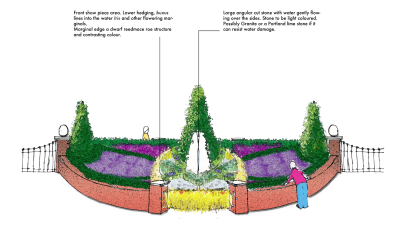
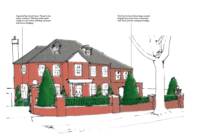
Front Drive on New Build ( ‘Knot Garden’ plan )

Drive and walls already constructed,so working with what is already there. I would like to take the curved wall down and have the hedge as a barrier, we shall see.
A bit garish on the colour front ,but that is to compensate for the printers printing on the dark side. Graphical. Drawn out of my head, scanned, rendered in P/S. See what i mean about the wall. A twist on the knot garden. Very formal due to the style of the house (mock Georgian) and the position as a semi circle on a two exit drive. Finished off with ‘water colour’ filter.Man in orange tee shirt seems to be a theme

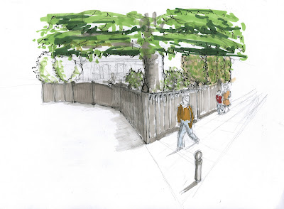
A bolted panoramic picture , traced, scanned and P/S.
Same finish with Water colour.


Lessons.

Still yet to find a routine that i a happy with,though the graphic route seems to be favoured at present. I am just so aware of providing images that communicate, rather than provide atmosphere as limited time and finances means reading the client and fitting the image to their need is important. Plus i still need to ‘practice the atmosphere thing, as well as everything else.

Tomorrow back on ‘Park Life’ 


Dark Satanic Mills

Ozzy the Victorian Man

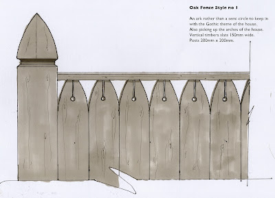
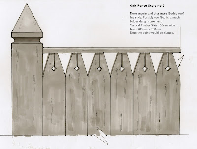
While i was designing some Victorian/Gothic style fencing, had some music on for a change (tend to work in silence as the old grey matter tends to ‘get in the groove’ alas the wrong groove).
Itunes Genius playlist, What could better than a bit of Black Sabbath playing a delightful tune from their ever popular long player ‘Master of Reality’ called ‘Into the Void’ a real throat slitter, perfect for a Gothic Fence design.
A quick sketch of the front entrance

Gothic Arch theme. The slits and holes for a bit of decoration

A bit more ‘Adams Family’ with diamond shapes.

All out of Oak,it will cost a fortune but last 40+years without any treatment, the beauty of hard wood.
All made at Hever Saw Mills , hopefully.

Out with old…..

Well really trying to do this quick sketch thing. Takes me awhile to work out perspective in my head, then i draw/scratch, so good, so far. Rendering is were i come unstuck.
So many different ways, now i am running out of my beloved pro markers, forced into looking at more photoshop, block colours and then fading the opacity. It takes me as long either way at the moment but i guess with practice etc.


So here is one i did earlier, can you guess what it is yet?

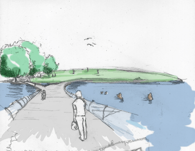
My iron men battling the current in the middle inspired by Antony Gormley’s 
‘Another place’. Works well with my ‘people centric themed park’.


Le Crunch

Lille 2011


Sunday,


Arrived late so no change there, NetworkSouth East connections/cancellations blah blah.

Hotel room just south of Paris, a couple next door banging for France and finally the Kettle was broken.(though repaired as many know life without Chai for me is impossible)

so a good start.

Monday,


Introduced to the site by the town planners walked around in our team, impression, windy, cold, exposed, industrial, dusty, brewery odours.

Big site 55 hectares.

Started to scratch out a proposal for Tuesday presentation.

Tuesday,

Our theme was escape from the urban, but we really got bogged down in the intellectual process. All very lastminute.com , but fun.

Wednesday/Thursday,


We all worked hard to resolve and combine the two drawings from the two groups. Yes we argued,but in a very good natured way. Win some, lose some.

The God of Context and the saints of the straight line seemed to be our main stumbling block. The main idea in the end was radical so hats off to every one for going along with Simons idea. Pondering further a very good one.

Personally i felt we conformed on other areas such as housing, but its a case of looking past the rendering/model and thinking about the over all long term vision of 100 years. which was a good proposal, ie water recycling from an old dock, and as technology improves thus efficiency increases.

Friday,


Pin up. Worked late and up early to get it all done. We didn’t but 90% on the wall missed annotation of master plan.

Master plan hand rendered pencil and pro marker
By Batiste, Soziem and Elise

Paula and Amile worked on the document and putting drawings together. 5 star hard workers!! As usual Sue pumped out some excellent perspectives , love the happy chicken. Susan for her work on planting and placement

Edith and I, the cross sections, i drew and partially rendered she finished rendering and sky, which i love, swoosh. Jamie said it was very good before realising that it was mostly my work, hilarious seeing him backtrack!!!
Found out today(14th Feb) Paula did a bit of PS to lighten the sky and make them brighter…Nice

Photo’s of Lukes awsome model. Edith and i for pics then i done the usual photoshop thing for atmosphere. Annotation in a matter of minutes.
One drawing to come with Simons analysis and proposals, very technical,but full of well thought out process. Sue and I also bodged out a time line of 15 years for initial completion. Edith some conceptual, drawings really deep, and more research work from Susan.

Simon And Edith spoke ,very well with Luke and myself jumping in at the end to clarify a couple of points, managed to insult the main man, but hey ho, he won’t forget us!

Over all great team work, no slackers every one gave it their all.


Hurrah for the Water People!

Back to the Coalface

Well had to get back to work and actually earn some filthy money.

Bit of a shock physically, slept like a dead man.

Sketch blow up


Good exercise in thinking about what you have to resolve. My main points to resolve before thinking about anything were spot levels, gradients and differentials as in water height to island height for example.

A lot going on in the chosen area. I can visualise in my head what is going on, which is no help to the viewer so more perspective sketches needed, even the two minute cross section type.

Then i can start to nail down materials and planting styles along with irrigation, lighting, etc.

Reading an interesting book called, ‘The Dynamic Landscape’. the outline of the book is about bio diverse planting in parks as the education of the public to understand and appreciate the beauty of naturalistic planting rather than the municipal planting of the 19th century that is still the core of most local authorities , ‘we have always done it this way’ philosophy.

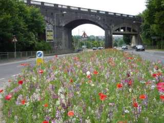
If the park can demonstrate the example of the naturalistic style with the slightly more formal prairie style then this can help the local authority to use this style as the public will have seen this in the park. Complaints can be referred to the park as an example. A case of re education. Use this style for roadside verges and cut down on the present high maintenance amenity grass that is the norm

A company providing flowering grasses specifically for local authorities…Nice

If you hit a medium he won’t be happy

And so it continues…..

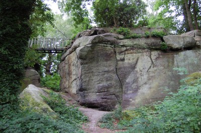
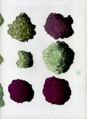
Rock solution, first find a rock, this is a good one from High Rocks. Then cut various shapes from it. Looking at the Contour lines. Some small, others large, mix em up.

Then duplicate loads of the images, and start building, making note of keeping contour lines parell to what ever angle you started at, also look at shadows and add if necessary.

All my rocks came from this one pic

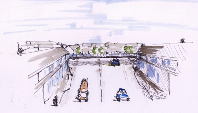
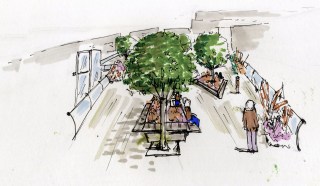
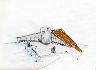
Done some more little perspective sketches for the Doc. Slowly getting better, but never satisfied, and yet i see 30 sec doodles by my class mates and love the looseness. Anyway, still a bit lolly pop and not entirely accurate but each one took app 15mins
The hill up Mount pleasant, with my new bridge inc tree’s!
The walk across said bridge, seating, planting and a glass lift.
Lunch time snack cafe in top park serving only the freshest food
(apart from road kill)
The Restaurant with movable seating outside, and viewing tower to look at the distant views of the Ashdown Forest.
BED!!!!

Why do i feel ‘Miffed’

Well crit over/marking. Not really sure what to make of it all. yeah, yeah, fancy rendering, but i agree with Paula (Romania) the previous one has more life as did the the very first sketch. This one is to dull, to refined. I prefer something with some more soul.

Its about being expressive for me and although there is a place for straight informative drawings, it just doesn’t get the feeling across. And thus the feeling of disappointment.

Perspective Ahhh need to do sketch up model for depth of field, over all a bit miffed. I think on the marking front i got away with it and it was generous. As the seduction of rendering helped the lack of skill on the perspectives, another day another attempt.

I think earlier in the Degree i felt more confidant about taking risks, as i get nearer the finally i find myself getting more conservative, its a case of letting go of the reins and then thinking too much about the consequences. Really quite annoyed.

What to do?

Well its a case of not trying to ‘please the panel’, but to concentrate on the design.
The difference of designing for a client, either they get it and love it or they don’t the story ends, whereas this situation its the added chasing marks regime which we all do as they are there as a standard, and there has to be bench mark. So i am going to try and stop thinking will they or won’t they and go for what feels right as that is the point otherwise we would all be Jamie/Julia/Paula clones and bad ones at that.

The presented drawing had cross section annotation, forgot to put the update on my stick and thus lost is when shutting down Uni computer.
Like this one, but the extension to repetive. trees have not been thought through, rather what i could find. Though there is some atmosphere.
Again trees’s 

Tree’s etc

etc

Just don’t and have never liked these, just can’t get excited.
So the remedy, bring back the excitement/noise of experimenting and taking risks. Lesson over, now the document.

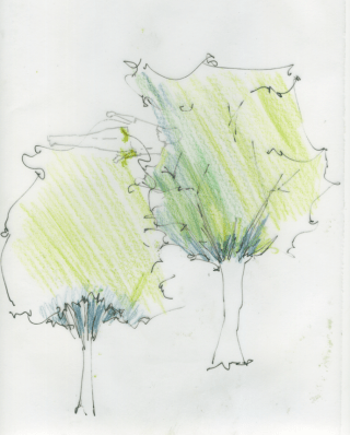
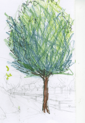
Tree’s blobs and lollypop’s

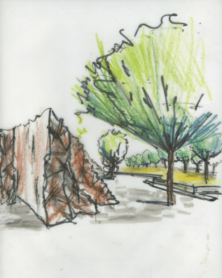
Well like just about everybody spent a lot of time trying to create tree impressions for the plan as well as the perspectives.

Plan


As usual stumbled on this idea and developed it I think the result is quite effective and can be played around with further
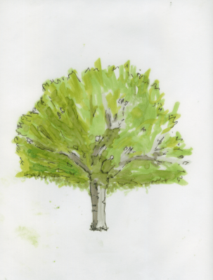
1) Pro marker on Trace, shade to create depth, (the ink stays wet so mixing is possible). Let it dry. The ink one side with .3-.5 pen.

Then put in photoshop, Filter gallery>watercolour>ok and then again but this time poster edges. Adjust to suit. Cut out, play with colours etc  
                  
Cut out and duplicate loads of times for tree’s.When done, each tree will be on a single layer. Select all, duplicate. Then all the duplicates merge into one file. Turn to black via images>Hue andBalance>lightness bar to the left, so black.
And now the ta da bit, that layer put underneath all the tree layers, then  shift to one side and by magic you have perfect shadows in the shape of the trees all moving at the same angle.
Perspective.

Well spent ages with pencils, pro markers and to be honest still have not got it, but a start, pro markers on trace

Generally work needs to be done on perspectives.

Watercolour pencil + sharpie
Watercolour Pencil +.3 pen
Watercolour pencil+Bad Temper

Back from the edge.

So much work, so little time sums up my (and i suspect the rest of the class of 10/11) Christmas.

Pin up on Monday was a strange affair as everybody looked so pale and bloodshot, alas not from a night on the town. I think the ‘Blitz Spirit’ is alive and well in our group as we all can empathise with others long dark nights of the soul, when that blank sheet of paper mocks your every stroke of the pen.

So what i pinned up for the first crit, of the year. We have a week to update and final marked crit on the 24th of January. As usual the crit normally states what is at the back of your mind or what you were trying ‘wing’. Plus some surprises.

(click on pics to enlarge)

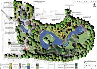
                                                     Park Life


The Masterplan


My Aim: I was trying to convey the topography of the site with shades of green. Tried loads of new ideas and techniques. Overall pleased with the strong but tonally dark colour scheme. Not so happy about the water, general cramped feel, paving colour, outside buildings. The name feels right as it conveys (in my opinion) that people are the park, as in the Blur song ,park life. Simple, catchy and with an element of humour, which adds up to a memorable title, i hope.
Crit : Too much writing, smaller more descriptive to the point annotation  and thus more of them. Trees too small, line weights generally to heavy, little or no hierarchy in the line weight, Loads more definative shadow, Outside buildings greyed out, buildings defined, generally more obvious and less suble communication.
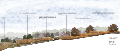
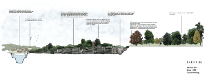
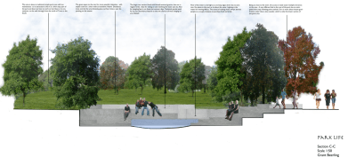
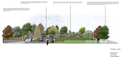
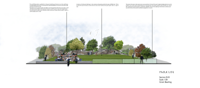
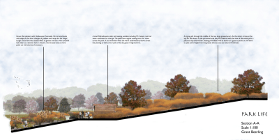
Cross Sections

1:100
Aim: Trying to get atmosphere in the area. The calm feel of the grasses along with the enclosure of the planters. Depth of field.
Crit: Line weight of the ground level too thick. Shorter and more concise annotation, more of it. Use the whole with of the page, otherwise wasted opportunity.

Aim: To show the vallies and different shrub/tree planting on bank. to get depth to the other side of the park.
Crit: As Above
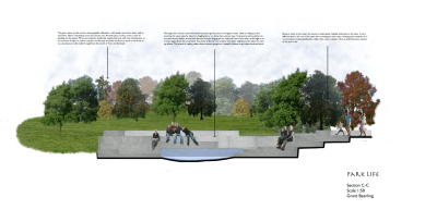
1:50
Aim: Depth and water and sitting possiabiltys on the granite cubes. Not so pleased with this as it lacks fun and atmoshere, which is the point
Crit: As above
Aim: To show a small crowd enjoying an event. Stones being used. Depth of field. Really hard to get people sitting on the ground looking at you of the net.
Crit : As above.
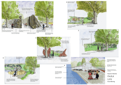
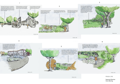
Sequential Sketches on the main circular route.


Aim: Really rushed, all 6 in 6 hours. Some of the perspective are way out as they were all out of my head. The tree’s in the for ground are naff, though in the distance are ok. Though the drawings are average at best there is some atmosphere.
Crit: Line weight! way to heavy, lolly pop tree’s and people. no variation or possible id of different tree species. Colour, shadows the list goes on!! 
Conclusion, Need to sharpen self crit skills to see what is actually in front of me.More sketching less photoshop filters. I think i need to just nail some issues such as grass and mass area’s for colour and feel. Atomsphere rather than to much technique.
                                        Think Atmoshere

Quick Sequence Sketches, first attemp

Played around with Pro Makers on Trace. Constructive crit on images, darker outline on the foreground (cheers Alick) and fade on the distance.

So played a bit in  Photoshop, with layers of low opacity white, various filters and image enhancements.

Enclosure

Revelation

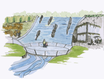
Noise of waterfall, glass viewing platform reflecting the water. 
Two different speeds of water, thus channeled in different ways