A short vid from lille last year. Just a load of pictures of Garden Designers err being mature.
We all looked so young at the start of the week
Lille Le English from Grant Beerling on Vimeo.
A short vid from lille last year. Just a load of pictures of Garden Designers err being mature.
We all looked so young at the start of the week
And so it continues…..
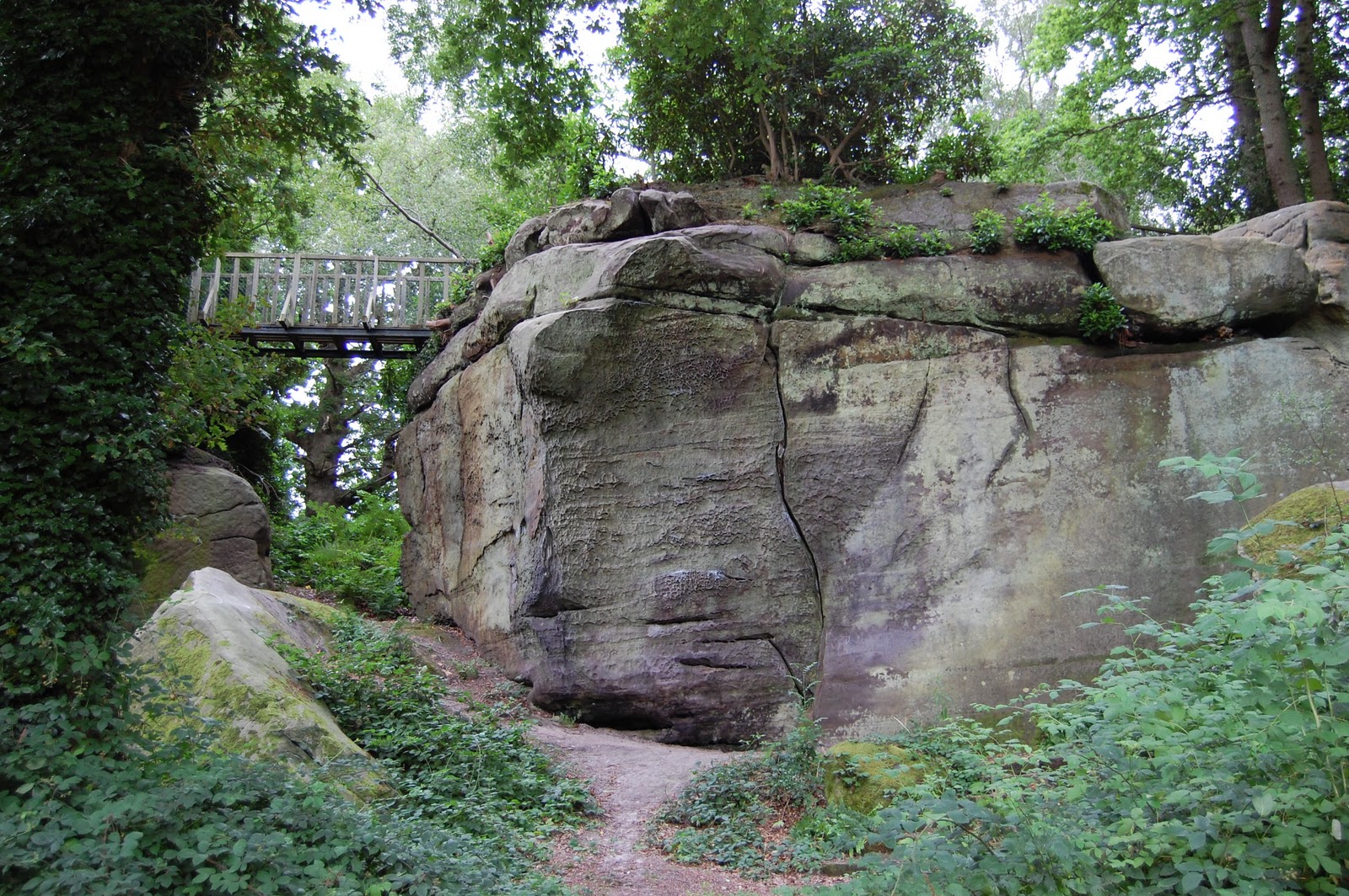
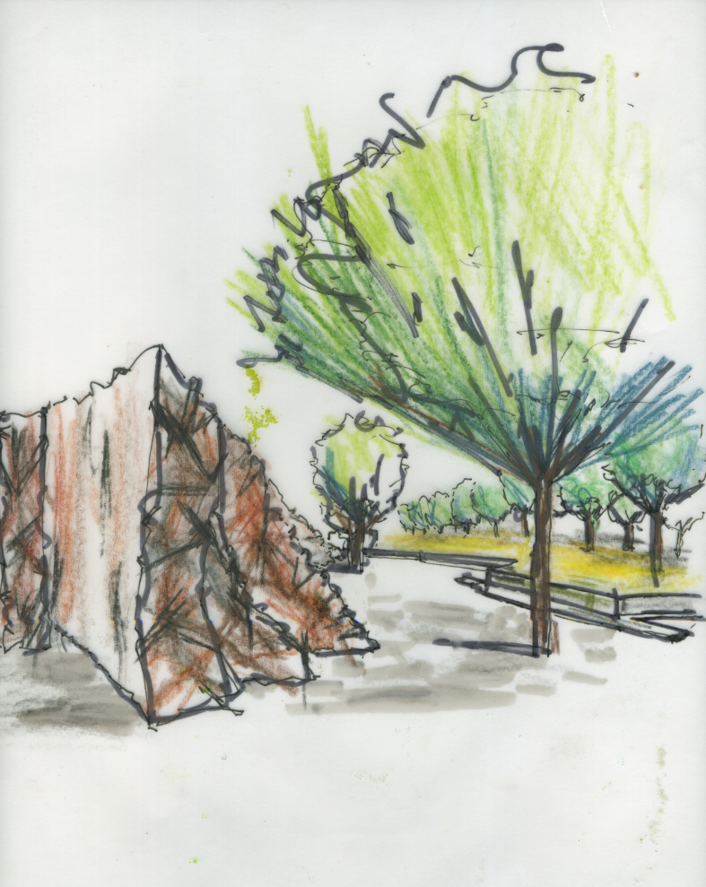
Rock solution, first find a rock, this is a good one from High Rocks. Then cut various shapes from it. Looking at the Contour lines. Some small, others large, mix em up.
Then duplicate loads of the images, and start building, making note of keeping contour lines parell to what ever angle you started at, also look at shadows and add if necessary.
All my rocks came from this one pic
Well crit over/marking. Not really sure what to make of it all. yeah, yeah, fancy rendering, but i agree with Paula (Romania) the previous one has more life as did the the very first sketch. This one is to dull, to refined. I prefer something with some more soul.
Its about being expressive for me and although there is a place for straight informative drawings, it just doesn’t get the feeling across. And thus the feeling of disappointment.
Perspective Ahhh need to do sketch up model for depth of field, over all a bit miffed. I think on the marking front i got away with it and it was generous. As the seduction of rendering helped the lack of skill on the perspectives, another day another attempt.
I think earlier in the Degree i felt more confidant about taking risks, as i get nearer the finally i find myself getting more conservative, its a case of letting go of the reins and then thinking too much about the consequences. Really quite annoyed.
What to do?
Well its a case of not trying to ‘please the panel’, but to concentrate on the design.
The difference of designing for a client, either they get it and love it or they don’t the story ends, whereas this situation its the added chasing marks regime which we all do as they are there as a standard, and there has to be bench mark. So i am going to try and stop thinking will they or won’t they and go for what feels right as that is the point otherwise we would all be Jamie/Julia/Paula clones and bad ones at that.
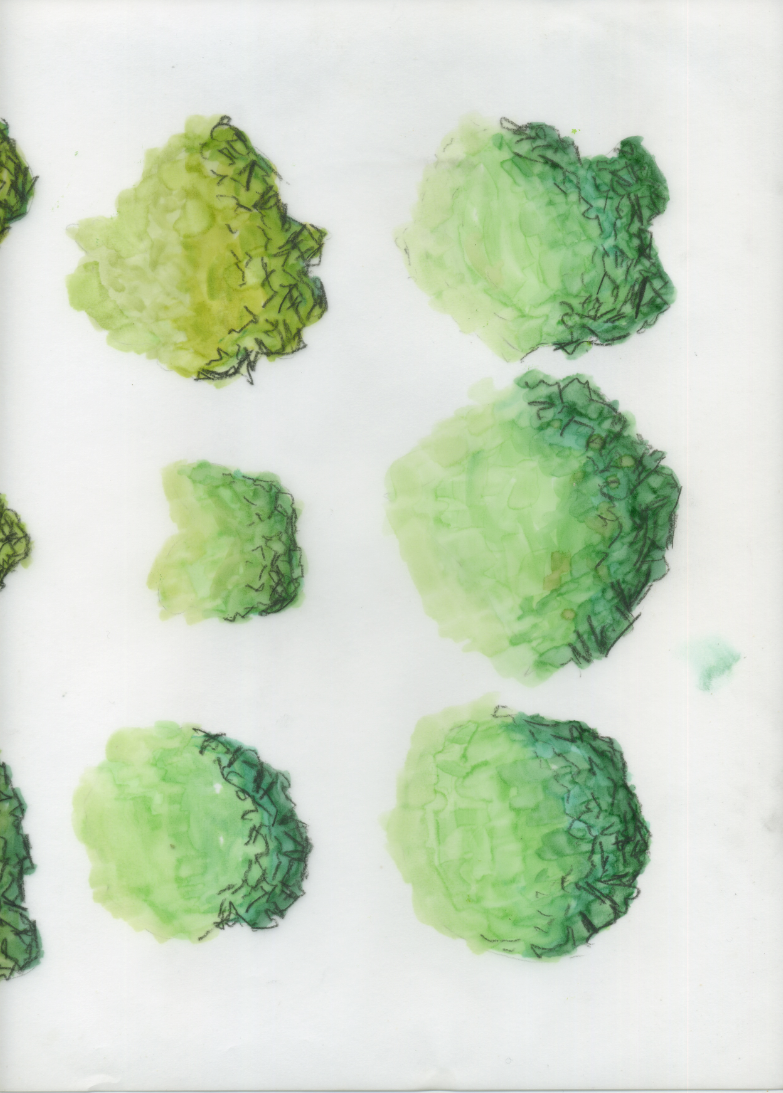
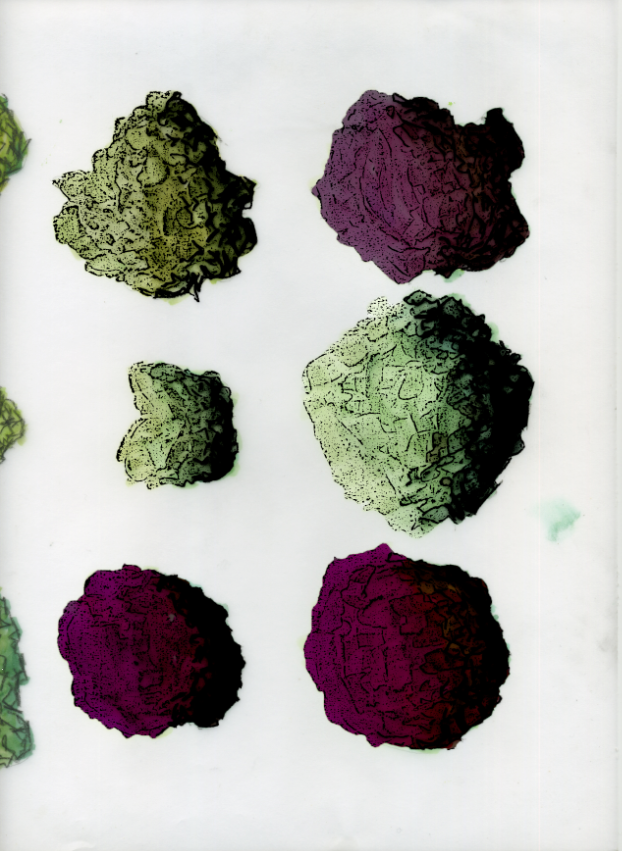
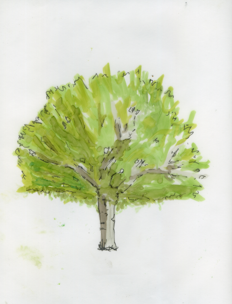
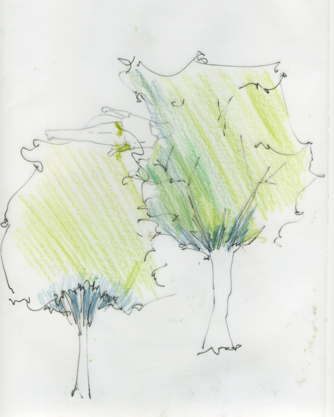
Well like just about everybody spent a lot of time trying to create tree impressions for the plan as well as the perspectives.
Plan
As usual stumbled on this idea and developed it I think the result is quite effective and can be played around with further
1) Pro marker on Trace, shade to create depth, (the ink stays wet so mixing is possible). Let it dry. The ink one side with .3-.5 pen.
Well spent ages with pencils, pro markers and to be honest still have not got it, but a start, pro markers on trace
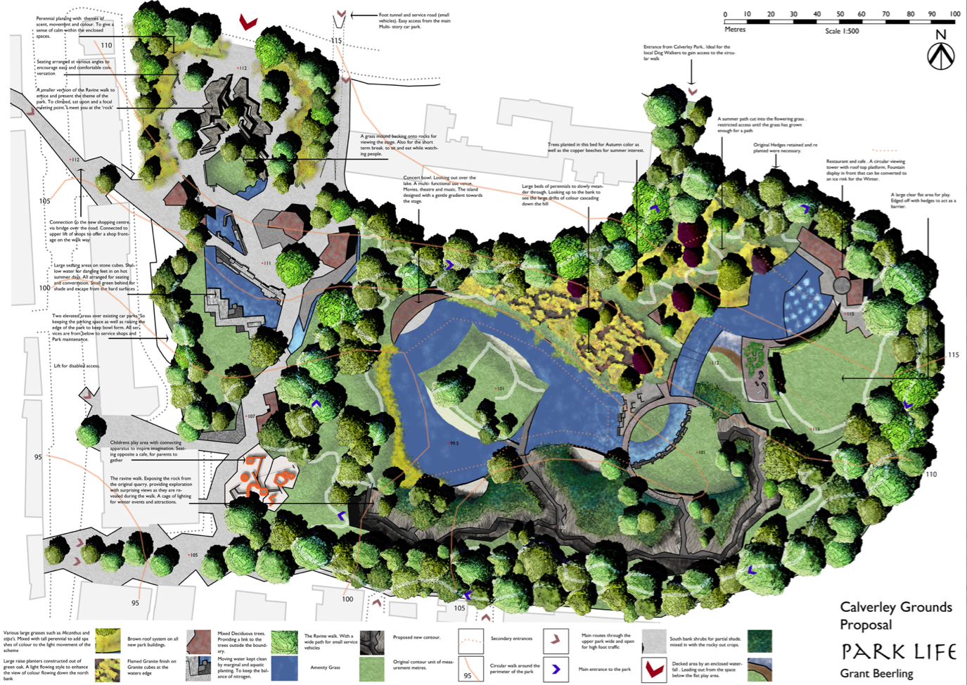
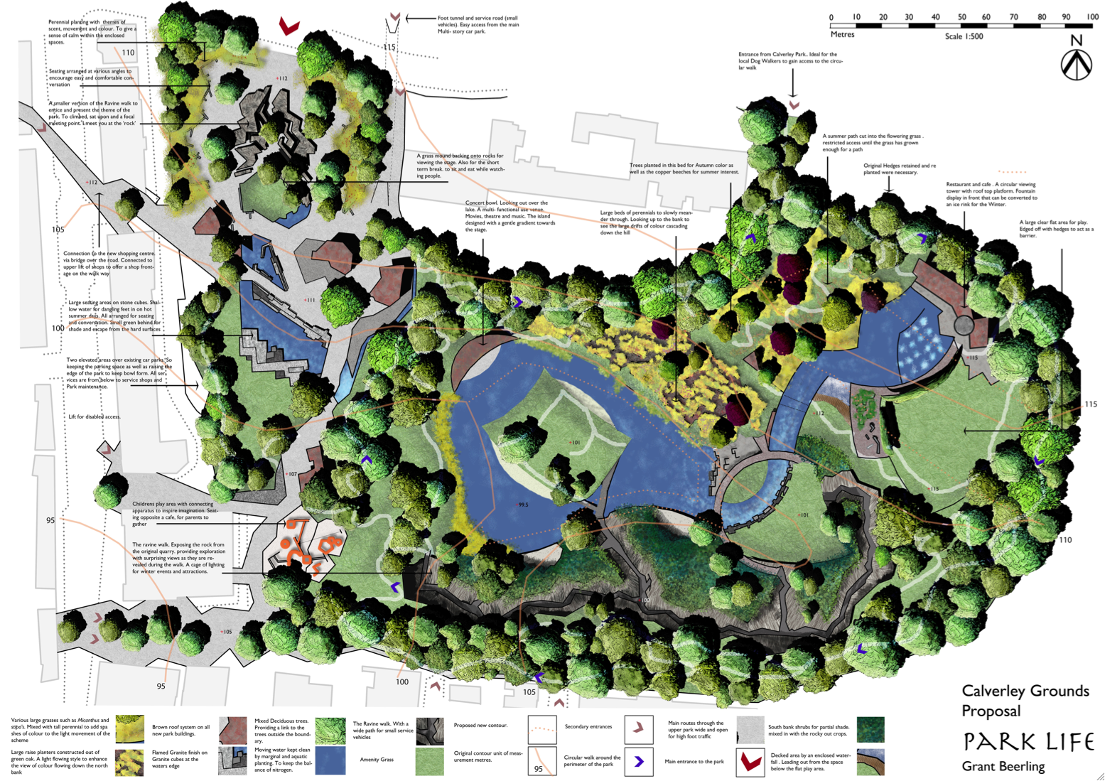
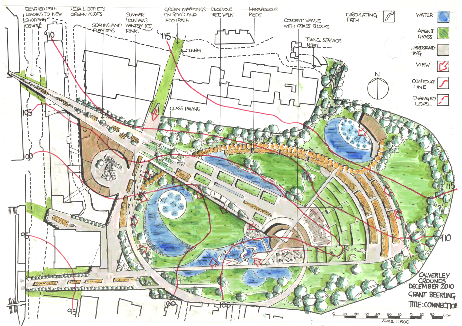
Well final Materplan, not proof read yet. But I think i have covered everything, though i doubt it. Made it a bit garish to show up on the wall at a distance. So less of the trendy colours more of the primary, well almost.
Anyway done for the mo, tea and bed.
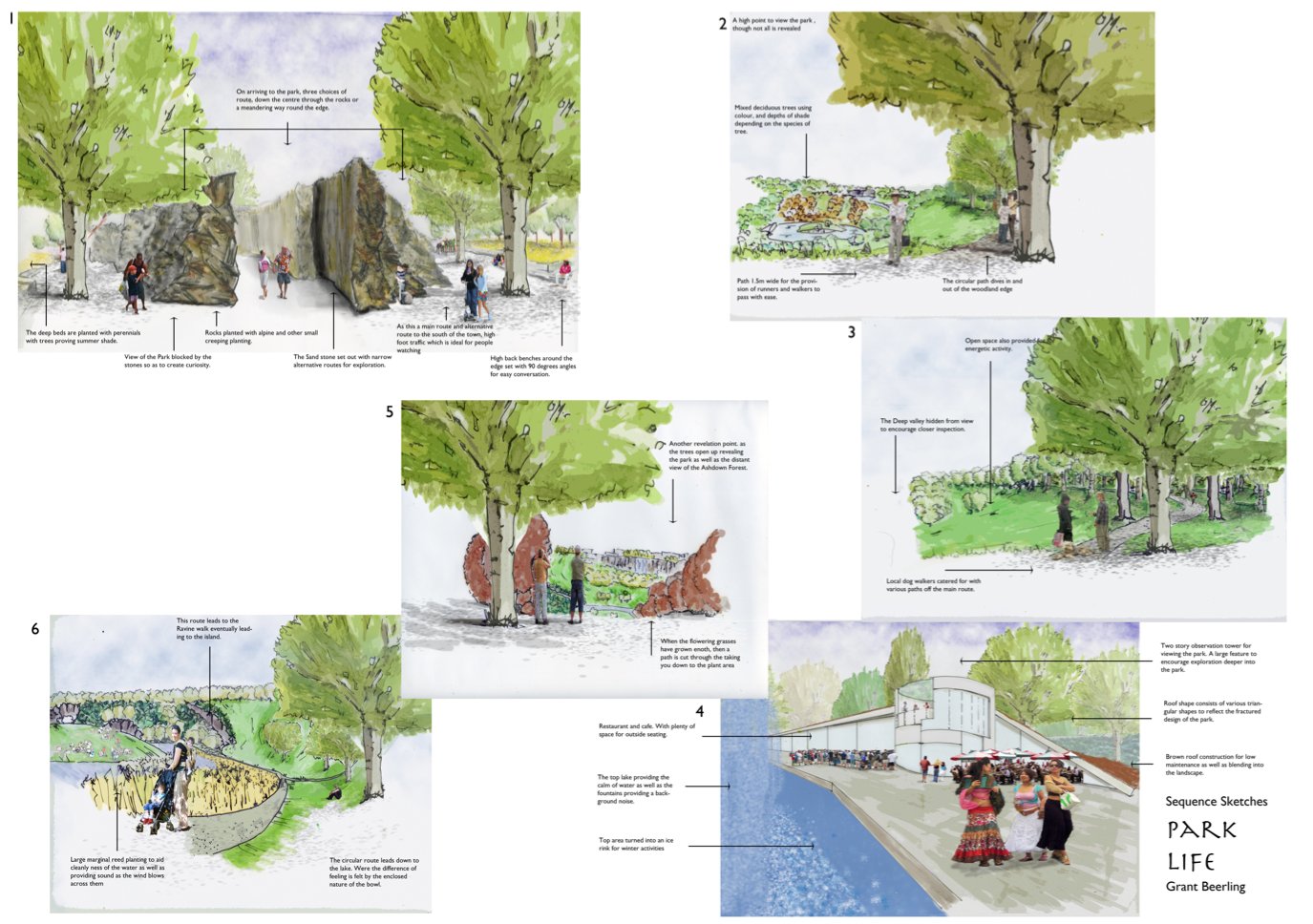
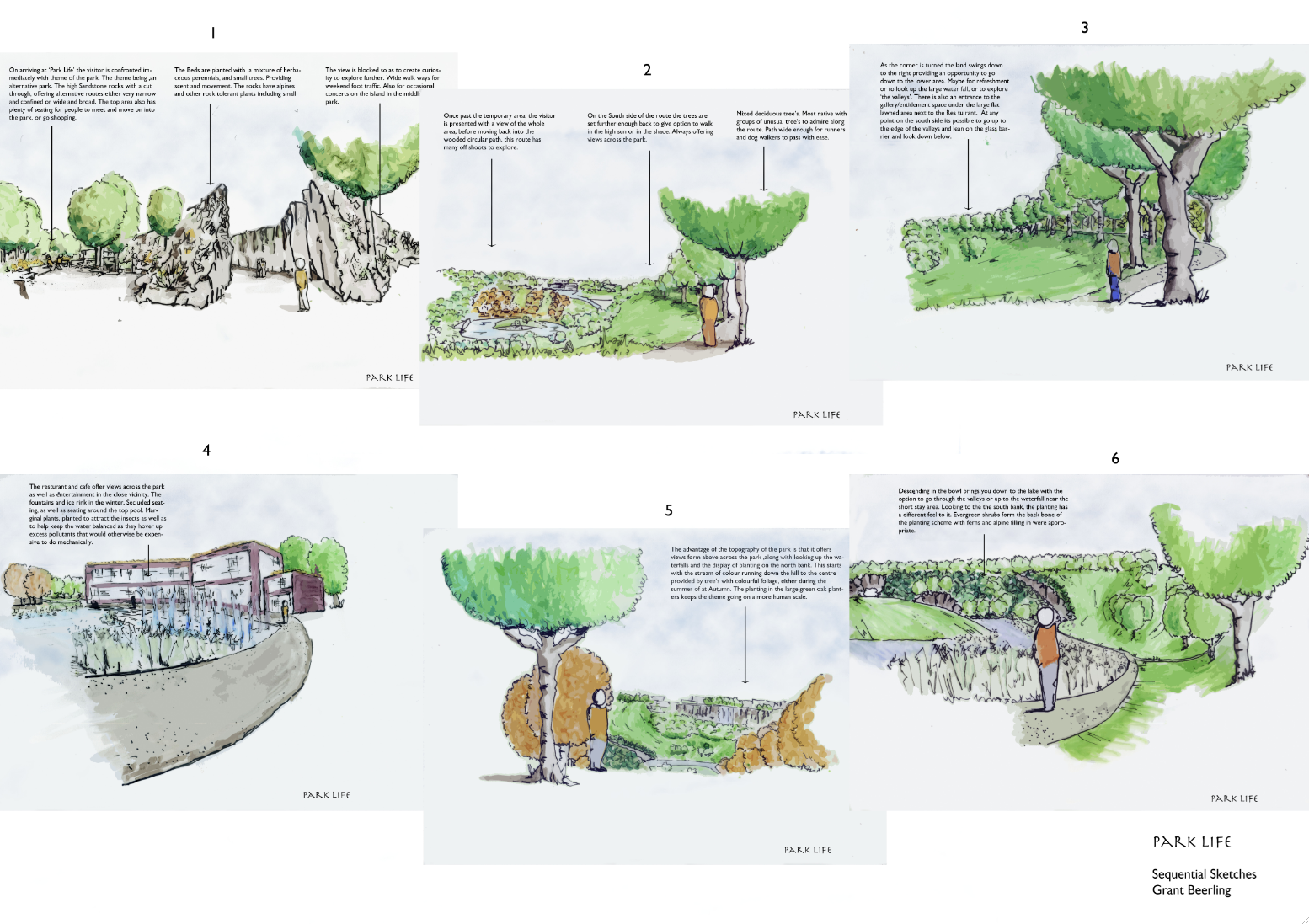
Then sequence sketches….
So much work, so little time sums up my (and i suspect the rest of the class of 10/11) Christmas.
Pin up on Monday was a strange affair as everybody looked so pale and bloodshot, alas not from a night on the town. I think the ‘Blitz Spirit’ is alive and well in our group as we all can empathise with others long dark nights of the soul, when that blank sheet of paper mocks your every stroke of the pen.
So what i pinned up for the first crit, of the year. We have a week to update and final marked crit on the 24th of January. As usual the crit normally states what is at the back of your mind or what you were trying ‘wing’. Plus some surprises.
(click on pics to enlarge)
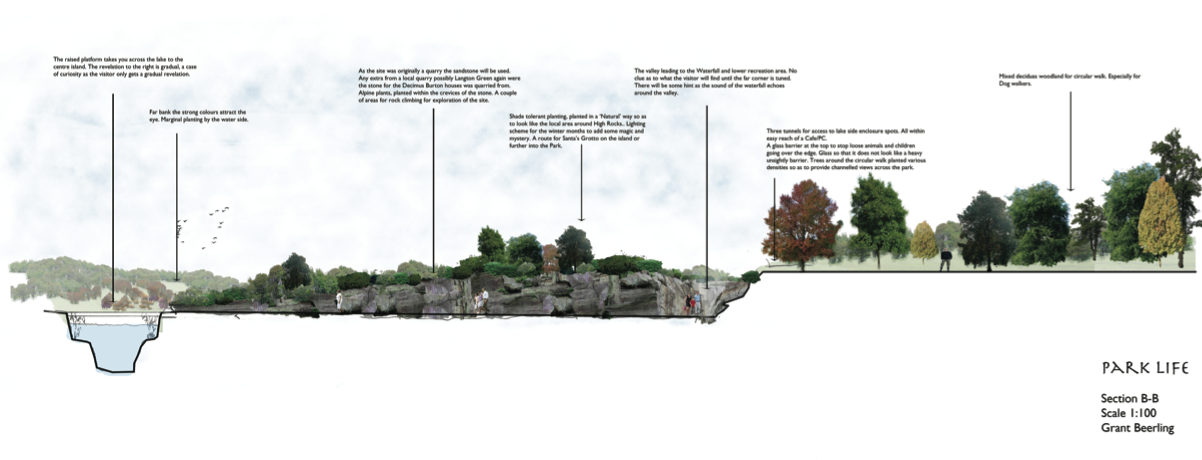
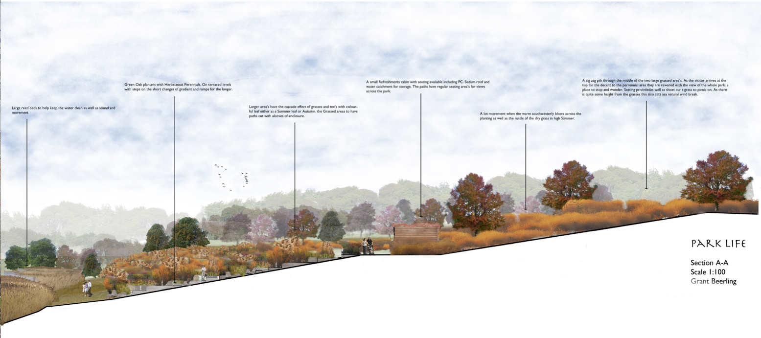
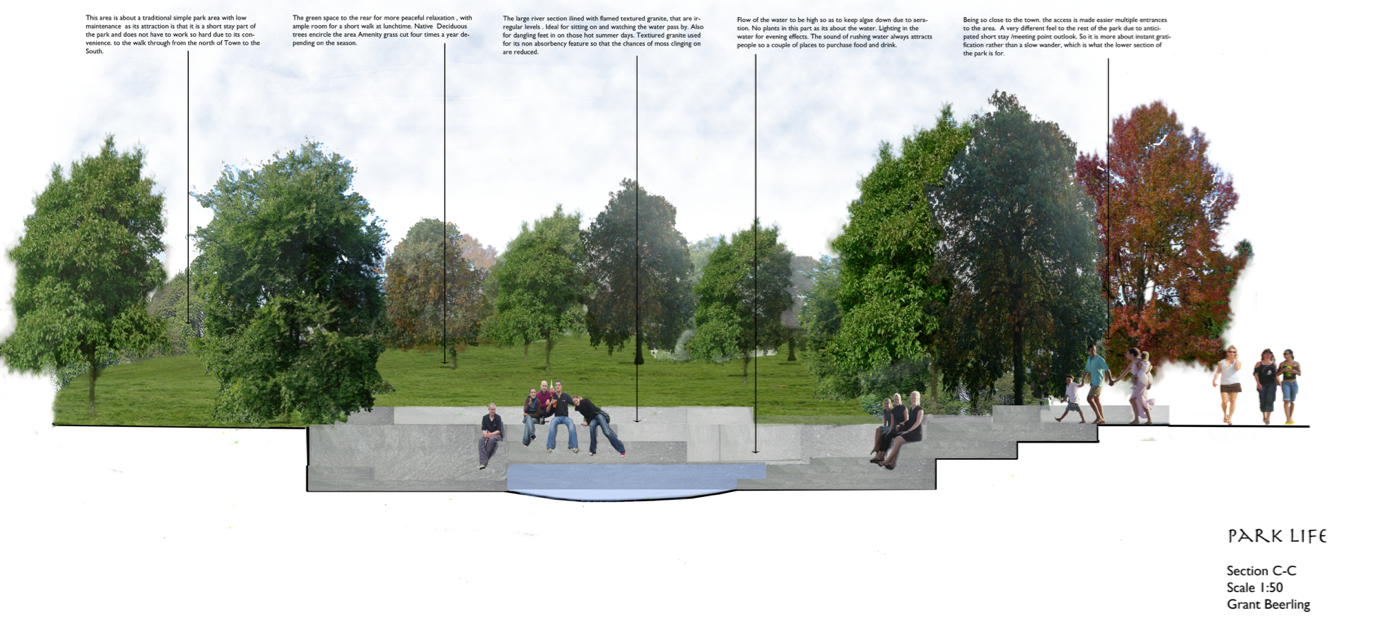
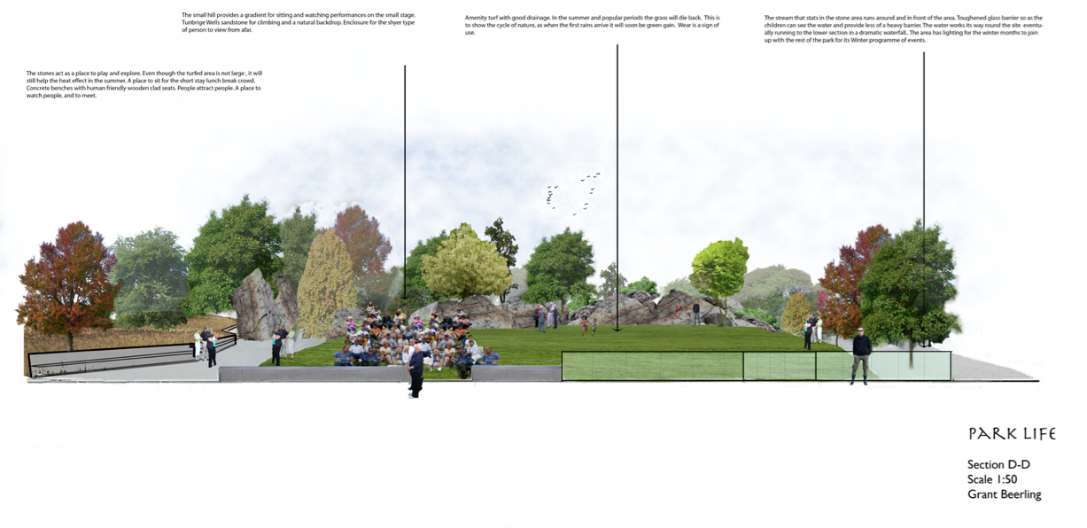
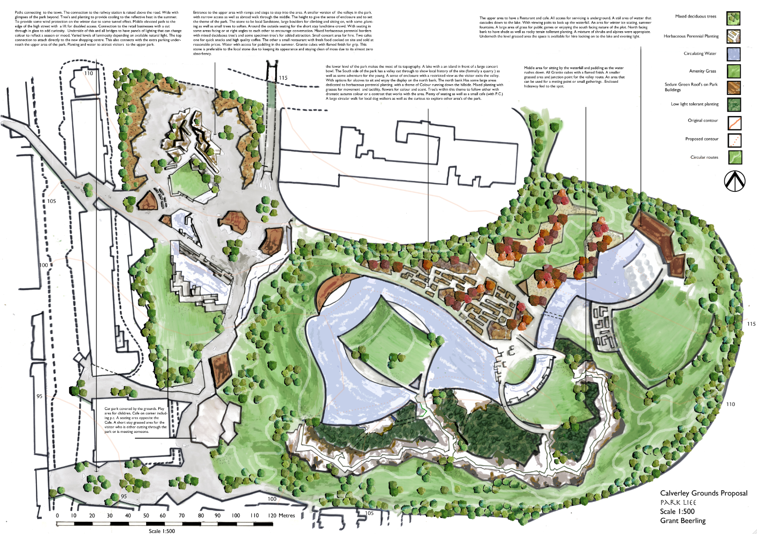
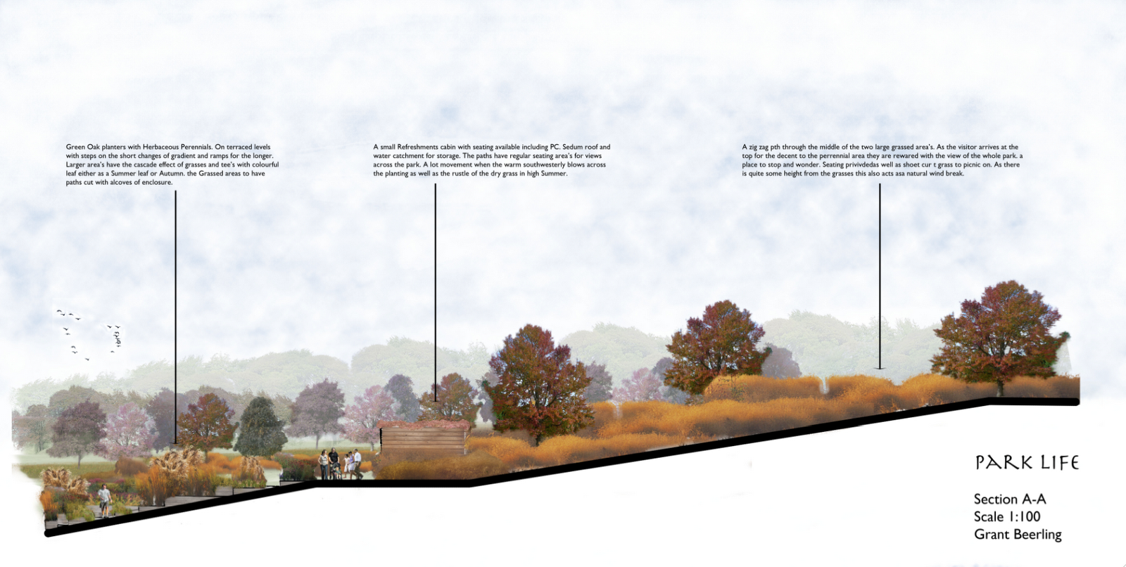
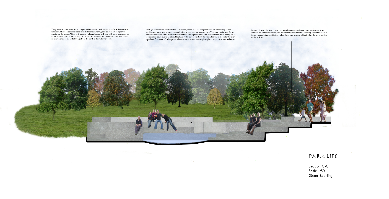
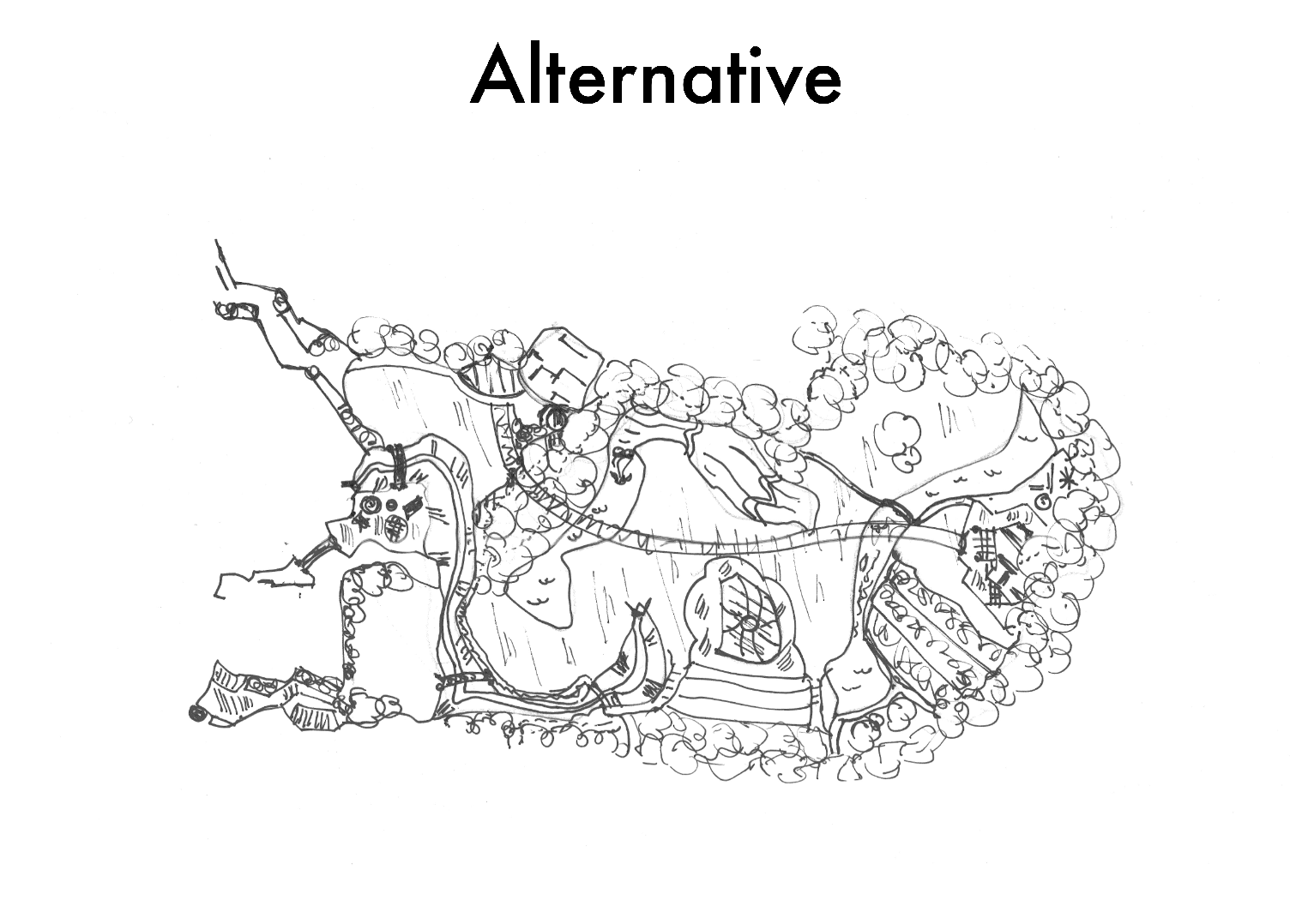
Park Life
The Masterplan


Played around with Pro Makers on Trace. Constructive crit on images, darker outline on the foreground (cheers Alick) and fade on the distance.
So played a bit in Photoshop, with layers of low opacity white, various filters and image enhancements.


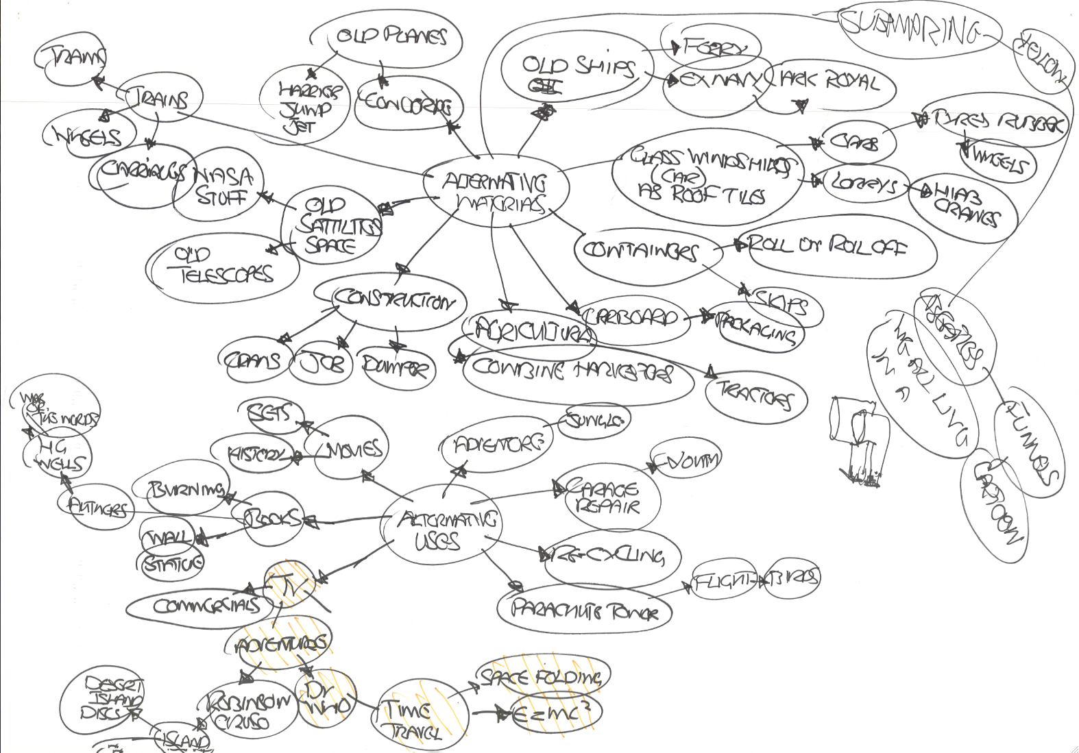
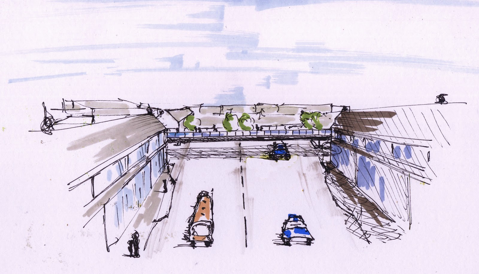
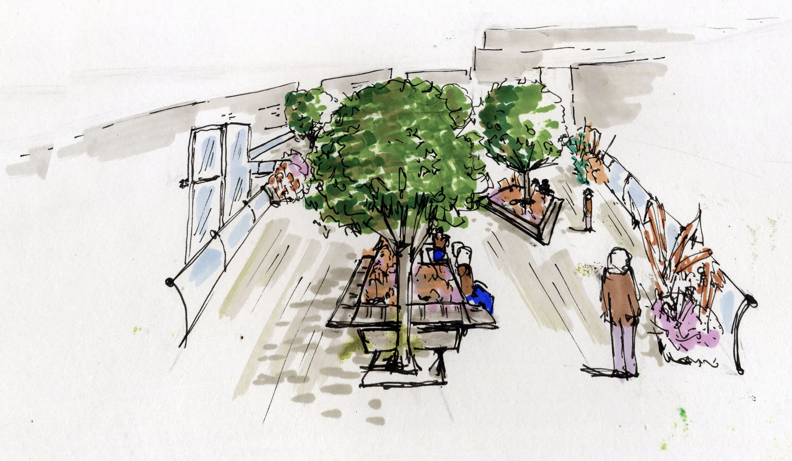
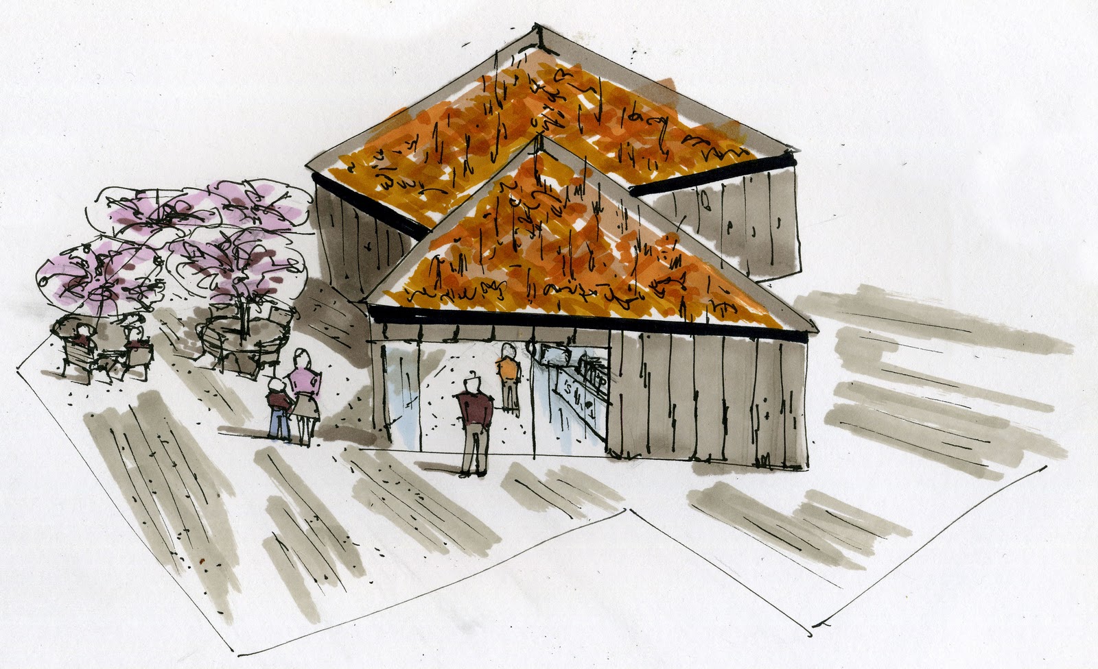
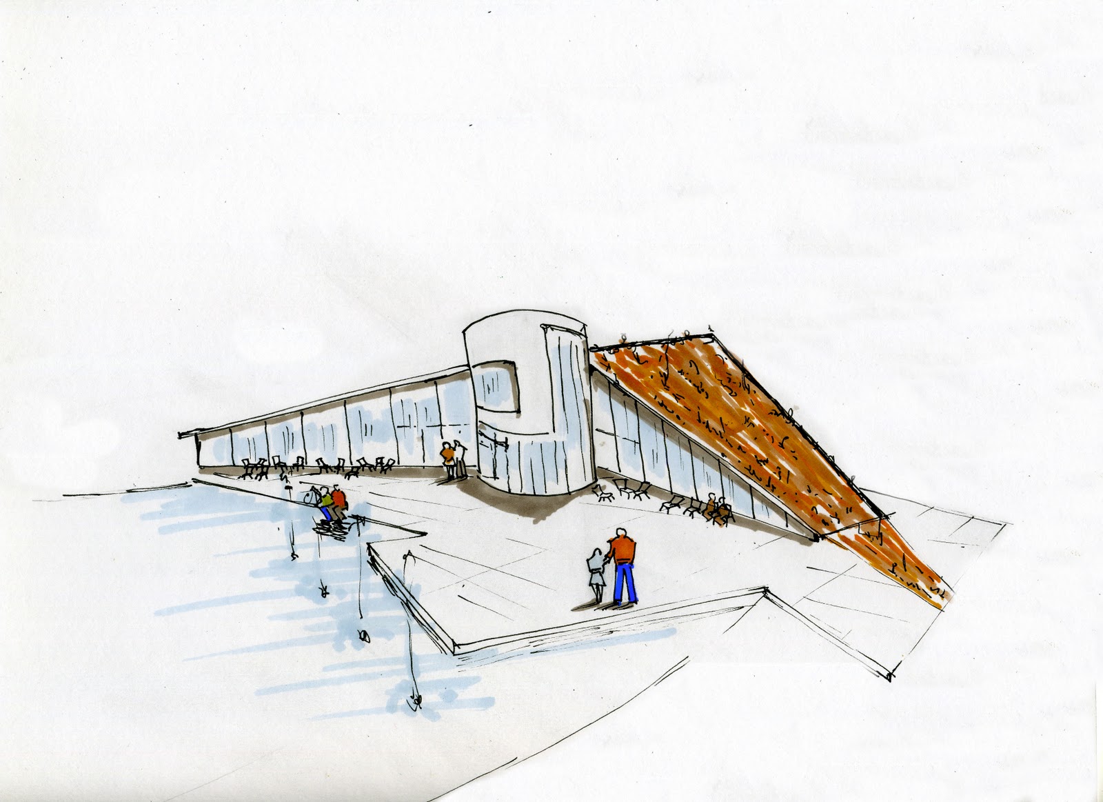
Well after an intense crit ,’the panel’ decided on Alternative. I wanted to do Connection. The issues with connection are the shadow the ‘flyover’ creates. Also maybe too much dominance of the axis on the space.
The attraction of alternative was due to the valley idea, as well as maybe the general setting out. Though the large circular area’s of grass where not appreciated, which on reflection i can see that there is not enough difference in the sizes as well as maybe a bit strong on the basic geometric shape.

What a diverse bunch we are, from extreme wow ,noisy, party, to calm considered and conservative. I noticed that nearly all of us had a phrase that our favoured design seem to spring from, even if we did not know it before presenting. You have to go with your own personality and how you see the world to get passion, otherwise its just ‘another job’. There was plenty of passion yesterday.
I will not tell you which one was chosen to develop yet, so that if any viewers would like to comment then there is no bias. An initial idea sketch followed by a more detailed sketch. The three words they are inspired by are Connective, Educational and Alternative.


Its late and probably like everyone else been at it solid for two days.
What i have learnt.
Pressure is both a good and bad thing. On the plus side it gets stuff down on paper, on the negative side , the improvement of the design is so great between the three designs that you want to start the first one again!!!
At least these are still at sketch stage. I can see sooooooo many faults, a case of more speed less haste.
Rendering on trace with pro markers is like using paint, you can mix on the paper which is really handy to getaway from the formal look.
I can see so much detail justification that has to be sorted out. Plus lighting so much new stuff out there really want to make sure i don’t miss anything as a lit space is a whole different world, just listen to Adele.
Bed and then face the music tomorrow!