Original idea?…nah don’t exist!

Had an idea a for Calverley Grounds whizzing round my head for three weeks, then Jamie blurts it out!!!! DOH!!! I think i will still use it as one of my idea’s, but as the saying goes ‘nothing new under the sun’.

This next section does sound daunting, proper big school, no hiding behind the comfort of Hadlow College now.

What have i learnt this week? I am an internationalist by nature and my fear of nationalism also makes me suspicious of localism, thus (if) i have a design style then it would be along the lines of an international style, with a hint of local, but outward looking rather than inward, future looking rather than too much to the past as we should celebrate the now and not be downtrodden by the past and its design statements. That does not mean that we don’t learn from the past, just don’t mimic it. Confidence not timidity. High quality and grades of materials. Skilled tradesmen to construct with management systems that help not hinder.
And a high budget for ongoing maintenance, after all we all know that Park Citroen could be sooooo much better with some TLC.

Conclusion: we are all driven by our baggage ,not necessarily a bad thing, but worth being aware of nonetheless.

Babble over, Photojobo sent these photo’s through, Will never see curry in quite the same way. A case of ‘small is more’. Click on them to get the full effect.

Spilt milk

Post Adobe anger managment

Well what a day. Worked like the proverbial dog (as all of us) and bloody Adobe (or my ignorance in fairness) and image quality. So have sussed it (thanks to Jamie, as usual), well at least I think so, i will steam into it tomorrow.
Talking to Isabelle about music and in particular Classical and my personal struggle with pre mid 19th century classical music, i always see the issues of the time and thus judge the music by the issues as i see them.
I was recommended this album by a classical musician in a very high end hi-fi shop (appointment only, those were the days when i had money) when asked were should i start with Classical music, with no hesitation, Faure Requiem. Purchased that day and at first struggled with the pace, but as with any good music (or wine) it matures and gets into your Soul.
So when ever it all gets to much, this is the album that puts it all into perspective. A definite ‘Desert island Disc’.
Calverley park designed with this as a theme, i can so see the Tunbridge Wells Choral Society loving this.You don’t have to be an intellectual understand something that hits your soul. I was 24 at the time, so its not necessarily about age either (just in case you were thinking, old git).

http://listen.grooveshark.com

Then copy and paste in the search box

Faure: Requiem;Op48

If i had to rescue one track on my desert island as the other seven were washed out to sea,then it would be ‘In Paradisum’

As for Jazz the place to start ‘Kind of Blue’ (Miles Davis). After many years of jazz, this album still holds its own.

Can you design around a musical theme?

The Garden Design Course started on an autoCAD theme (sorry a bit of me, me, me, going on here) to design for a bench for Hadlow college. My effort was around the context (in my opinion) of a 60’s building, cool students (or so we think), a quick break in the area next to the canteen and to represent Hadlow College.

Dave Brubeck’s, ‘Take 5’ (as in a 5 min break between lectures) a classic jazz standard from the sixtes.

So as a further tool for design idea’s and spring boards?

How about ‘God save the Queen’ by the Sex Pistols for Jubilee Gardens?Connection Queens Silver Jubilee 1977.
After all its a ‘fascist regime’ apparently according to the late Mr Rotten.

Google it if you are not familiar, after the watershed though!

Happy Editing all!

Grant

Todays fashion is tomorrows disaster?

As i have been glued to buildings and materials this past couple of weeks (and most of my life building them), it struck me how fickle tastes are. Love the Tunbridge Wells Town Hall, and actually like the Axa Building opposite (along with the much maligned ‘Barbican’). So why? I think time has an effect on softening our views and maybe understanding what the original concept was before it got lost amongst all the clatter of the baying ‘heritage’ mob.
I suppose its a case of the present mood, the optimism of the post war years for a fresh start gave us brash and bold design, not really thinking about the consequences when people had to actually live and work amongst these bold statements for new living. The point i think i am winding my way to is that a desire to create timeless pieces that are adopted by people. The Gherkin building in London for example is now an accepted part of the skyline.
How is it done? Who knows, but Faith and conviction play a major part along with a thick skin!
And with our present Tutors i am sure we are all developing a leather like shell.

Talking of a thick skin, a man who knew his brick bonds and would quite happily talk for hours about brickwork, Not sure Cameron would understand the joys of actually building rather than tearing down.

The Greatest Bricklayer of them all Winston Churchill, on a nice bit of 18″ (450mm) brickwork.

Mystic Meg visits car park

When leaving late one evening from Avery Hill, noticed how a bit cold of mist can effect the haze of lighting. Very spooky, but enclosed by the darkness of the sky in contrast to the effective downlighting (to avoid light pollution) of the white lights (high pressure sodium i believe), compared to the orange (low pressure sodium, more efficient for luminosity to power consumed than the high pressure ref: http://en.wikipedia.org/wiki/Luminous_efficacy). 
The white is more up lifting and ‘safer’ in a car park situation, but putting that aside for the moment, the white just looks better due to ability to bring out the green (ie white spectrum compared to orange) in the planting. Thoughts for both parks. I know blue works well with humans in low light as it works well with our non colour sensors (what ever they are called) in the back of our eyes. Which i believe are there for low light (ie the less light the more grey and white landscape we see) or is my school boy memory playing tricks again? Normal back of post card please.
Getting ‘A back to the Future’ flash back, expecting a Delorian to come screaming out of know were doing 80mph+ with maybe a long haired version of Tom Turner at the wheel after an adventure in some Renaissance carriage park (or should that be stable yard), he would so love that.

Sequence or Rhythm?…. as long as it’s got that swing

Well I am sure I am not the only one who struggled with this. Enjoyed thinking about space and placement etc, but is it Rhythm? Only when i reached the last two I came to a conclusion, rhythm is a sequence, but lots of them. Sequence is part of the rhythm picture/groove. I purposely did not look at a dictionary to see if i could work it out by doing and thinking. Am I wrong? Find out Monday, oh it is already! Not a plane crash if I am wrong, enjoyed the challenge, the journey and all that.
Thinking about the Funky Drummer and how i could draw the beat in 8 squares (emphasis on the 4th beat according to James Brown, who am I to argue))
I have come to the conclusion they are all sequence apart from no 9

1 2
                                                  
3 4
               Autumn sycamore          Space Lab
 5 6
                                                         Traffic
       7
       Butterflys
 8
  8 is the strongest in my opinion. Had the thought of ‘The Machine Age’ and a certain scene from the film ‘Metropolis’ (silent and made i think in the twenty’s). Not the kind of film that would go down to well with your Torygraph reading ‘T Wellian’.
9

Rendering..good or bad?

Its not modern (1945) and its not clever, but i really like the simplicity of it. Back to my Janet and John view of T/Wells. The simplicity means that the idea is immediate rather than trying to look past fancy rendering covering up an average design (i am very much speaking to my self here). i am not saying i like the utilitarian design (form follows function), but there is a certain honesty about it. Plus the instructive Gill Sans font, very ‘KEEP OFF THE GRASS’.
Or am i talking blather?

Harry Wingfield illustrated books of the period, very idealistic. 

Line Path

 Had a go and understood the more i did it. A hilly bit of woodland. The feel rather depends on the time of year. Summer hard, compacted and dusty. Winter wet, slippery or rock hard. Seasons colours, sounds and smells. All very poetic, but relevant.

Had a thought about a windy day. A lot to remember for future surveys.

Composition

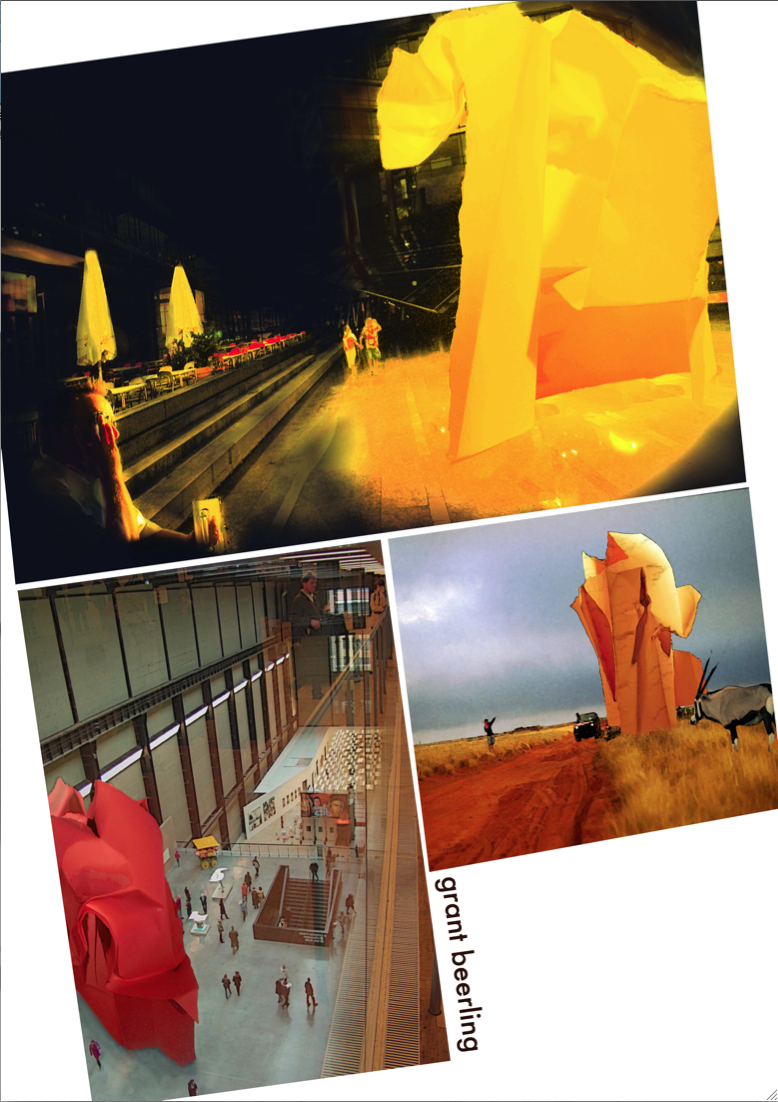
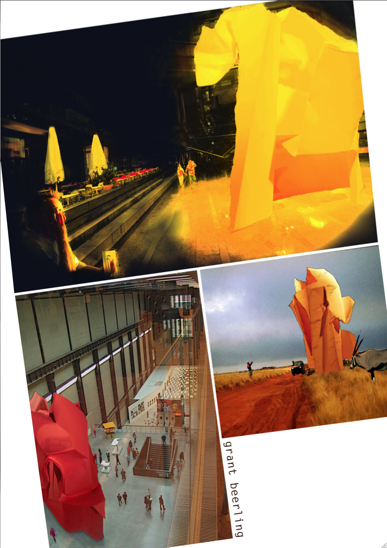
Well I thought I would put up my thought process on getting to the point were I got to for pin up (after seeing everyone else’s work wished initially i had done things different, but then started thinking again, more blather later).

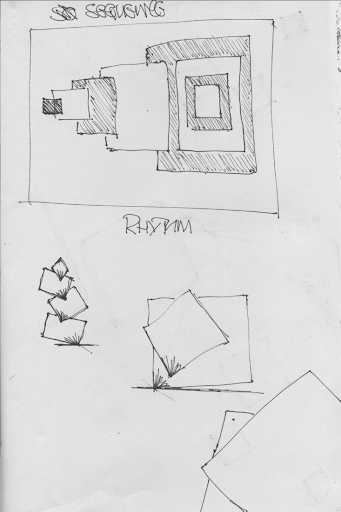
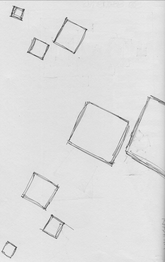
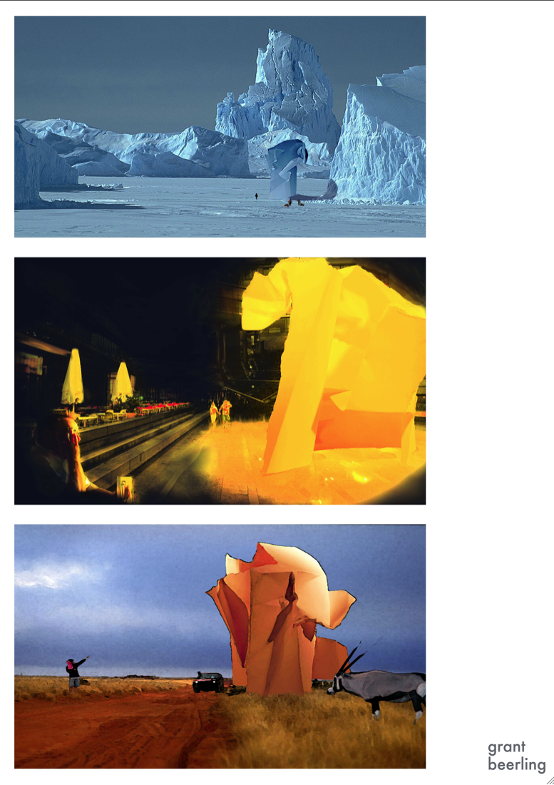
So the difficult bit. First was a vertical grid. All pictures the same size evenly spread. Rejected because there was no hierarchy and even though the second pic was in the middle (the strongest in my opinion) it was lost, plus the name
tag = lost
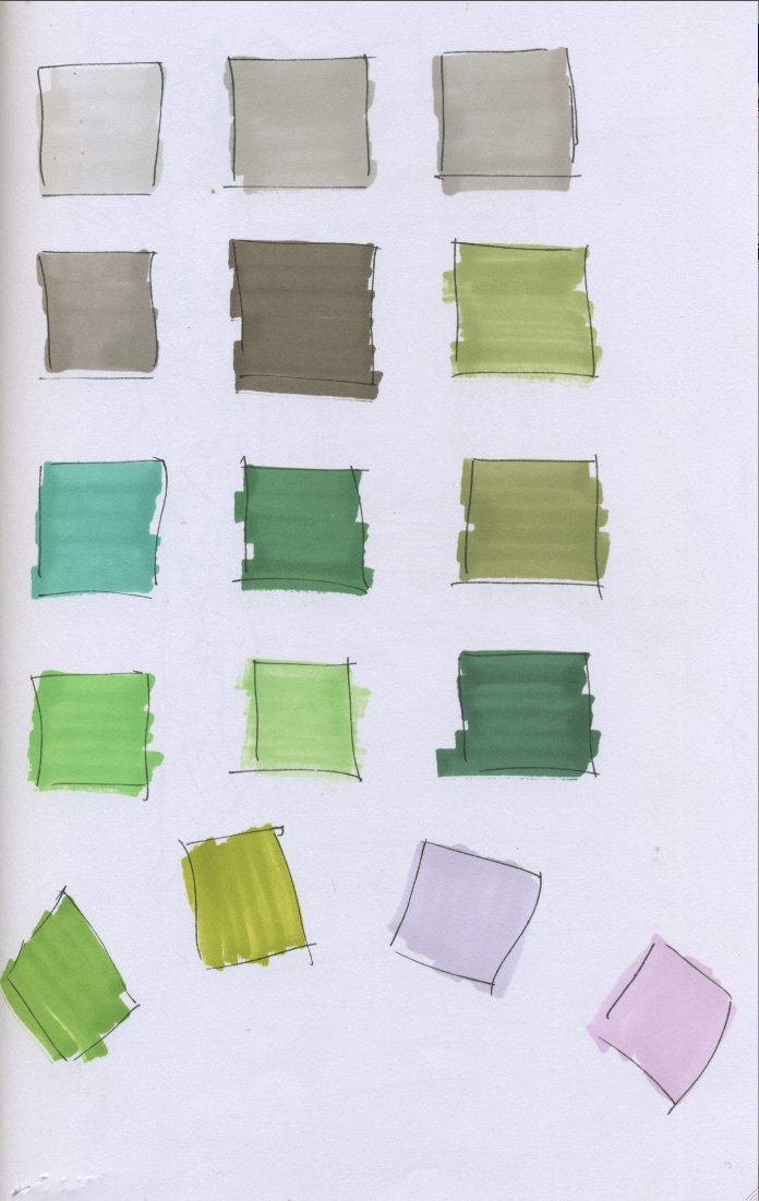
Futura font/light grey
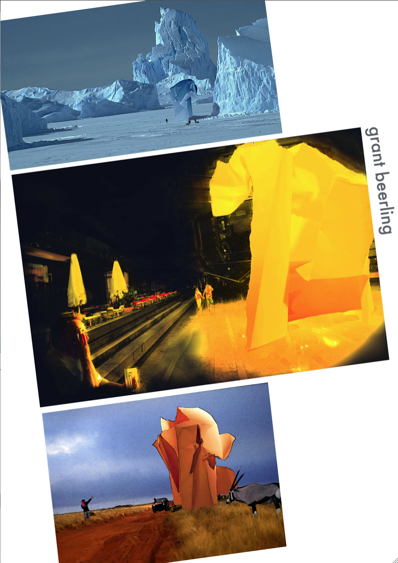
So Changed the angle, increased the size of yellow pic to dominate, the others as secondary. A bit of clipping. Top one Futura, lower case, grey. Font just sticks out as to formal, the grey look half hearted.
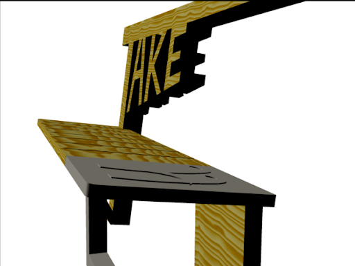
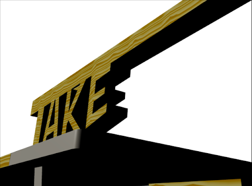
The second font Amsterdam Graffiti, black. The font was to give the idea of a ‘Sketch design’ i.e. less formal than Futura. The name is to close to the middle rather than bottom right, so could lead to the viewer not looking at the bottom of picture. Ie last thing you see is what you remember, so it should be the name?? or not, not sure.
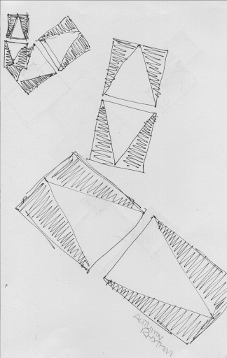
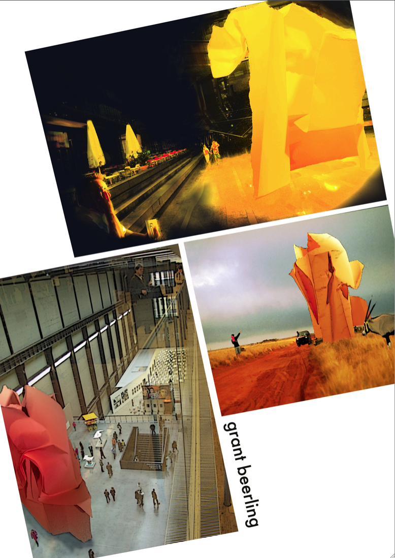
No4. Decided the Blue Ice scene was to much like African Dust. So decided to do a top view (my only chance to get in the Tate Modern). Due to the different shape of the image it threw out the above pattern, so tried this, but decided the yellow pic did not dominate enough. Name in right place but does not sit comfortably.
Then a lot of playing about with the Transform button and got my yellow dominance back. The name aaagh. The two ‘g’s.


Finally, changed the font to Lucinda sans typewriter, lower case, Ages trying to get it to line up (thanks Paula!!!!!) and i will now blame the pinter/pdf/adobe /the weather/George Bush for that ‘alleged’ 2mm.
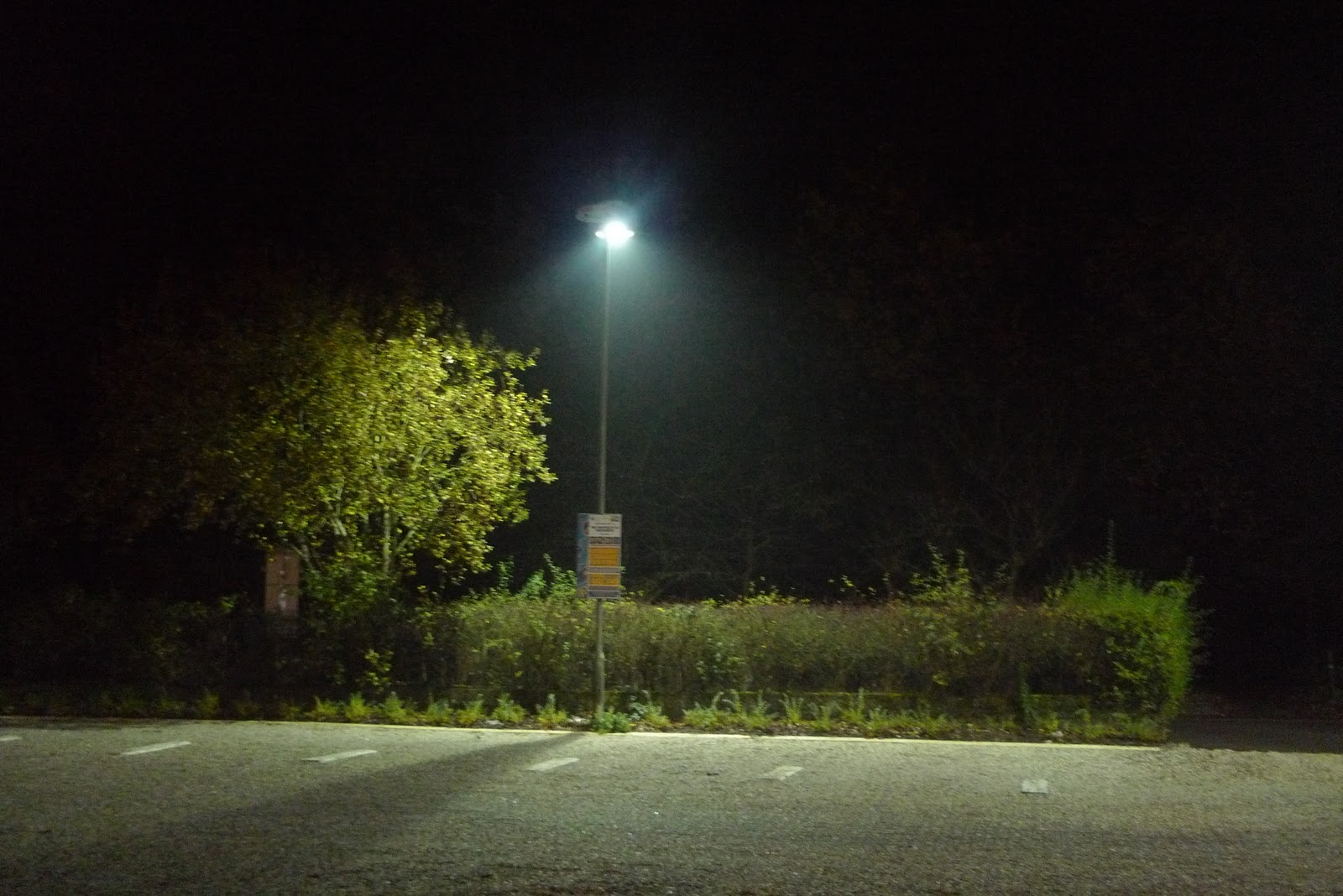
After looking at all the other work on show and listening to Jamie i thought what could i change. Well on reflection because of the style of the images, i.e. quite conservative, cutting the sky’s out would lose the atmosphere, i.e. dark night, african storm, enclosure of the Tate. If the images where more abstract then yes.
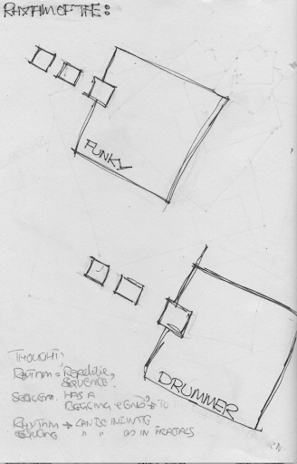
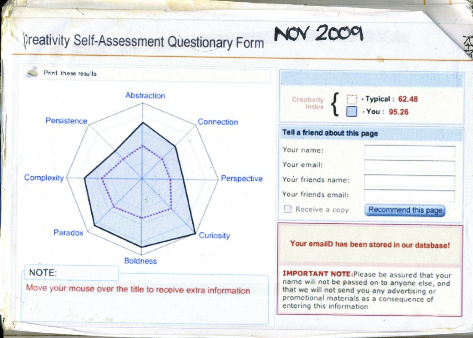
So why do i see the world this way?  As that was the point of the lesson, how you and I view the world and thus interpret space. Nature or nurture? Personally I think more Nurture that nature. 
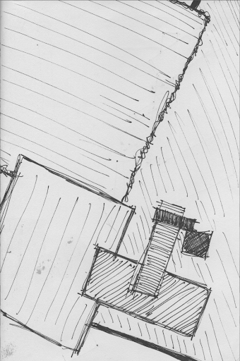
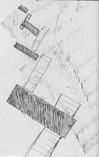
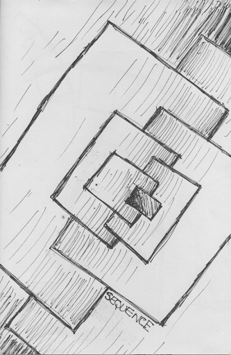
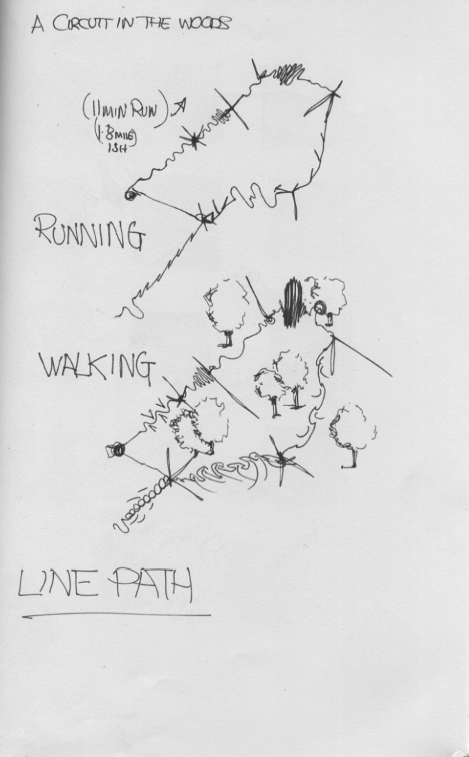
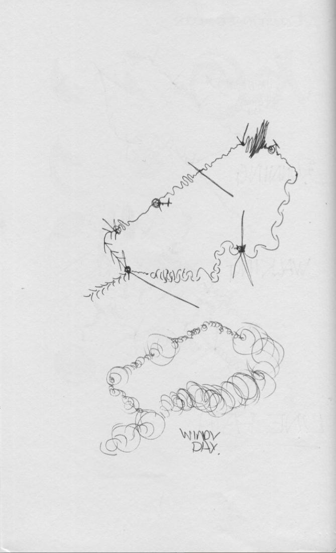
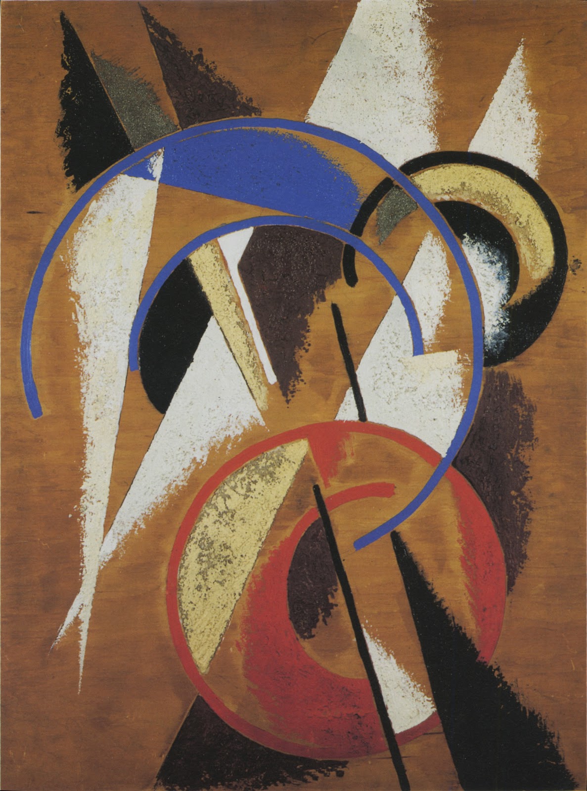
I noticed the way i always design is straight lines and arcs all scratchy and quick.
As a big fan of the Construtivist movement, Le Corbusier etc, (modern rather than post modern obviously)reminded me of a picture in one of my constructivist art books. Doh!
So as usual ‘Nothing new under the Sun’. Plus my Step Father is a cubist Artist and thus grew up with it.
                   Liubov Popova                   SPACE-FORCE CONSTRUCTION  
                                                                                         1921

There we go, got that out of my head. Just need to work Genius Loci!!!!!!!
Obviously there are a hundred and one ways to get to the final point, this is my rather teeth sucking, looking in the mid distance, OCD kind of way.

Finished Sketch Model thingy.

Is there anybody out there?


Phew, changed my mind about one of the images (thanks Karen) so rushed out another. just the dreaded pin up Monday.


Now a weekend of Roman religion, as Sid James would say with a filthy laugh!
This blog thing is a bit like talking to yourself, yadda yadda.


I may put images up, depends on how much slagging off comes from Jamie, annoyingly he is normally right…Doh!


Cerax Creativity Test

Well i have published this on the 17th July 2011 as i saw that Joey had put his up and i missed it.

The one thing i get a high mark in does not count……Doh! 

Did it two years running and remarkably it came out within one point, i think the change in the bias is due to my change of attitude, to become less of a shrinking violet and more of a bold sun flower.

Still have severe moments of doubt, thats why i buried it back in this part of the year. So bold in design and belief, just not in the chase to be an Alpha male.
So Lille taught me to stick to my Guns more and take defeat on the chin and not personally, and success with modesty. 


A bit messy due to being in the back of my thrown around sketch book, which went everywhere, on site as well as at home. Could not find the originals on my computer due an external hard drive failure…..back up your back ups..when will it end.


Roll on the day when Solid state hard drives are cheap enough to bin the susceptible disc spinning hard drive we have at the moment. So yet another £150 to retrieve, doh.


Those who know me, know that generally i walk around with my head in the clouds, and can completely miss stuff. Can’t do plant idents due to my Dyslexic memory, or spell and have a gift in terrible grammar.Everything is in 3d picture form, so i think this lines up with this kind of test. Also left handed, to add to the creative theory.