So much work, so little time sums up my (and i suspect the rest of the class of 10/11) Christmas.
Pin up on Monday was a strange affair as everybody looked so pale and bloodshot, alas not from a night on the town. I think the ‘Blitz Spirit’ is alive and well in our group as we all can empathise with others long dark nights of the soul, when that blank sheet of paper mocks your every stroke of the pen.
So what i pinned up for the first crit, of the year. We have a week to update and final marked crit on the 24th of January. As usual the crit normally states what is at the back of your mind or what you were trying ‘wing’. Plus some surprises.
(click on pics to enlarge)
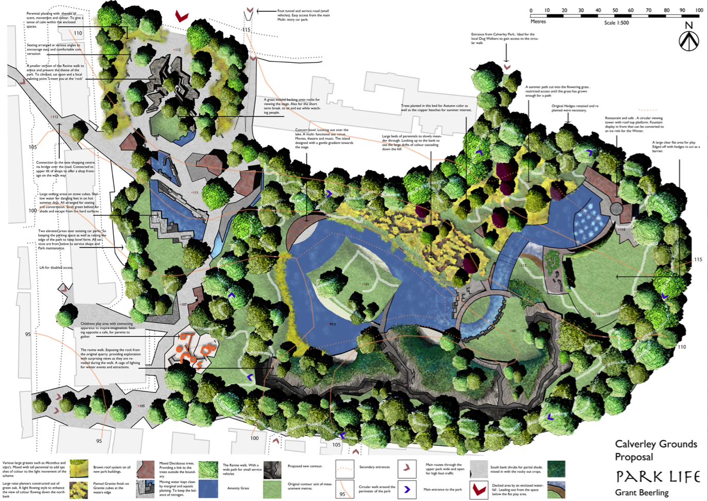
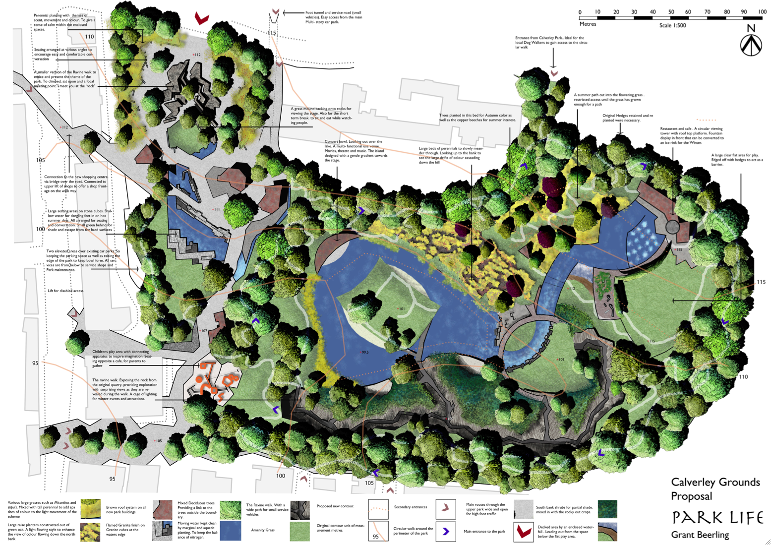
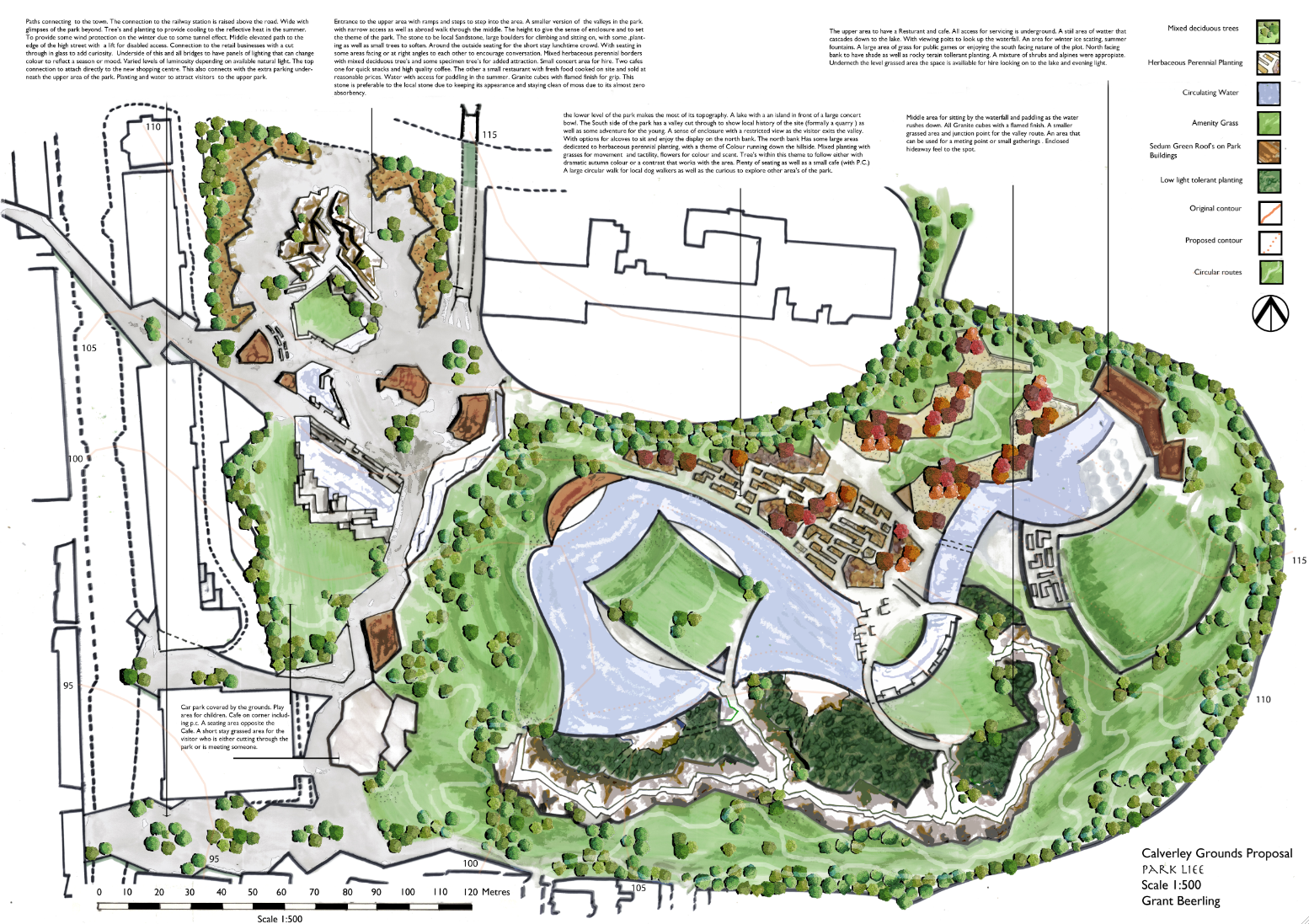
Park Life
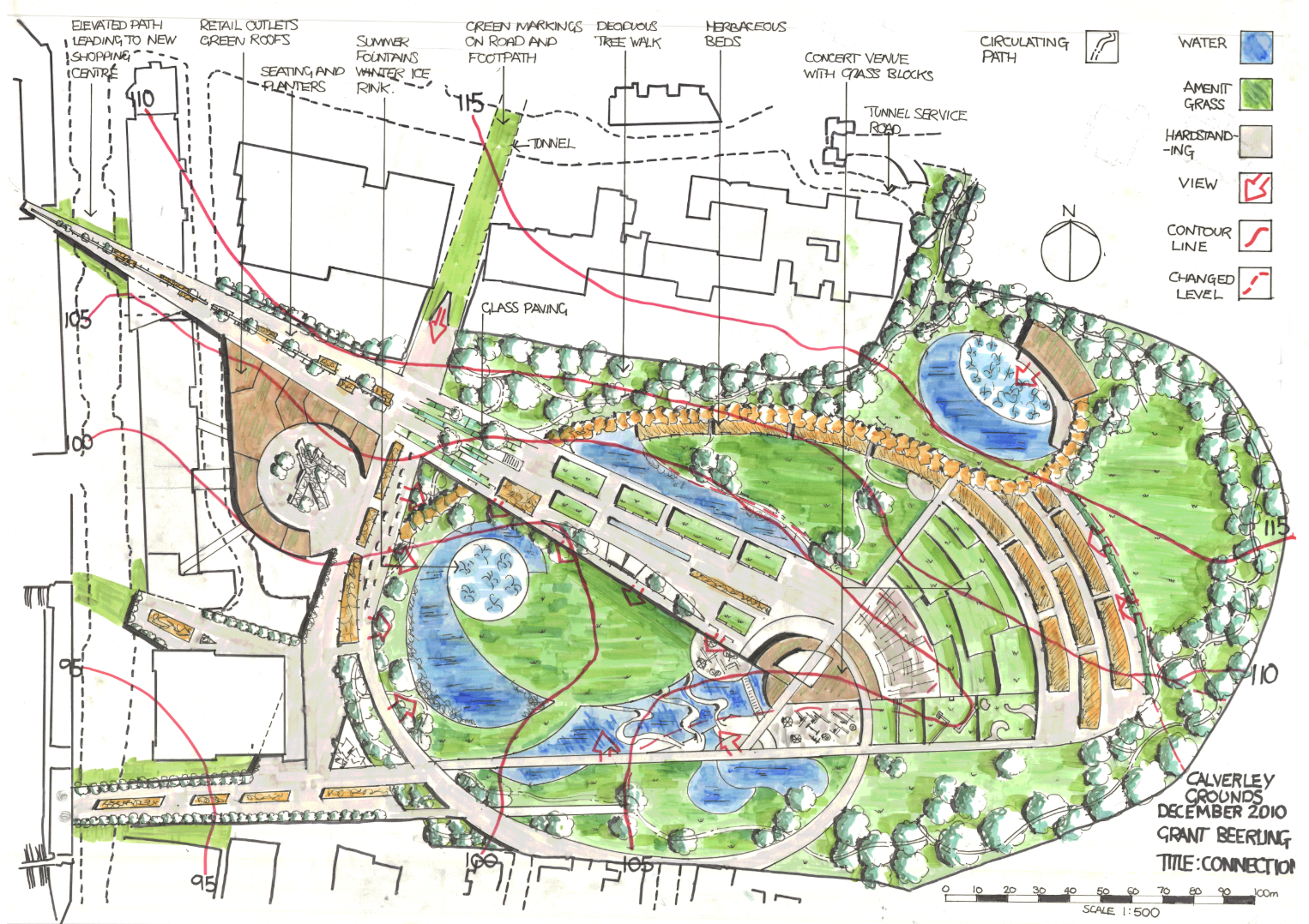
The Masterplan
My Aim: I was trying to convey the topography of the site with shades of green. Tried loads of new ideas and techniques. Overall pleased with the strong but tonally dark colour scheme. Not so happy about the water, general cramped feel, paving colour, outside buildings. The name feels right as it conveys (in my opinion) that people are the park, as in the Blur song ,park life. Simple, catchy and with an element of humour, which adds up to a memorable title, i hope.
Crit : Too much writing, smaller more descriptive to the point annotation and thus more of them. Trees too small, line weights generally to heavy, little or no hierarchy in the line weight, Loads more definative shadow, Outside buildings greyed out, buildings defined, generally more obvious and less suble communication.
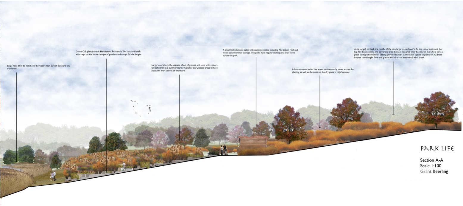
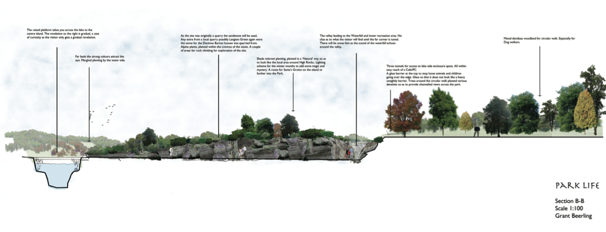
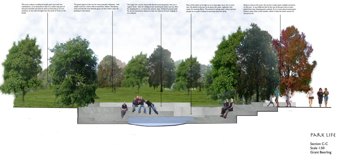
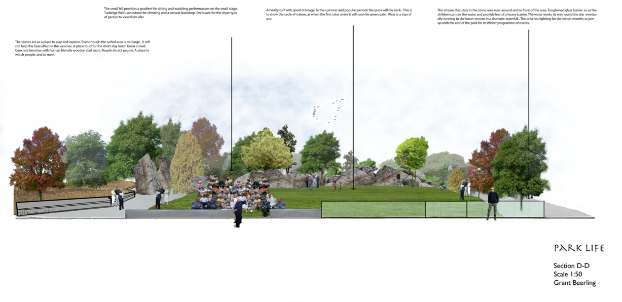
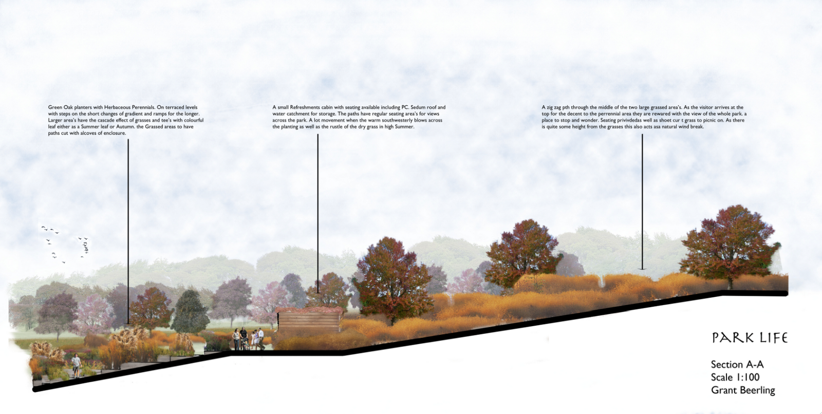
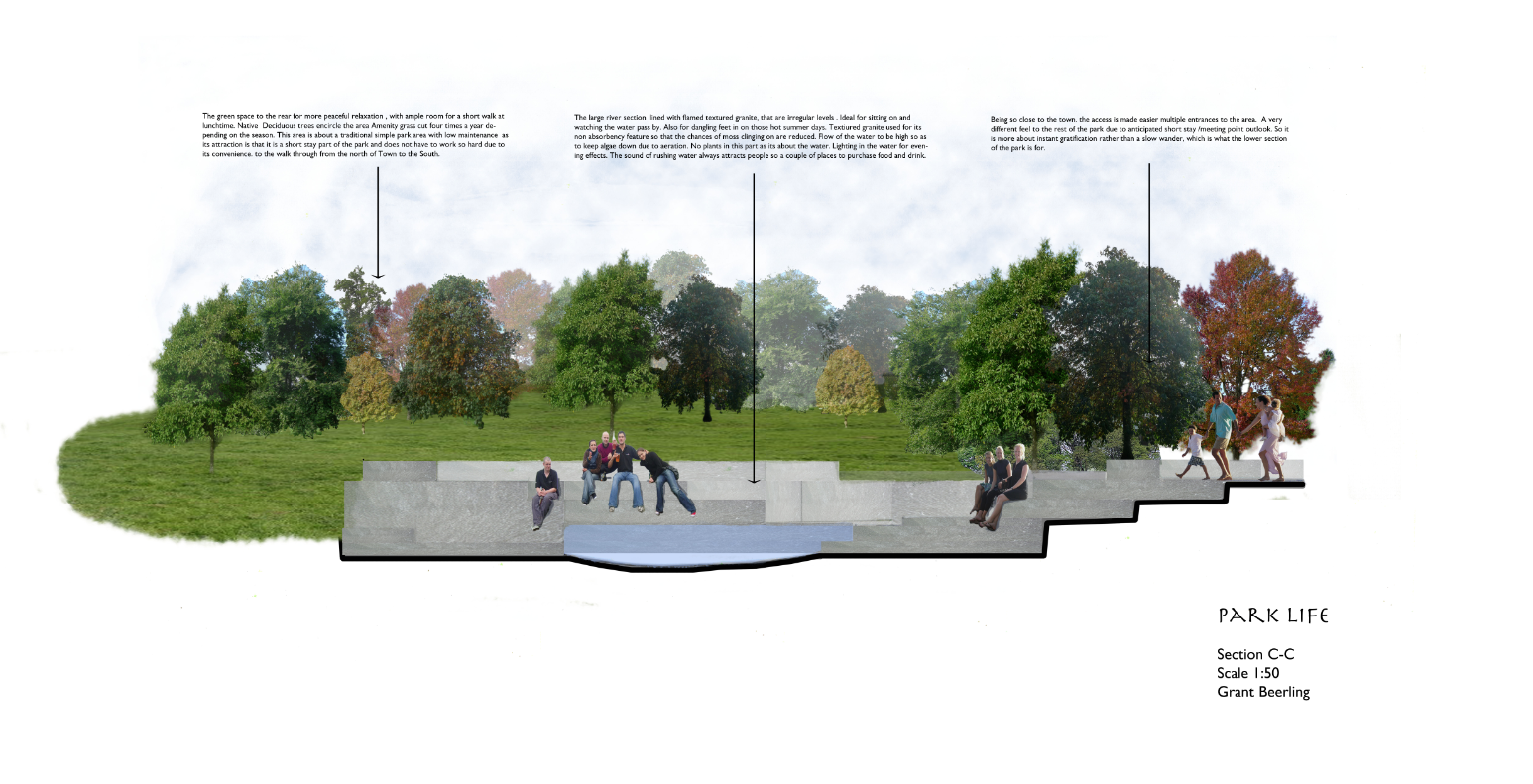
Cross Sections
1:100
Aim: Trying to get atmosphere in the area. The calm feel of the grasses along with the enclosure of the planters. Depth of field.
Crit: Line weight of the ground level too thick. Shorter and more concise annotation, more of it. Use the whole with of the page, otherwise wasted opportunity.
Aim: To show the vallies and different shrub/tree planting on bank. to get depth to the other side of the park.
Crit: As Above
1:50
Aim: Depth and water and sitting possiabiltys on the granite cubes. Not so pleased with this as it lacks fun and atmoshere, which is the point
Crit: As above
Aim: To show a small crowd enjoying an event. Stones being used. Depth of field. Really hard to get people sitting on the ground looking at you of the net.
Crit : As above.
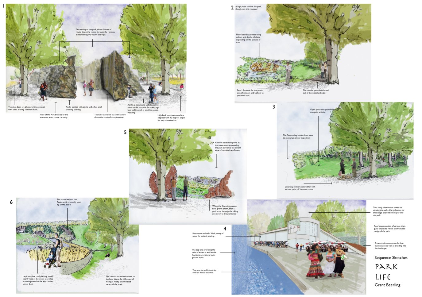
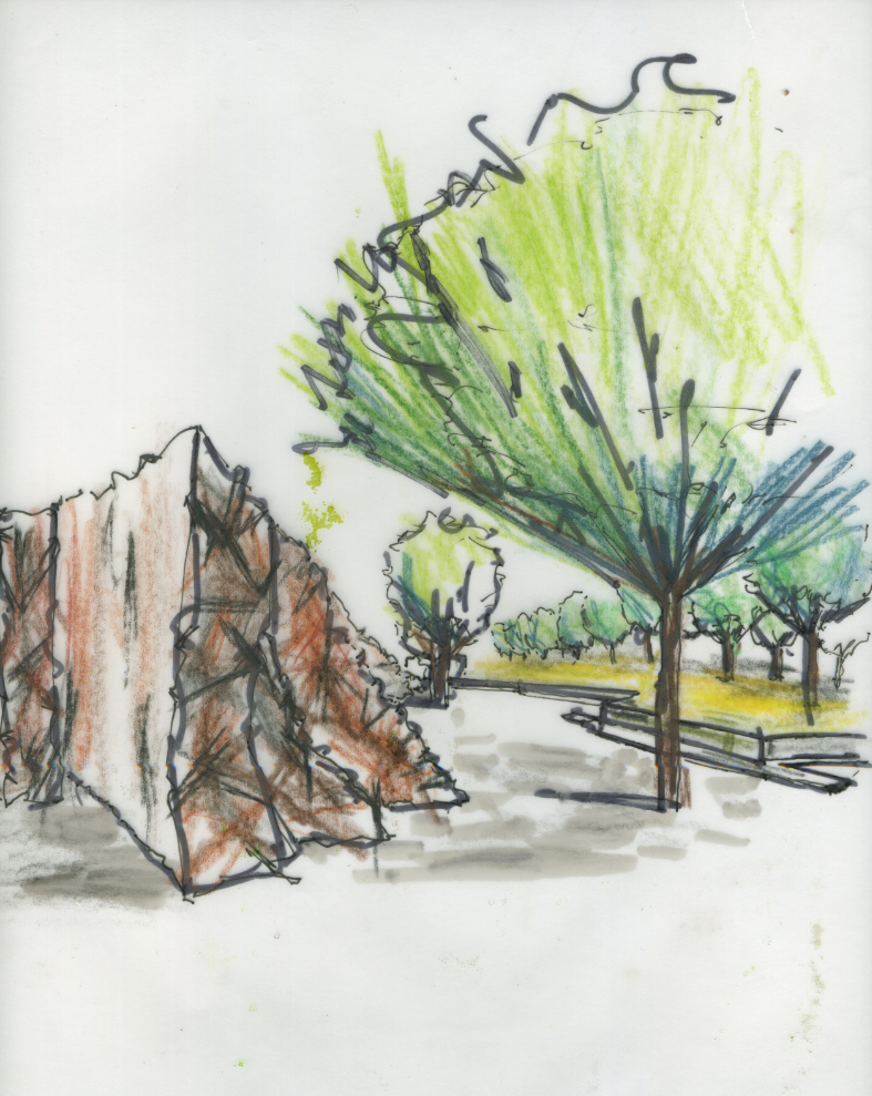
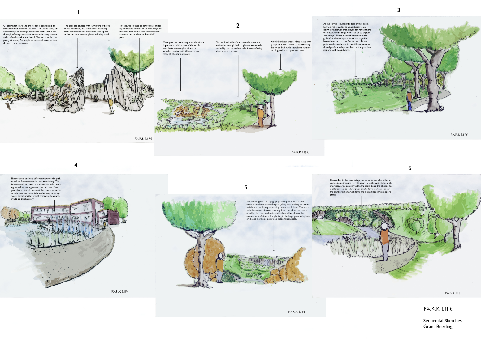
Sequential Sketches on the main circular route.
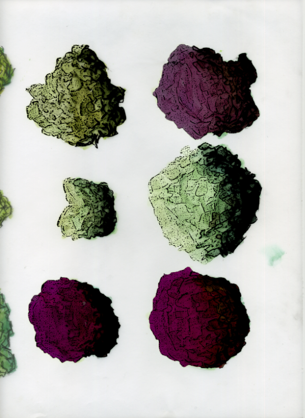
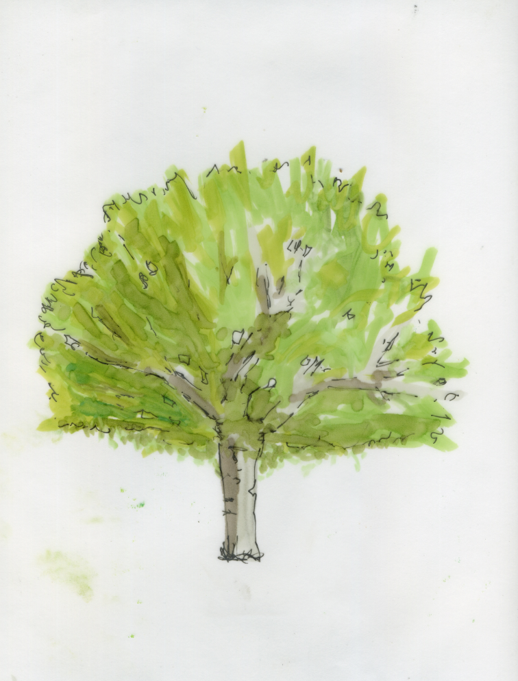
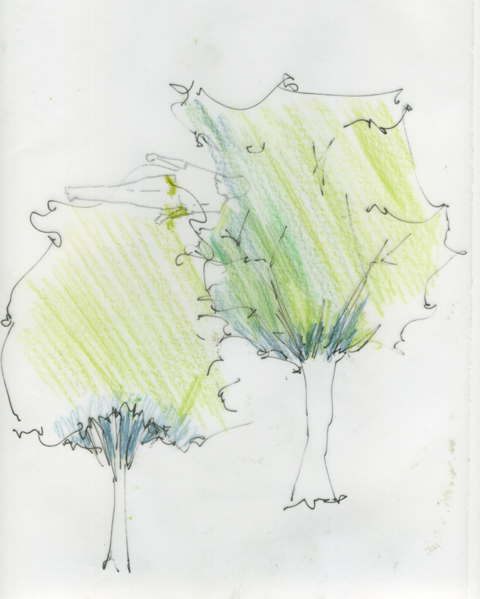
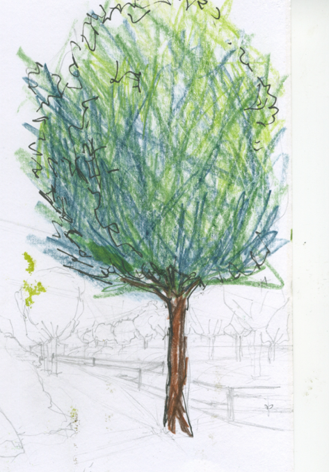
Aim: Really rushed, all 6 in 6 hours. Some of the perspective are way out as they were all out of my head. The tree’s in the for ground are naff, though in the distance are ok. Though the drawings are average at best there is some atmosphere.
Crit: Line weight! way to heavy, lolly pop tree’s and people. no variation or possible id of different tree species. Colour, shadows the list goes on!!
Conclusion, Need to sharpen self crit skills to see what is actually in front of me.More sketching less photoshop filters. I think i need to just nail some issues such as grass and mass area’s for colour and feel. Atomsphere rather than to much technique.
Think Atmoshere